European Comics Lettering
For Letterer Appreciation Day, I made a video of some of the things I’ve noticed about the lettering in BD.

PIPELINECOMICS
European Comics.
North American Perspective.

For Letterer Appreciation Day, I made a video of some of the things I’ve noticed about the lettering in BD.

For this year’s Letterer Appreciation Day, I look at choices Tom Orzechowski makes in lettering a classic X-Men comic. It’s about speed, volume, and number.
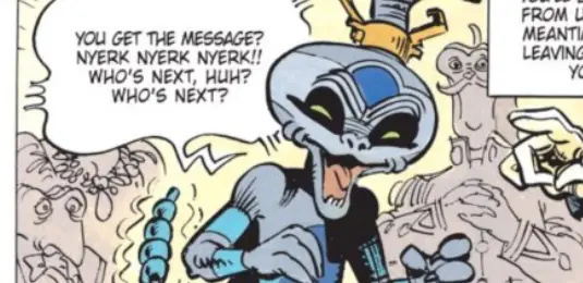
One panel in a Valerian album could be improved greatly with a few tweaks to the lettering. This is not about the font. It’s about the layout.

Chris Samnee incorporates hand drawn lettering sound effects in this “Rocketeer” mini-series to great effect. Here are five ways he uses the lettering in his storytelling.

In the early 1990s, lettering veteran Willie Schubert explained the art of lettering to “Hero Illustrated” readers in three pages. Read those here!

Perusing a random assortment of webcomics, I saw some simple lettering errors that can be easily corrected. Here are five of them.

The Adam Kubert art on this “Incredible Hulk” page is nice and all, but I really bought it for John Workman’s lettering, and I’ll tell you why.

Edgar Jacobs wanted his original “Blake and Mortimer” art kept together and fueling his legacy. A few years after his death, his plan fell apart….

Dozens of artists come together to pay tribute to Asterix on his 60th birthday. It’s a fantastic mix of art styles and familiar names doing fun work.

I visited a French book store in New York City and walked away empty handed. But I did see a lot of very cool things, and maybe regretted not buying one.