
Small Lettering Change. Big Improvement?
I know that the law of the internet is that any question as a headline is an automatic “No” answer, but please hear me out.
A Brief Disclaimer
“Valerian and Laureline” is an amazing series, and I’m not one to tell the creators what to do. They’ve already done it, they’re done with it now, and they’re both better at their crafts than I ever will be.
There’s nothing worse than someone who’s never made a comic book in their life telling a well-respected professional how to do their job. I don’t want to be that person.
I’m not superior to them in any way, and I don’t think they’ve failed in the way I’m about to show. This article is about a panel I really liked, but where a few tweaks to the lettering layout might help it out. I’m likely the only person who noticed this, and I admit that.
I think, though, that it can be a teachable moment for readers of this website, more than the creators. People don’t understand what letterers do or why they do it. So let me give you a concrete example of a couple of the thousand decisions that go into every book.
This is about how making a couple of changes can improve readability and flow of one particular panel.
Missing Credits
No creator credit is given for the lettering in any Franco-Belgian comic, generally speaking.
The translator and the person who adds the English lettering (via computer) get credits, but they’re working within the scope of the balloons that are already drawn on the page.
Did Mezieres letter these pages himself? I have no idea. The original colorist gets a credit, but not the letterer.
Let’s get on with it now:
Layers and Depth and Left to Right
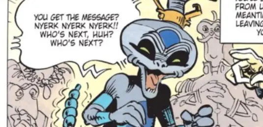
This is the panel I want to analyze to a ridiculous degree today:

It has something in it that I hit on in a lot of reviews. It’s a subject in comics art that I’m obsessed with, because so few artists do it. I’m talking about creating depth by using multiple layers. Placing objects at different distances from the reader can create a more absorbing image, the kind that welcomes the reader in to look around and see what’s going on. It creates a natural three dimensionality in a two dimensional space better than any 3D glasses could.
As you read this panel from left to right, the action also moves deeper into the scene. The Schniarfer on the far left is closest (foreground), then the Quatuor Mortis alien in the funky sunglasses in the center is in the middle area (middleground), and Laureline can be seen getting kidnapped in the far back (background).
There’s no overlap between the levels to make it more obvious. In fact, Mezieres appears to go out of his way to ensure that. Everyone just misses touching each other across this panel. It’s like Laureline’s hair is trying its hardest to miss becoming a tangent with the alien’s left arm. Look at how those waves of hair pull up short of his arm every time.
In the context of the rest of the page, though, it works. You know that the Schniarfer is small, but he’s standing up on something, so the perspective works that he’s the same height as the Quatuor Mortis alien.
It’s a straight line of action. As your eye moves left to right, you follow the story in progress, and get dragged deeper into the room where all the action is happening.
You can break this panel into three sections, one for each of the three characters I’ve mentioned already, along with their appropriate word balloons. Let’s break this down one by one to tweak each to make a better whole.
The Lettering Tweaks
Balloon 1

The first thing I noticed is that the lettering is fighting against that separation of layers in a couple of ways. First, the balloon for the Schniarfer is behind him. While that might help him pop out more, it also confuses that straight line into the scene that I described the reader taking before.
That word balloon is the furthest thing to the left of the panel. It should be the closest to the reader. It should not be behind anyone’s head.
I reconstructed the word balloon and had it overlap his head just a bit. This is not a perfect new balloon. In that, it almost forms a tangent with the alien’s head, to the point where it looks like it’s the proper head shape, bot the balloon border that shows up there.
But the idea is simple: The balloon is the first thing you see on the panel moving left to right, and I want everything to move front to back as you do so.
To that end, the top of the Schniarf’s head is breaking the panel. If I’m going to let that stay, then the balloon needs to break the panel border, too. So I moved the whole thing up and to the left.
Balloon 2

Next is the guy in the middle, whose balloon is overlapping no part of him. It’s not an offender at all. I am a bit weirded out that the second balloon is higher in the panel than the first balloon, but just a bit. It drives the reader’s eye off the straight line that’s going left to right, and front to back. Suddenly, you’re going left to right and up a little.
I changed that, and added something else that might be controversial. First, I lowered it so the reader’s eye didn’t have to pop up.
Second, I placed the balloon between his hand and his shoulder. I placed it in the scene at a depth in line with everything else. That pointing hand pops out a little bit more now, while the body pushes back a bit. It’s an extra trick to keep movement heading away from the reader as the action moves to the right.
Is this too cutesy? Is this gimmicky? More importantly, is the right side not quite low enough so that it forms more of a tangent than an overlap? I meant for it to overlap.
Balloons 3 – 4

These balloons are furthest back. There’s no way these balloons should be breaking the panel border. They need to stay inside the panel. In fact they might even be drawn smaller to indicate a bit of distance of sound. The further away from the reader, the softer a sound will be, right?
I didn’t redraw the balloons to make them smaller, but I did move them down a bit and away from the panel border. This keeps them in the room, but they are now also positioned in a straighter line with the other balloons in the panel.
Additionally, I extended the panel border out to the right, to keep the kidnappers from breaking out there. They’re supposed to be the furthest away, but Mezieres has them overlapping the border in the same way the closest person does on the far left. Doesn’t make sense.
The border is the window the reader is viewing the scene through. If the person furthest back is breaking the border, then the person closest to the reader who is also breaking the panel border doesn’t look so close up anymore. It destroys the illusion.
The Final Results
Now, look at it all together:

I like it better. There’s less bouncing up and down as you move left to right, and everything seems to be in the right place in three dimensional space. The only time the panel border is broken is by the thing closest to the reader and, thus, more likely to pop out. For some, the lettering might be interfering in the art too much. There’s a school of thought that all balloons should automatically float to the top of the panel they’re in and never get in the way or interact with the art. This wouldn’t work if you subscribe to that school. I’m more of an interactive/activist lettering fan. Let it be part of the art.
What do you think?
To Be Fair
I liked the lettering layout on this panel elsewhere in the same volume a lot:

The word balloons travel in a semi-circle, paralleling the open vault door. They could have tried stacking those first three balloons up in the upper left corner. That would keep them out of the way of the art and the screaming “WAAA” balloon. They didn’t, though. Keeping them mirroring that door helps frame the characters into a confining situation, which is in character and correct for the situation.
Richard Starkings taught me to think of lettering as being on a plane kind of right in front of the characters. There are times (and in many old comics I don’t find it as distracting for some reason), where it looks OK to have a part of a speaker cover it up, but generally I think of things that are behind that plane as being further back in time. While your fix takes care of the baselines, I dunno, it kind of messes my flow of dimension and sequence.
Hi Bram – That’s a valid point, and I’m not one to argue with Richard. 😉 I like that concept of the plane up front, too. It’s something I’m going to think about when I read my next comic. I’m sure it’s all I’ll see now. Ah, the dangers of being “the critic”….