How to Make (or Fake) Heather Gray
Heather Gray in Clip Studio Paint
It’s a popular color for sweatpants, leggings, hoodies, American Apparel (remember them?) t-shirts, etc. But it’s not just a solid color. It’s a pattern. Take a look:
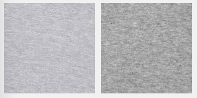
Different manufacturers might have slightly different shades of gray for it, but there’s always that straight line pattern — almost like a striation — that runs through it.
There’s a cheat for it that I found when I needed it for an Inktober challenge. There are a lot of little settings you can tweak to make it look just like you want to, but it only takes three steps to get this effect.
1. Fill in the area with a gray color
Use the magic wand to select the area you want to fill, because you’ll be needing that selected area in the next steps.
Fill in that area with a gray color. This is where you can choose just how gray your color is. In my mind, it’s about 50% to 75% of the way between white and black. You don’t want to go too dark with something like this. Err on the side of lightness.
2. Add Perlin Noise
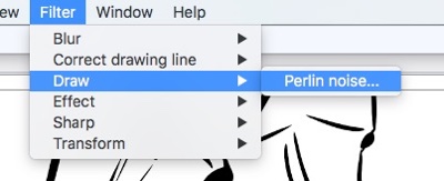
It’s in the menu bar under Filter –> Render –> Perlin Noise (Older versions of Clip Studio Paint have it under Filter –> Draw –> Perlin Noise.)
It’s going to give you a series of options. Play with them. Adjust to taste. Make sure you have the “Preview” box checked so you can see the impact of every change you make. That’s a lot more useful than guessing and hoping.
Here are the settings I’m using:
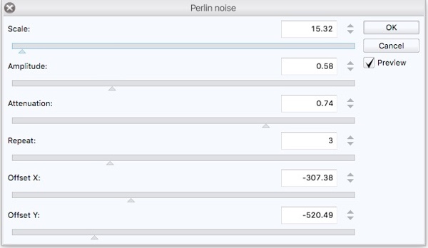
I chose those because they give me a nice narrow and regular band. The final noise is not large and blocky. It’ll look nicer after the next step.
3. Add Movable Blur
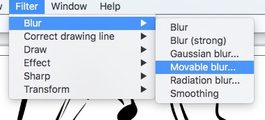
It’s in the menu bar under Filter –> Blur –> Motion. Older versions of CSP called this “Movable blur”. The screenshots of this window below are from an earlier edition of Clip Studio Paint. Everything is the same, it’s just the labels and option names that have changed. I’ll point those out as we go.
There are some settings here you can play with, too. I recommend sticking with 10 for the “Area to blur” setting (or “Strength,” as it’s now called). Anything more and it starts looking too blurry and the edges get too thin.
Here’s what 10 looks like: (OK, so it’s 9.93. Close enough.)

If you push it out to 45, you start to see more of the blur and less of the pattern. Plus, you get those white areas at the edges. This would work great if we were looking for motion instead of a fabric pattern. We need to minimize that effect.
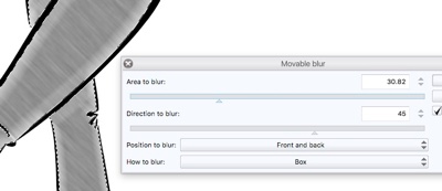
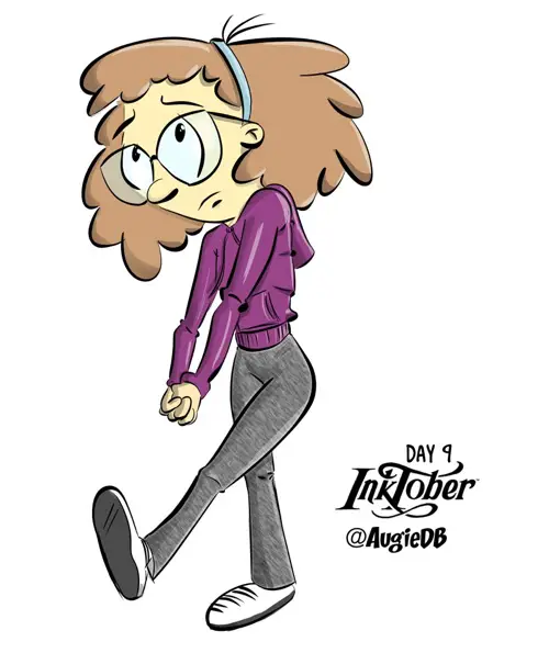
“Direction to Blur” is a good spot to change the angle of the blur to match what you’re blurring. In this case, I chose to match the forward leg. So I tilted the blur at 45 degrees. (This has been changed to “Angle” in more recent editions of Clip Studio Paint. That makes more sense.)
“Position to Blur” is useful if you were really blurring something in motion. Stick with “Front and Back” for now. If you switch to “Front”, you’ll get a white spot in the front. If you switch to “Back,” that white spot will be at the back of your blurry area. It’s not a good look. (In more recent versions of Clip Studio Paint, this is labelled as “Direction”, and the option is named “Both Directions.”)
“How to Blur” gives you two options. I prefer “Smooth” to “Box,” as it will cut down a tad on the halo effect on the edges. (This is now labelled “Mode.”)
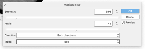
Here’s what the v1.10.10 version of this options window looks like:
To Sum It Up
You are not using the “Movable Blur”/”Motion Blue” tool for the purpose it’s intended, so you’ll need to play with the settings to see what works best for you and the resolution you’re working at. It would probably have helped me here, for example, to have expanded the wanded area out a few pixels. That would hide more of that initial white area under the black ink lines. That’s something I’ll keep in mind for the next time I use this technique.
If you’re going for the Heather Gray look, though, it’s pretty easy and only a couple of steps, really. Give it a try sometime.
Here’s how the final image came out.
And here’s how it was done. You can see the pants getting colored in around the 1:50 mark.