
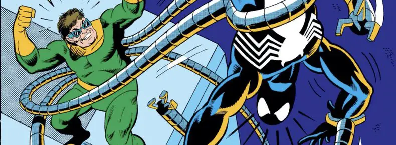
The Amazing Spider-Man #296 – #297: Prelude to McSpidey
It’s hard to explain how big a change in art and storytelling styles it was when Todd McFarlane started his work on “The Amazing Spider-Man” #298.
McFarlane’s first issue debuted in November 1987. To set the scene with some of his Image contemporaries: Jim Lee hadn’t started “X-Men” yet. (January 1989) Rob Liefeld hadn’t drawn “Hawk and Dove” yet. (October 1988) Erik Larsen hadn’t drawn “Doom Patrol.” (March 1988) Mark Silvestri was the new artist on “Uncanny X-Men.”
Art Adams was a huge and rising star, but that was for his art style and not necessarily for changing how stories were told with crazy page layouts and the like.
The easiest way to see the difference between the two worlds would be to look at the two “The Amazing Spider-Man” issues before McFarlane started and do a little comparison. Conveniently, they’re included in the same omnibus with all of the David Michelinie/Todd McFarlane issues.
Old School, But Clear, Art
Alex Saviuk drew and Vinny Colletta inked the two issues, and it feels (hindsight is 20/20) very old school. The layouts are straightforward enough: two or three tiers of panels, establishing shots with backgrounds followed by medium shots without. Closeups are rare, unless it’s for something like Spider-Man inspecting his empty web shooters. Backgrounds are outined, but there’s no hatching work or added texture or detailing thrown in. Solid black areas are saved for the folds of people’s clothes.
It’s not bad work at all. It’s solid comic book storytelling. The action is easy to follow, the camera angle choices are smart. Everything feels well composed, both in panel and between panels. It’s clear and easy to read, but it’s never exciting or inspiring. It’s not, for won’t of a better word, flashy. Nobody’s mind was blown by these pages.
I hesitate to add that Colletta’s inks likely didn’t help matters on the surface level. He gets enough of a bad rap already for erasing Kirby’s pencils, but it feels like he did similar level work here. Backgrounds are all drawn with a thin single width line. Buildings are a lot of simple straight lines, with the brick work drawn in only sporadically.
It works; it tells the story and it explains to the reader anything the reader might need to know. It’s probably for the best that Saviuk does his most detailed work on the people in the foreground. That’s where line widths vary and shadows fall in and the art starts to feel like it has more volume.
To be fair, this was originally printed on newsprint, which sucked up black inks and muted colors. Reading it now digitally or in the Omnibus, it’s been cleaned up and reprinted on slick paper where no detail is hidden or smudged. Colletta had been inking comics for decades at this point. He knew how much detail would be too much. You need to work towards the final output, and maybe that’s what he and Saviuk both were doing?
Yet I look at these two issues and they just feel boring, visually.
There are pages where Spider-Man is swinging through the city and outlining the plot to the reader — a Michelinie trademark! — and even those are awkward. The backgrounds get more detailed and more three dimensional, but Spider-Man’s body language is relatively flat. It’s not exactly realistic, but it’s also not exciting.
The difference in art styles isn’t immediately obvious when you look at McFarlane’s first couple of issues, but if you compare his later “Amazing Spider-Man” work to these two issues, it’s night and day.
Remember that when McFarlane came onto the book, he was still a relatively new artist. And, perhaps most importantly, he wasn’t inking himself yet. It wasn’t until he took over those duties that his trademark style truly showed through.
But the bones of it were there right away. Spider-Man’s poses grew instantly more bendable and his eyes grew three sizes. Even if the final details weren’t in place yet, you could see a difference.
On the flip side, there are moments in McFarlane’s storytelling where you wish he’d back up a bit, give the characters more space to breathe. Those skinny tall panels boxed people in a bit. Sometimes, that worked, and other times it felt restrictive.
We’ll get to all that in time, here on The McSpidey Chronicles….
As my memory recalls, Saviuk moved to “Web of Spider-Man” after this, which is where he was when I started collecting comics a year and a half later. I don’t have those issues anymore, but I do remember a few issues where he’d have panels that looked influenced directly by McFarlane, though still in his own style.
Everyone did eventually adjust to the big eyes and the webbing, but some of the more extreme poses were harder to adopt, or just not in the style of other artists at the time.
The Marital Problem
At the point this story was written, the Peter/Mary Jane marriage couldn’t have been more than a year or two old.
So, of course, the first thing a Spider-Man writer does after such a momentous occasion is to separate the two. Mary Jane is off filming a soap opera across the country. Peter is left alone, leading the bachelor life.
This entire story is the classic “illusion of change.” Peter is still a photographer for the Daily Bugle, having a tough time getting any assignments and only making money from his pictures he shoots of Spider-Man. He’s alone in the city. He has money issues. He can’t catch a break and, in fact, has to embarrass himself in front of the entire city — or just a couple people in a window across the street — in order to save the day. When he does save the day in another occasion, he’s threatened with a lawsuit when he breaks stuff along the way.
Married or not. Living with Aunt May or on his own. Black costume or red and blue.
It’s all the same. Everything past the core story of the luckless Peter Parker with all of the responsibility his powers give him – it’s all the illusion of change. It works!
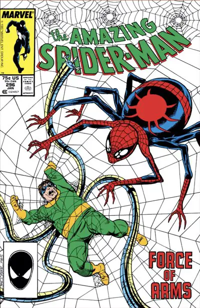
Amazing Spider-Man #296
Spider-Man runs out of his web fluid in the rain and now has to slum it with the norms and walk home. (His costume has no pockets, so he can’t even afford bus fare.) When he gets home, some of the rain had already fallen through his skylight, making his bathroom floor wet.
We’re two pages in and already Spider-Man is a complete sad sack who can’t catch a broke and who won’t, by the way, add any pockets to his costume in the near future. The web fluid issue, on the other hand, becomes part of the story.
Meanwhile, Doctor Octopus is undergoing some kind of “new radical sleep therapy” in a psychiatric facility, separated from his arms as he’s being observed by a caring doctor. While he lays there in bed, the doctor gets to give all the exposition we need to know what’s going on: that Octopus shuts down at the very thought of Spider-Man. We get the nightmare sequence to go along with that, of course. There’s a second later on. If you hate dream sequences, this is not your issue.
On the other hand, it gives us this sneak peek into the Spider-Verse:
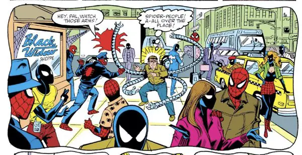
There is so much going on in this panel. I have many questions…
Peter, meanwhile, has redesigned his webshooters, but needs money to fund the new tech toys. That leads him to the Bugle to look for more photographic work. Hey, kids, in 1988, photographers were busy people at newspapers. The reporters didn’t just whip out their iPhones to get a boring headshot to go along with their story.
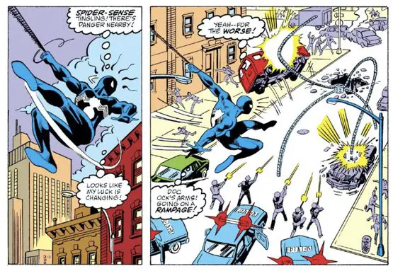
Meanwhile, Octopus’s fears bring his arms back to him and attack Spider-Man along the way. Spider-Man concocts a plan with the help of Octopus’ doctor to bring him in safely. It backfires in an unexpected way.
But Peter got some pictures he could sell, and Octopus has landed on a new way of defeating Spider-Man: by destroying New York City!
To be continued!
It has all the elements of a classic Spider-Man story, don’t you think?
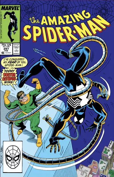
Amazing Spider-Man #297
We begin with three pages of Spider-Man using his new webshooters, and showing off how his camera belt can hold extra web fluid cartridges. Then he accidentally webs up an innocent person walking the street, who threatens to sue. Spider-Man meekly apologizes and tells him he’ll be free in an hour.
Spider-Man is a jerk!
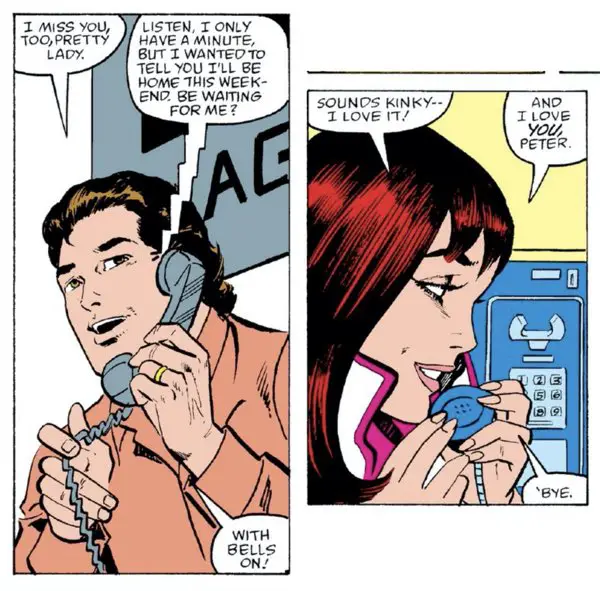
After that, we get a bunch of little scenes that continue on the soap opera of Peter’s pike. Aunt May and Mary Jane’s mother stop by for a visit and to take him out for dinner at an awkward moment. Robby Roberson at the Daily Bugle wants Peter to consider another career (!). Doc Ock starts to make plans against Spider-Man. Mary Jane and Peter share a phone call.
Spider-Man interrupts a theft at a daytime black-tie penthouse party. (It’s a weird combination of factors there.) One of the bad guys is attempting to steal a painting that has quite the provenance:
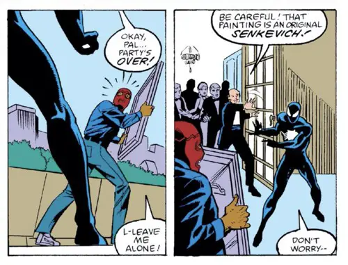
And that, boys and girls, is how you pronounce Bill Sienkiewicz’s last name phonetically.
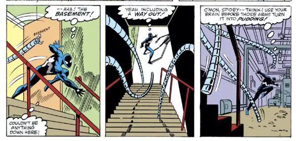
Finally, in the last nine pages, Spider-Man finds and confronts Doctor Octopus, only winning by making the good doctor feel like he’s won by publicly embarrassing Spider-Man and letting him go on to live with the shame.
It feels like something comics would do 30 years ago before everything had to be so serious and “realistic.”
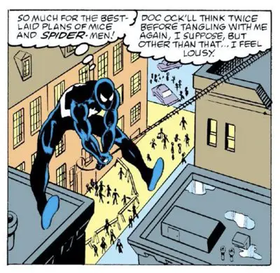
But, hey, the city didn’t get blown up so Spider-Man did his job!
Storytelling, In General
The bulk of the story in this two-parter isn’t all that much different from what you’d see in the McFarlane years on the series. Michelinie may have been smart enough to include as many villains into the series for his wunderkind artist to draw, but his basic storytelling skills and style remained consistent.
If anything, he may have learned to tell his stories in fewer panels. Saviuk averaged seven panels per page in these two issues. McFarlane still used a lot of panels in his pages — many of them extreme close-ups, narrow, or skinny — but he also had a couple of spots in every issue to flex his artistic muscles. That’s where you’d get the dramatic Spider-Man swinging through the city or the big reveal getting a half page or more.
Without seeing the original scripts, it’s hard to know how much of that was McFarlane rearranging the panels outlined in the scripts and how much was Michelinie adapting his work to his artist.
One thing’s for sure, though: These were stories constructed before the Trade Paperback Era. These two issues are standalone stories that work well together. The rest of the issues we’ll be looking at with The McSpidey Chronicles are likewise one or two-parters. The Assassin Nation is a six-part story that seems custom-made for a trade today, but Michelinie constructed those as standalone issues along the way. Another summer bi-weekly run had a theme running through it, but it was never a single story carried across multiple issues.
That’s part of the reason the pages have as many panels as they do. Michelinie had to get the complete story done in 22 pages. There’s no room to stretch out.
It’s something we should be very happy about today, because it gave him the chance to throw as many different characters at McFarlane to draw and redesign.
That parade of costumed characters begins with the next issue and that classic Spider-Man nemesis — Chance!?!
Buckle up – the ride is about to begin!
I finally found a link to this page that works!
See, what you write here is very interesting. It’s a typical case of backwards thinking. You find this “not exciting” because you read later books first. You’re like those youngsters raised on Rap or punk rock who find Mozart boring. Or those who think Flash Gordon is a rip-off of Star Wars.
Now, For everyone who finds McFarlane page composition “exciting”, you’ll find just as many who’ll find it confusing, gimmicky and unnecessary flashy, detrimental to the story. As a regular Marvel reader at the time, I seriously considered dropping ASM when McFarlane started, as I enjoyed neither the excessively cartoony art, nor the uninspiredly existentialist Michelinie scripts (see it’s not all Todd’s fault). I held on a little longer but finally dropped the title during Bagley’s run, Peter’s parents coming back as robots was the final nail in the coffin for me.
Speaking of Todd’s art, I can think of one comparison to illustrate my point of view. I was an unconditional fan of Neal Adams on Batman. He was revolutionary and his talent is obvious. I liked him less on Deadman when he started overlapping panels and useless diagonal panel separation. He completely lost me on X-Men, when most of his storytelling had me scratching my head about the sequence of what I should be reading next on the page. For me, McFarlane is like that, except he started directly at the last phase, on ASM, and he wasn’t that great an artist to begin with, as his previous work at DC amply showed. The way I see it, he took all the quirks of the previous generation (Art Adams, Michael Golden) but none of the basic foundation that makes the art solid. Learning to draw from comics is not the same as learning to draw from Hogarth’s anatomy books.
Every generation hates the generation before. It’s an endless cycle. Also: “OK, Boomer!”
Now, I never claimed McFarlane was a storytelling genius. You won’t see me doing any Hyperanalysis articles on this run. And, in fact, you’ll see plenty of criticism as we go through these issues. I am capable of separating out the wide-eyed inexperienced comics reader of my teenage years with the 30-year veteran of today. So, stay tuned.
As for Neal Adams — an excellent illustrator, but most of his story pages don’t work for me. I couldn’t make it through the first volume of his collected Batman stories. (Though that might also be because Adams reworked some pages to make them “better” before the reprint. Most people don’t think it was an improvement.)
for some reason, the comments of this subsection of the site do not show up in my RSS feed, so I had to check the page to see that mine cleared.
Has it gotten better? This subsite is technically a new site, so I had to manually clear you as a user who can comment again. Now your comments should go up automatically as an “approved, known” user, and they would show up in the feed instantly, too.
Great idea! I read the last Blacksad album and came here to find your thoughts on it, when I found this… amazing! Before reading any comics run, I always try to read the previous two episodes, to get an idea of who much a new creative team can influence and change a monthly publication. All these thanks to digital media, of course. Again, great work!