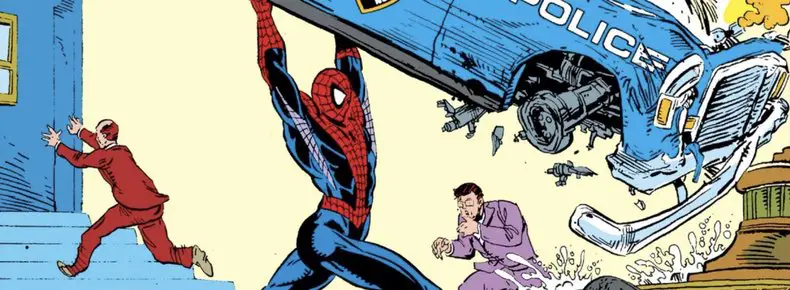
The Amazing Spider-Man #306: “Humbugged!”
A bug-powered villain is easily handled by Spider-Man, who also has jealousy issues with his alter-ego, Peter Parker. And Jonathan Caesar just gets creepier by the issue.
Not Quite Christmas Credits – Bah Humbug!
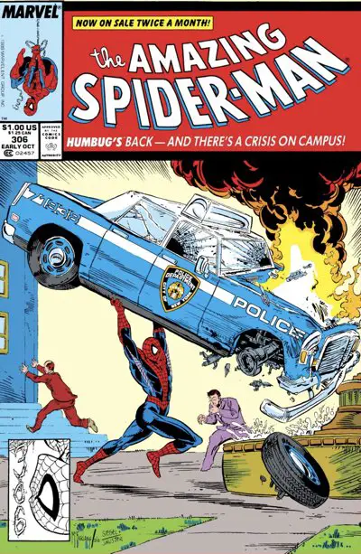
Artist: Todd McFarlane
Colors: Bob Sharen
Letterer: Rick Parker
Publication Date: June 14, 1988
Todd McFarlane: King of Comedy?
For a man who fashions himself a horror artist these days, Todd McFarlane does very well drawing more light-hearted and comedic moments. His style lends itself nicely to silly things. He naturally draws very goofy-looking people. He stays on model with the main characters, but check out the cartooning he does with the background people and the bit players.
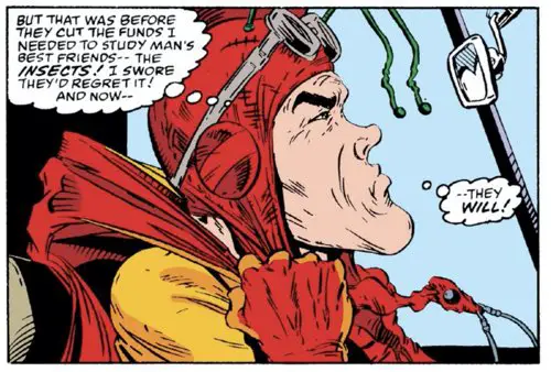
There’s no better example of this than “Amazing Spider-Man” #306, and its villain, “Humbug.” A college professor/researcher/graduate student/something seeking revenge on Empire State University is dressing up in a silly cape and suit and using bug sounds to get what he wants. The character looks and acts ridiculous, with poses that look like an anemic guy in baggy clothes barely carrying his cape. He runs like something out of a Hanna Barbera cartoon. The cowl with the big “HB” across his forehead around the fin (!) is silly.
It’s glorious!
His bug powers, by the way, are the result of using amplified sounds of insects he recorded and then plays back from a tape recorder strapped to his waist. Those sounds are channeled through his gloves and — look, the whole thing is delightfully preposterous. Don’t think about it too much. Just look at the guy:
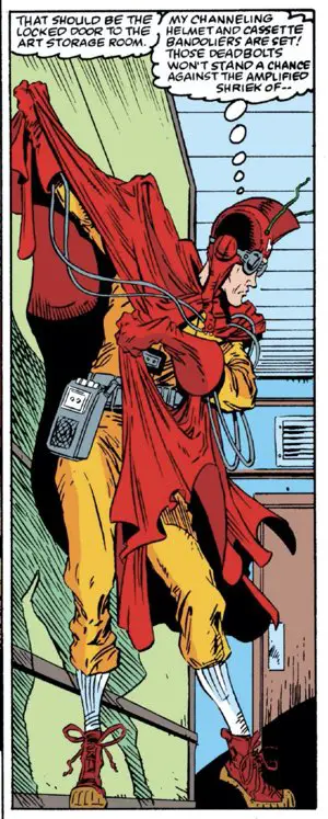
It’s not a question of IF Spider-Man will beat him, but HOW entertainingly he’ll wipe the floor with this idiot.
McFarlane sells him. He doesn’t draw him as a muscular moron. He presents Humbug as the nerdy insect-loving freak in silly ill-fitting clothes playing dress-up. He just happens to be slightly dangerous because his insect-inspired weapons and powers are enough to cause trouble.
McFarlane plays the superpowers straight, visually, including the nicely-designed energy blasts coming out of his hands. And he has a cool cape that could, in theory, be dramatic. It’s a McFarlane Cape, so of course it’s going to be fun to see on every panel.
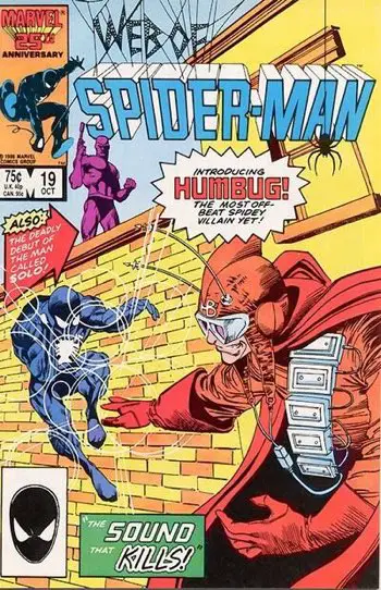
Humbug debuted in “Web of Spider-Man” #19, which is unfortunately not available on Comixology. That issue was written by David Michelinie and drawn by fellow future Image Founder, Marc Silvestri. The issue also featured the debut appearance of Solo, who we’ll see Todd McFarlane draw during the “Assassin Nation” storyline near the end of his run.
It’s also an issue that starts with Spider-Man testing his spidey senses after a chance encounter with someone in a subway in the previous issue that we’d later come to know as Eddie Brock/Venom.
As with that “Web Of” issue, Humbug is an easy catch for Spider-Man here, though the elements of surprise catch him off-guard at first. The fight plays to Spider-Man’s strengths, giving the web crawler a scientifically based villain that he can out-think, both emotionally and logically. (Spoiler: He threatens a jar of roaches to get Humbug to surrender.)
Writer David Michelinie realizes the level of Humbug’s threat and doesn’t play him for much more than laughs. Humbug is limited to a third of the issue and is easily disposed of. He’s the mandatory action bit of a superhero comic that’s much more of a soap opera than an action/adventure piece, anyway.
Michelinie’s run on the series suffers from a serious lack of villainous firepower. I don’t think anyone could take Humbug or Black Fox seriously. Prowler looks cool but is hardly threatening. Chance was in over his head. Silver Sable is more friend than foe. Aside from Venom’s appearance in issue #300, Spider-Man’s been getting off easily. The serious drama in the series comes from the soap opera parts.
Story Structure and Serialization
As Michelinie is wont to do in the series, the rest of the issue is spent on a smattering of things.
This series adopted that episodic flow where things come and go as they please, instead of a more focused, singular story where everything goes in one direction and there’s a definite ending (presumably after a six-issue trade.)
Denny O’Neil once outlined how you keep multiple plot threads running and rotate which one comes to the fore at any time. If you read Chris Claremont’s “X-Men,” you also know the drill. There’s the main superhero story at the core of the issue, but all the characterization and subplots weave in and around it.
This is what my generation so often refers to as classic serialized superhero action. Stories flow over each other. There’s never an easy beginning and end. You have a villain of the month kind of thing, but it’s not the entire issue, and there’s lot of other things going on around it that keep you coming back whether you are interested in the next villain or not.
In writing The McSpidey Chronicles, I’ve learned that on an even deeper level. Pardon the pun, but I can see the web of Peter Parker’s life and how all the characters are intertwined.
Looking at the Spider-Man titles of the late 80s, you can see how all these subplots become main drivers of plots before getting pushed back until needed again. Change is always happening to keep things fresh, but the core concepts remain.
It’s a beautiful style of storytelling that puts the monthly comic first over the collected editions that started to rule the industry in the early 2000s. I love trades, but they work best to collect complete stories, not to start a new method of serializing stories that are longer and less frequent.
This constant flow of storylines is what kept readers interested month after month back in the day. It may lead to slightly underwhelming storytelling by today’s standards, but there’s something to be said for events unfolding at their own pace and overlapping as they go along. It doesn’t all feel so neat and contained as it might today. It feels more natural and less structured. I like that part.
It also works best with creators who stay on a title longer than their single 12 issue storyline. Giving them time to stretch a bit and make the comic their own is a great way to promote juggling all these storylines. It’s longer-term thinking than what we see in comics today.
Sorry, I’ll end my rant there.
How It Starts
The issue starts with David Michelinie inventing another situation to show that Peter Parker is jealous of Spider-Man. This is Writing 101 straight from the school of Show, Don’t Tell. Rather than having Peter tell Mary Jane about these feelings, he shows us how Spider-Man might overreact to a situation where this jealousy comes out.
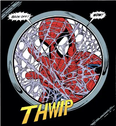
Spider-Man webs up the lens on the camera man’s camera (awesome splash page design by McFarlane that would late be used in a button set), then grabs him by the belt buckle, picks him up, and drops him on the other side. In reality, it’s completely unnecessary and most likely something that would be a viral video against Spider-Man in today’s day and age. But for a power fantasy comic, it’s pretty cool.
After that, Spider-Man swings away through the city and, once again, recaps the plot. It’s completely redundant to previous issues, but this was still the newsstand distribution days. You had to assume every issue is someone’s first and that this wouldn’t be a trade paperback in three months.
Besides, it gave page space for McFarlane to go crazy drawing cool Spider-Man poses high above the city. These are the kinds of drawings you think of when you picture McSpidey in your mind. The webbing is all over the place, the legs are bent, the feet point out, and the city shrinks behind him.
McFarlane Cityscapes
McFarlane cityscapes come in two flavors. One is the hand-drawn nighttime city, where the buildings are tall rectangles with yellow lights shining in neat rows. At its best, it’s a mesmerizing graphic interpretation of a city filled with very tall buildings.
The other flavor, which is used more often in daylight situations, is a photocopy of a picture of the city. It is doctored to one degree or another, then pasted in behind the dramatic Spider-Man pose.
(Wait, there’s a third where he borrows from Akira, but let’s not go there at the moment.)
This issue has two variants of the latter right up front, and the original art is available to inspect on one.
Here’s the first panel:
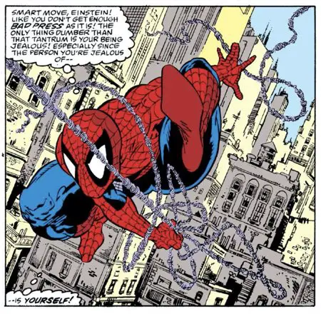
Looks like he took a picture of New York City and drew the outlines of all the buildings and added details in the windows as he liked. With a bi-weekly deadline, I think this is about as good a use of reference material as you can ask for. It’s not a strict tracing. There’s some of McFarlane’s unique style in the panel. He keeps the textures of the buildings — whether brick or metal and glass.
Things are very compressed and busy looking. There’s a slight bit of sky showing in the upper right corner, but for the most part McFarlane is jamming everything into a tight square to make it feel busier and more detailed. Spider-Man is really inside the city here. He’s practically a part of it.
Also, the colorist, Bob Sharen, does a great job in separating the buildings with the use of only two colors here. He adds depth to the image with his careful lighting.
On the next page, though, we have this:
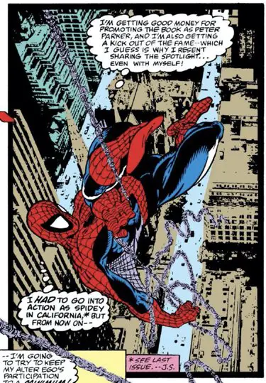
This looks like the old trick where you repeatedly photocopy the last photocopy of an image. Maybe you even shrink it down a bit each time. Do it often enough and you lose resolution and create something new.
The city in his panel hasn’t been redrawn. It’s a low-res copy of a picture.
This is the same trick he used on the cover to “The Amazing Spider-Man” #300. That cityscape is an aerial photo that’s been manipulated (pre-Photoshop days) and given three dimensional form by some very careful coloring. It’s the oranges and yellows used in a similar way to the previous example here.
Thankfully, we have the original art available to inspect on this piece. It was auctioned off on Heritage, which describes the panel like this: “The city background in panel 2 is a printed stat paste-up photo of actual New York City. Text in that panel is paste-up, with a taped in text correction.”
If you zoom in on the art far enough, you can see the lettering is pasted in.
I guess they also cut the background stat around the Spider-Man figure to put it into the background? Sounds tedious.
Also, is this something McFarlane does, or Marvel’s production staff? There’s a note from McFarlane to editor Jim Salicrup on the border: “* Jim * will send background”.
So I guess he made the stat and sent it to Marvel to glue in? Imagine having to cut around all that webbing! On a bi-weekly schedule (really twice a month), bringing in the bullpen for help on things like this is a good idea.
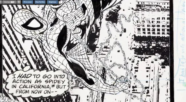
The only thing that hurts the original art on the page is the late added word balloon on the same panel. I’m not a big Rick Parker fan as a letterer to begin with, but at least his lettering is consistent from page to page and panel to panel.
Someone else drew in the second word balloon here to add in the plot recap from the last issue. The lettering “correction” is in blue pencil on the border next to the panel in handwriting that is not McFarlane’s.
It might even be that the last two lines of the previous thought balloon were changed in the Marvel Bullpen, too. The spacing with the letters gets a little weird there, and the letters are slightly different forms. If I owned the original art to this page, the only blemish on it would be the obvious lettering corrections. (They might have been pasted in after the fact and easily removed, though.)
Someone else bought the page in 2016 for a song, by 2021’s measure. (You have to log in to see the price, so I’ll honor that by not giving the specific price.). Heritage shows offers made to the purchaser to buy the page from them. Not four months after this page was sold, someone offered the owner almost 50% more for the page. The most recent offer from May 2020 is more than 2.5x the original purchase price.
Yup, I put money in a 401(k) in the naughts when I should have been bidding big in Heritage art auctions… Hindsight is 20/20, but it still hurts.
Sub Plotting Around
Jonathan Caesar invites Mary Jane to a soiree at his place, where MJ fights off unwanted advances and Caesar thinks evil thoughts. This vaguely minor background plot from recent issues will blow up in the next couple of issues.
Meanwhile, in Chicago, a businessman is replaced by his evil twin, who turns out on the last page to be The Chameleon. He’ll be the center of next issue.
The Black Cat is also back in New York from an overseas trip and looks up Peter Parker, only to find out he’s moved. The new guy in the old apartment wonders if the skylight is really a good idea. The correct answer to that question is always no. You’re just begging for a leak after the next rainstorm.
Like I said above, Michelinie likes juggling plots around in this book. All of these bits are leading to things in upcoming issues. There’s a point to them, but you need to follow the comic every month to see it all. It will all play out eventually.
Meta Cameo and the Distinguished Competition
As we’ve talked about before, Peter Parker’s book tour in the comic was specifically timed to go along with book shows and comic conventions.
This book came out in June of 1988 and is set in Cleveland. Before one of his signings, Peter is set to guest lecture at a local college. Backstage, he runs into a fan who asks for an autograph, but then accidentally drops his bag of comics.
It all leads to this paragraph:
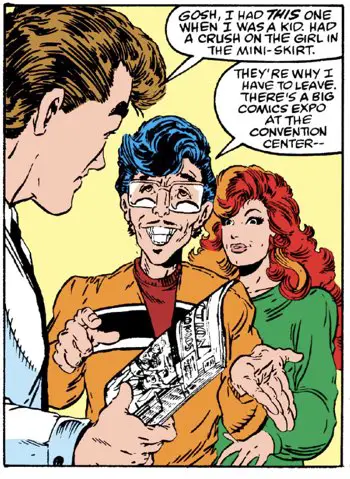
The International Superman Expo was held at the Cleveland Convention Center from June 16 – June 19, 1988 the weekend after this issue hit the Direct Market. Perfect timing!
It was part of the celebration of Superman’s 50th anniversary, all of which helps explain why it’s a Superman comic that Peter is nostalgic for. It also explains McFarlane’s Superman homage cover.
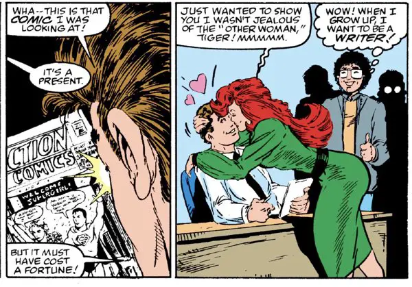
At Peter’s book signing, Mary Jane surprises him with a special gift — the very Superman comic Peter had remembered a little earlier in the issue. I’m not sure why the comic cover wasn’t colored in, but I’ll just assume it was on the advice of the Marvel legal team.
I’m also confused as to where she got the comic from. The comic show didn’t start until the next day, and she managed to find the comic while he gave his short speech before the book signing? I guess she bought it from the kid whose copy of “Webs” he autographed before the speech?
This would have made more sense if he was signing at the comics expo, but he wasn’t. This looks more like a college campus, particularly as he was being introduced by a journalism professor.
Maybe this is one of those things I shouldn’t be thinking about…
The book Peter is holding is “Action Comics” #285. (Somewhere, Mark Waid is saying “duh” under his breath.)
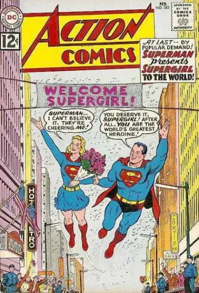
These days, you can pick up a copy for as little as $35 to $50, unslabbed but in OK condition. (Slabbed copies can top $500 in high grade.) Mary Jane could afford this comic 30 years ago on her model earnings, easily.
One last note: The man in the next panel with the thumbs up and the happy thought balloon is Jim Salicrup, editor of “The Amazing Spider-Man.”
These days, Salicrup heads up the Papercutz line of comics, reprinting some European comics that are kid-friendly, including “Asterix” and “The Smurfs.”
Felix Watch
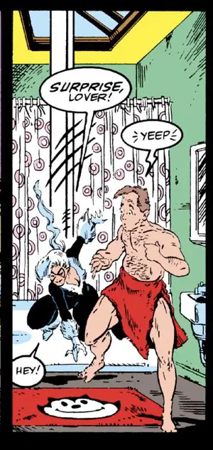
The man currently living in Peter Parker’s previous apartment has a Felix mat in his bathroom. Felix looks like an Animaniacs character from this angle.
Also, this guy probably bought the Felix mat because it matched the color of his towels. Orange is a strong choice for both particularly in a mint green bathroom like this one. Unfortunately, the digital comic version looks red. Trust me – the original newsprint comic had a decidedly more orange tone to it. Just fade/desaturate all the colors back 20% or so and you’d see.
Even scarier, here’s the next panel with a closeup:
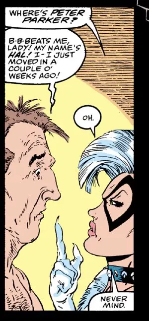
Is it just me, or does that guy look a lot like Todd McFarlane in 2021, as drawn by Todd McFarlane in 1988? It’s a little eerie to me.
Hidden Cover Spiders
Nope, none in this issue. Just wait for next month, when McFarlane starts hiding those spiders in earnest.
That’s So 80s

Even Aunt May has a Nagel poster in her living room. Did Peter give it to her when he moved into the Bedford Towers? It’s not exactly the same as the one we saw in issue #298, but it’s pretty close — dark around the eyes, black clothes, long hair. The collar is too different, though.
I’m not sure whether it makes me chuckle harder to think that they just pass the same poster back and forth between moves, or that the Parkers were a big Nagel family and everyone had one of them on their walls.
I wonder if Ben Reilly had a Nagel poster in his apartment?
Or had the Parker family moved on to Thomas Kinkade by then for home decorations?
BD Recommendation
If you liked this issue, I have a recommendation for you from the world of les bandes dessinées, or Franco-Belgian comics.

If you like to follow a lot of plots at the same time, let me recommend “Alter Ego” to you.
The framework for this series is pretty simple, but difficult to imagine writing: It’s six books with stories about six different characters. They’re all, in one way or another, connected. You can read the books in any order. They overlap in many places, but it all makes sense in the end.
The artist, Matthieu Reynes, is a favorite of mine. Check out his “Harmony” series, too, to see his art really flourish.
You can read my review of “Alter Ego” now, and then skip straight to Comixology/Amazon or Izneo to start your reading!
Next Issue!
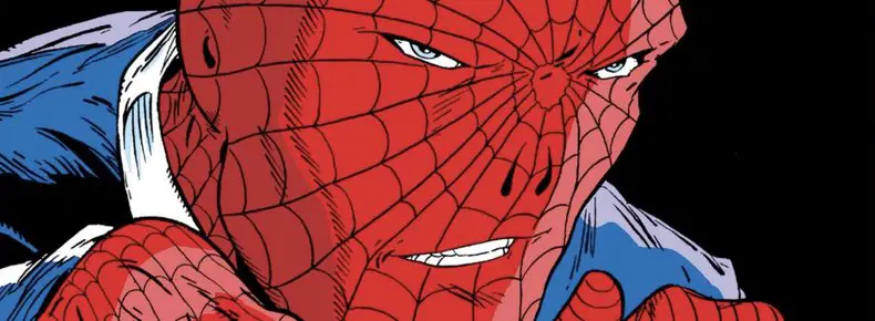
The Chameleon is in Chicago! Guess where Peter Parker’s book tour will be stopping next? Yup. Also, Caesar makes his move! And we have more caricatures, one of which isn’t actually that bad!

