
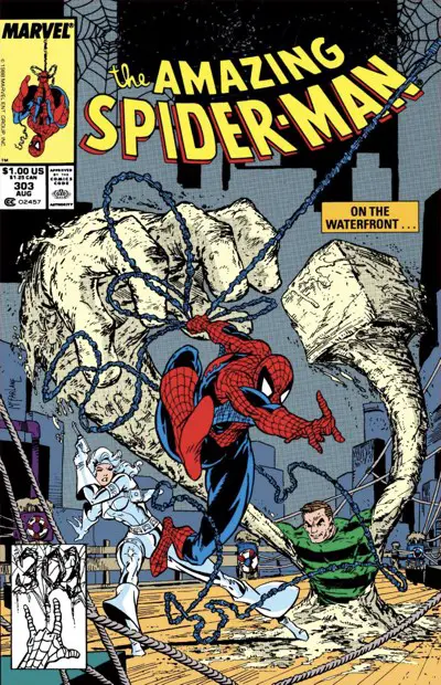
The Amazing Spider-Man #303: “Dock Savage”
Spider-Man joins up with Silver Sable and Sandman to take down a Nazi. It’s a nice payday. Meanwhile, Peter Parker and Mary Jane make a decision about their careers…
If You Close Your Eyes, You Will Nazi the Credits
Pencils: Todd McFarlane
Inks: Todd McFarlane
Colors: Bob Sharen
Letterer: Rick Parker
Publication Date: April 12, 1988
What’s Going On?
The storyline about Peter’s job offer in Kansas ends quickly. Mary Jane agrees to move to Kansas with him, and Peter Parker decides to go back to school instead. The potential fireworks for the situation are diffused immediately, as both feel side effects in their “day jobs” thinking about the situation rather than the job at hand.
I’m sure there will be no hard feelings on either side, and everyone will live happily ever after.
Until Mephisto makes them a deal a decade later…
You can see David Michelinie and Todd McFarlane starting to come together with this issue. It feels like Michelinie is starting to sense what a jolt of energy McFarlane’s art is for the book, and is writing towards that now. Michelinie gives McFarlane plenty of chances to show off.
Since I’ve picked a lot of nits so far in The McSpidey Chronicles and I’ve pointed out all the issues with McFarlane’s art, it’s only fair to show you some of the cool stuff that won McFarlane all his fans in the first place.
Check out this opening splash page:
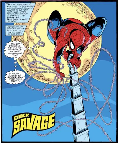
(Yes, it IS possible to take a photograph with the moon that huge. The trick is to use a very long lens. The only problem is finding a spot higher than the top of the Chrysler Building to plant your tripod. Thankfully, this is a comic book. It’s not constrained by that kind of thing.)
The first two pages are a blatant expositional recap of the last couple of issues, but they’re delivered in thought balloons by Spider-Man as he swings across the city and perches on top of the Chrysler building. Any excuse to let McFarlane draw Spider-Man in costume swinging around is a good one. It gives McFarlane a chance to stretch his legs and draw what he’s best at.
The perspective on the Chrysler building feels off on the second page, but it’s really just a two-page sequence to show us some of Spider-Man’s moves. Very few people probably looked closely enough to see if the perspective made sense. They were blinded by Spider-Man’s pose in the next panel, I’m sure.
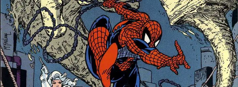
This panel, right here, is about as classic a McSpidey pose as you could ever ask for. It’s got everything in it, from the splayed bent legs to the straight arm to the web shooters heading past the reader. It also has the darker blue areas — we’re getting now to something closer to a red-and-black costume with blue lines for details of the muscles. That’s the look people remember from McFarlane.
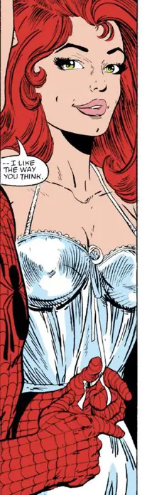
That sequence leads to a two-page conversation between Peter and Mary Jane in which MJ once againwears her finest nightwear. The two discuss their career troubles, reiterating what Spider-Man was just thinking about on the two pages previously, and ultimately put off any further discussion about it until tomorrow.
Yes, this is two pages about Spider-Man dropping into his new apartment, and then he and the wife getting frisky.
In what is a recurring situation with these two, the scene ends with Peter tugging at a string that doesn’t hold anything together on the form-revealing silky thing MJ is wearing.
Wink wink nudge nudge, fade to black before the Comics Code Authority objects!
Onto the Fight Scene!
The centerpiece of the issue, though, is of Spider-Man fighting the Nazis led by the guy who ran away a couple of issues ago. Silver Sable has hired him to help her out. He’s supposed to be the quiet recon man. She’s hired Sandman to be the muscle. (This was during a time when they were rehabilitating Sandman.)
Michelinie does a couple of interesting things with this battle. First, Spider-Man is only hired for the recon part. He volunteers to help out with the fighting part of it afterwards to help ensure nobody gets hurt and the Nazi is taken down. Second, Silver Sable is a force of nature all on her own. Spider-Man realizes she doesn’t really need his help directly. She’s more than capable of taking the Nazi down herself, so he handles some of the small army at the warehouse along the docks to clear the way for her.
There’s nothing more satisfying than Sable pushing her gun into the Nazi’s mouth.
McFarlane’s art shines in two places, in particular, during this fight:
First, there are a few panels with closeups on characters from the neck up. Those feel the most finished. McFarlane knows how to sling the inks in those moments, creating art that’s closest to his final form.
Second, his panel compositions work. Sandman uses his powers in interesting ways and McFarlane lays that out well. Spider-Man gets to bounce around in the best possible way, leading to more of those McFarlane contortions the kids all loved.
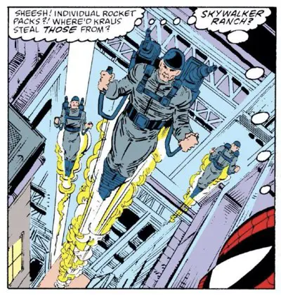
There’s a two page sequence, in particular, where Spider-Man goes up against some guys in jet packs that’s the best moment in the book. It’s another case of a squad of characters in matching single-color jumpsuits with cool accoutrements. Is their jet pack supplier the same as Carlton Drake used in issue #299?
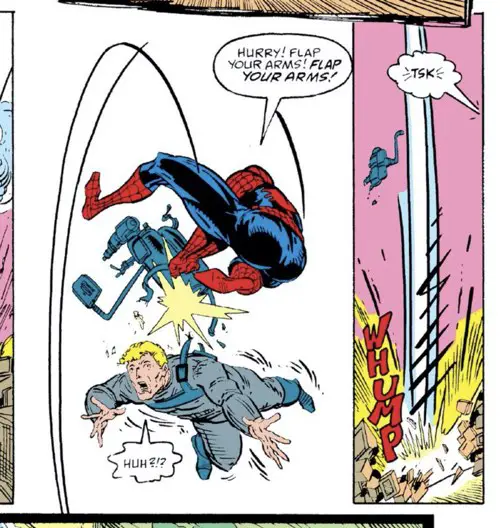
The second page begins with a wide-angle shot of Spider-Man webbing up and swinging two flyers together (see below), and then popping the pack off a third (see above) with a cute quip. It’s the funniest line I’ve read in a Michelinie script.
I’m appropriating “Flap your arms! Flap your arms!” for any time I need some useless quip suggestion in the face of impending doom. It’ll be the new “Stupid, stupid rat creatures” in no time flat.
(I’m kidding about that last part, but I think I will adopt this for my bag of quick response tricks. In the meantime, read about how Jeff Smith spotted blacks in “Bone.”)
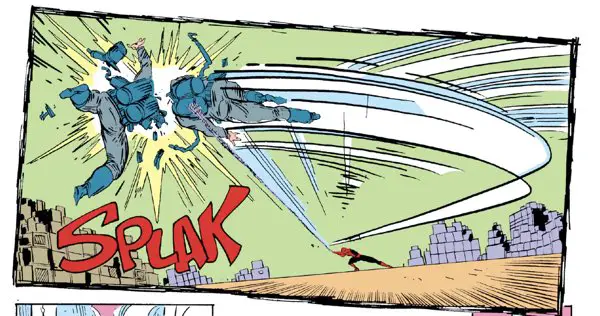
That first panel of Spider-Man swinging a flier around is a bit of the dynamic art style that McFarlane brought to the table. It’s a low-angle shot with a strong composition. Tilting it a bit off-axis helps add to the feeling of frantic motion, too, but it’s the motion lines that show the reader what’s happening the best. It’s a great panel.
If McFarlane had pushed Spider-Man off to the right a little more, he might have even been able to claim the golden ratio for its composition. That always makes you look smart, even when it’s coincidental.
I think a lot of artists draw panels that approximate the golden ratio without realizing it. They’re not drawing the circles going around and around. They see a great image in their minds without realizing that it conforms to one of those artistic tricks that make things look great.
Fun With Lettering
Another of the funs of pre-Adobe Illustrator-driven lettering in comics is how easy it is to tell when a last-minute patch job had to be performed in the bullpen. The lettering styles never match up perfectly, and no matter how little you might think of Rick Parker’s lettering, the patch jobs were always worse.
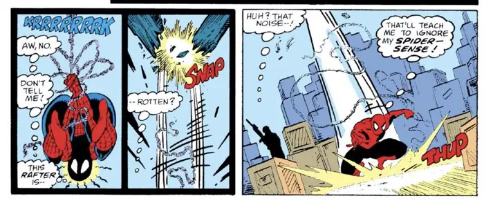
Check out that third panel in the tier of panels shown above.
Just before this sequence, we see Spider-Man in the rafters of this dock-side warehouse. Then, he hears a sound, realizes the rafter is rotten, and he falls to the ground as it cracks. Someone in editorial, upon seeing the art, had to raise the question, “Wouldn’t his Spider-Sense have warned him about this danger so he could have avoided it in the first place?!?”
That has to be why the final word balloon you see above is clearly in someone else’s style. I’m betting it was someone in the Bullpen, too, and not a letterer. The spacing between words is too great and the balloon feels too tight and has a different pattern to it than the others.
A veteran letterer did not put that one together.
I also think that means the Spider-Sense waves around his head in the first panel above were added by the Bullpen. My one bit of evidence on this is that McFarlane draws the lines emanating from Spider-Man’s head in the opposite direction to what we see in this panel. The beams get thinner as they move away from his head, not thicker.
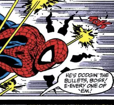
For comparison’s sake, check out this panel from issue #308:
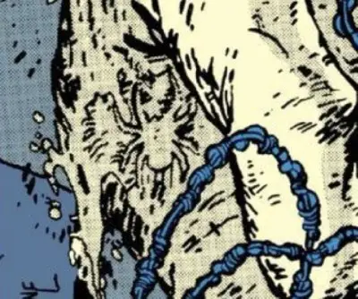
The Hidden Spider
This is the issue where Todd McFarlane began to hide spiders on the covers of his Spider-Man works. He wouldn’t start supplying the actual number of spiders on the cover for a few issues yet.
For this issue, McFarlane hid the spider in the busy sand texture of Sandman’s right hand, just above his signature.
Felix Watch
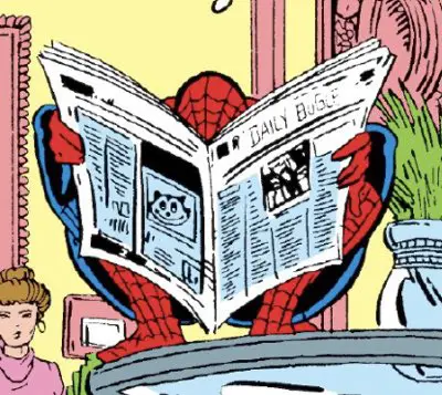
Felix is hidden in this issue, too. He’s on page 11 of the original comic, which works out to page 8 of the digital reader or Omnibus edition or other collected edition.
Again, you need to look carefully. He’s hidden on the back cover of the newspaper that Spider-Man is reading in the Symkarian Embassy.
Speaking of newspapers…
McFarlane Newspaper Watch
One of the great joys of drawing a comic in 1988/1989 is that newspapers were still a thing. Heck, Peter Parker even worked for one. It was inevitable that someone would be reading a newspaper in just about every issue of this run.
McFarlane liked to throw little in-jokes into those newspapers in the form of hand-drawn headlines. They’re clearly done in his own handwriting in a way that no comic company would allow their artist to do today. At the very least, they’d have the letterer drop in some cold mechanical font to suck the life out of the image.
McFarlane’s mock headlines and stories are often self-referential or call-outs to his fellow professionals.
This issue is no exception, and it helps place McFarlane’s career timeline on track, too.
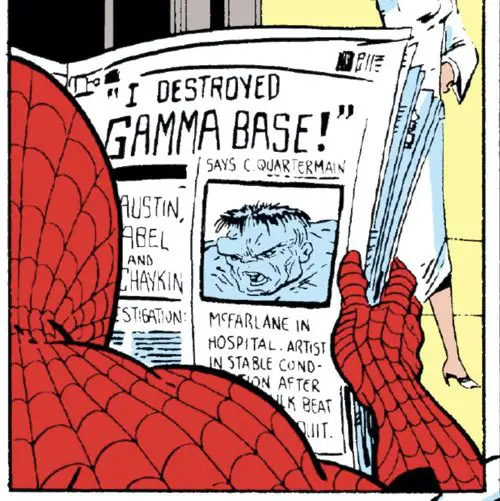
I’ve mentioned before that McFarlane drew two books a month at the beginning of this run. After 5 or 6 months, he had to give up “The Incredible Hulk” to focus on “The Amazing Spider-Man.” It looks like that happened around this time.
He references that a bit in this headline under a picture of the Hulk:
“McFarlane in Hospital. Artist In Stable Condition After… Hulk beat…. Quit.”
Sounds like the Hulk didn’t take too kindly to the news that McFarlane was jumping ship.
The main headline on top — “I Destroyed Gamma Base!” Says C. Quartermain — is a direct reference to the last storyline in the series that McFarlane worked on. Those were issues #345 (with as Akira-inspired explosion) and #346, which is the issue where Quartermain testifies about the events at Gamma Base. The latter was laid out by McFarlane and finished by Erik Larsen.
The newspaper also includes a call-out to three professionals on the left side there: “[Terry] Austin, [Jack] Abel, and [Howard] Chaykin.” The first two are inkers, and then there’s Chaykin. Sure, he inks his own work, but I wouldn’t call him an inker. Can anyone else think of what it is that ties these three, in particular, together?
I’ve heard Jim Salicrup say in a couple of places that when McFarlane came to “The Amazing Spider_Man”, he requested Terry Austin for inks. Austin was heavily in demand back in those days, so he wasn’t available.
Silhouettes: Try Something Once, Why Say It Again?
Why? Because it works so well.
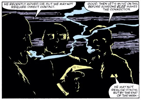
This panel is a teaser for the next issue, showing three men sitting in the dark in a smoke-filled room. They’re looking at Peter Parker’s Spider-Man pictures, putting two and two together, and planning on changing Peter’s life.
It’s not literally silhouettes, nor would the lighting in the room work 100%. But this is a comic and there’s no reason why McFarlane can’t be stylish and highlight what he wants to highlight, beyond just rim lighting.
The panel is meant to be ominous and to get you thinking in the most horrible ways possible. The most obvious is that these men have figured out Peter’s secret identity and that they’re going to actively do something with that information.
As you’ll see next issue, it’s not anything like that at all.
But this panel stood out to me because it reminded me of something else.
At one during his run on this series, McFarlane took over cover duties on “Marvel Tales,” the series that reprinted classic Spider-Man stories. Here’s one of them:
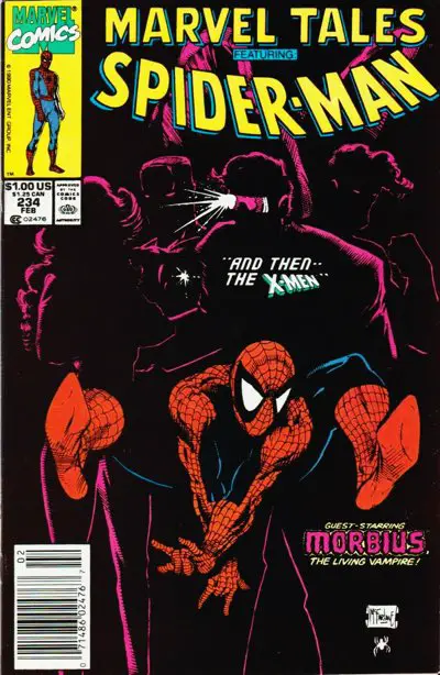
(The cover is reprinted in the Michelinie/McFarlane Omnibus book.)
The technique is a good one. I’m glad he got a second chance to use it.
Heritage auctioned off the original art for this cover in 2015. It went for just over $30,000, which seems like a steal today. The current owner is accepting offers, though. If you want to buy the art from him, Heritage will help broker that deal.
The twist? The owner is only entertaining offers of at least $200,000. A few offers have been made, but they’re low-balls, nowhere near $200,000.
Heritage offers a high-resolution version of the scan, but here’s a smaller one to give you an idea of what it looks like:
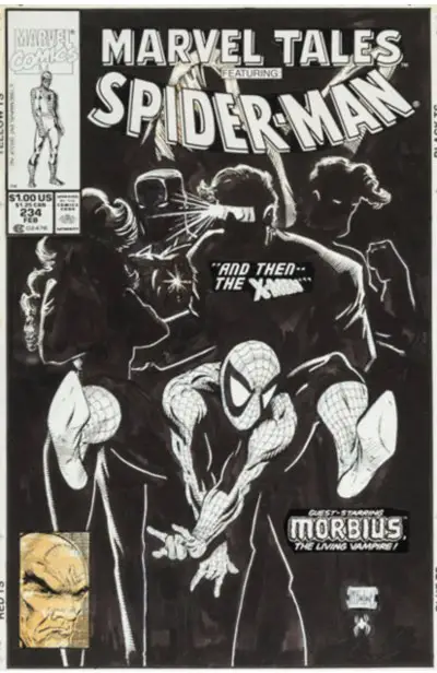
It includes a Professor X drawing in the UPC box. In its original release, this cover included a stock Spider-Man head in the corner box. From the looks of it, I’m guessing a photostat of that Spidey head was glued over top of the art for its photoshoot for printing, then later removed to show off the art again. That would explain the brown/yellow cast to that corner box.
Yes, someone in the Marvel offices glued something on top of original Todd McFarlane art and likely wasn’t immediately fired.
What a crazy world it was back then…
I can remember copying this drawing as a teenager. It was just so cool! Thankfully, all that art is long gone, so I can’t embarrass myself by showing it off here.
BD Recommendation
If you liked this issue, I have a recommendation for you from the world of les bandes dessinées, or Franco-Belgian comics.
This issue features Spider-Man, Silver Sable, and the Sandman hunting down a Nazi. Speaking of Nazis: World War II was a formative event in the life of France as a country. There’s plenty of books to go around that are set in that time or reference the Nazi invasion of France.

“Vice Squad” is a story set in the late 30s, following a young detective as he moves from Homicide to Vice. As the story moves along, the Nazi occupation of Paris begins and things get difficult at the police station.
It’s more a character piece than anything else, but the way it is intertwined with the history of the time is interesting. It’s written by Zidrou, and drawn by Jordi LaFebre, one of the best artists working in comics today. He’s a guy a lot of American artists think is brilliant.
Trust them. They’re right.
You can read my review of “Vice Squad” v1 here. The story concludes in a second volume.
In The Next Issue
Peter Parker goes on a tour across America! And Spider-Man keeps showing up behind him, coincidentally enough…
You know how someone dies everywhere that Jessica Fletcher goes? Peter Parker has the same problem, and always having Spider-Man following close behind feels like too much of a coincidence. What to do?
Also, with the book going bi-weekly, it’s time for a guest inker! And, shockingly enough, Marvel can’t count to seven correctly!
On page 11 Spider-man is the exact art used on the cover corner box, albeit with an extra bit of webbing drawn in.