
The Amazing Spider-Man #315: “A Matter of Life or Debt”
Venom is making his way back to Spider-Man. And one of Aunt May’s boarders is in trouble due to his gambling habits.
Hydro-Man, But Nobody Cares Credits
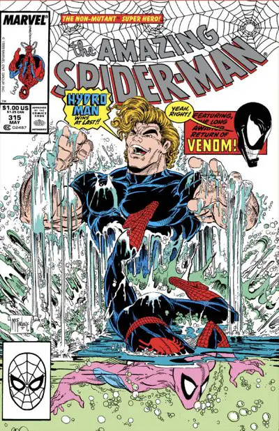
Artist: Todd McFarlane
Colors: Bob Sharen
Letterer: Rick Parker
Publication Date: January 10, 1989
Because You Demanded It — !
Poor Hydro-Man can’t catch a break. He’s a great visual for Todd McFarlane to draw, but ultimately nobody will care. This issue features the return of Venom, and that’s all this issue will be remembered for.
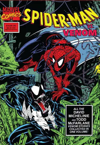
I didn’t start reading comics until a few months after this issue came out. However, I know this issue well. The first trade paperback I ever bought — off the shelves of a nearby Waldenbooks — was the trade paperback collecting all of Venom’s appearances in McFarlane’s run. This one:
It wasn’t easy to find back issues of “The Amazing Spider-Man” back then. They sold out quickly and didn’t make it to back issue bins. I was new to comics and didn’t realize that I wasn’t the only one who had immediately fallen in love with McFarlane’s style.
Being able to see these “older” issues was a great find for me, and I read and reread that book a bunch of times.
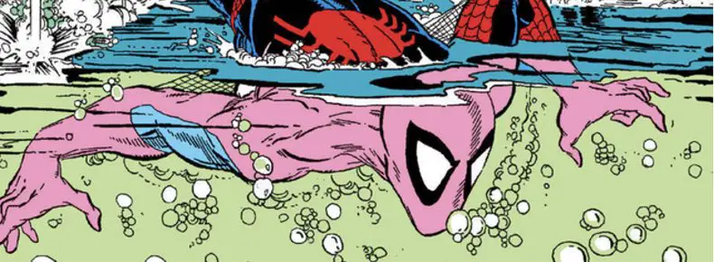
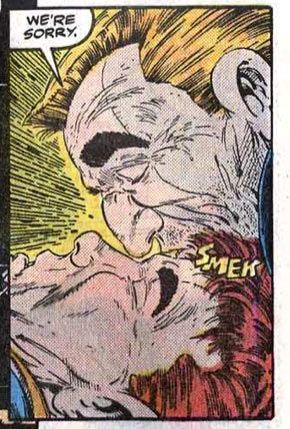
The issue opens with Venom breaking out of The Vault, the jailhouse for superpowered baddies in the Marvel Universe at this time. Venom has to kill one guard and scare the next one half to death to do it, but he does feel remorse in some small way. There’s some tiny semblance of humanity left in him.
Eventually, after becoming too popular, they’ll convert him into being a kind of good guy — a “lethal protector,” if you will — and give him his own series. And then, nearly 30 years later, there will be this whole crazy storyline with multiple symbiotes and evil aliens and whatnot, and it’ll be amazingly popular. They’ll graft a legacy from outer space onto him, fill his world with ridiculously heavy metal names, and people will Eat. It. Up.
To each their own.
For now, Venom is obsessed with hurting Spider-Man and woe be to anyone who gets in his way.
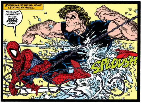
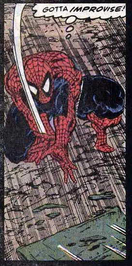
Spider-Man, meanwhile, is busy fighting Hydro-Man at a construction site for attempting to steal a payroll truck. As usual for David Michelinie’s writing at the time, Spider-Man is using physics and chemistry in his fight against a bad guy whose superpowers should be enough to overwhelm him. It’s a throwaway sequence, but one that gives McFarlane a chance to play to his strengths with a super-powered fight scene. Can’t complain about that. All of those thin black lines work well with a water-powered villain.
Back to civilian life, Peter Parker is working harder than ever to score good pictures to sell to the Daily Bugle. It’s slightly amusing to see Peter’s darkroom in his aunt’s basement. This comic doesn’t seem all that old, but those dark rooms are basically extinct at this point, save for those holdouts with their purity of film and all that. Film lovers are hoping for a vinyl-style return, but it ain’t happening. It’s kind of crazy that there’s a category at photosharing sites for pictures taken with expired rolls of film. I have to imagine they’re all expired by now…
Follow the Money and the Spider-Soap-Opera
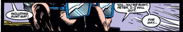
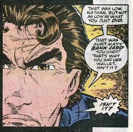
The main story of this issue is from one of Aunt May’s boarders, Nathan, whose gambling problem has put him in a deep hole with the mob. They’re ready to collect, and Peter wants to step in to help. He does, of course, as Spider-Man knocks out three bad guys in sequence for the second issue in a row.
Nathan is resourceful. Even from his wheelchair, he holds off the mob guys for a short time with a bag of flour, a can of Raid, and a steak knife. That buys enough time for Spider-Man to step in and clear things up. It’s never quite that simple, though, as Nathan relapses shortly thereafter, continuing Peter Parker’s losing streak.
This is part of the bigger soap opera that was happening across all the Spider-Man titles at the time — “Web of Spider-Man” and “Spectacular Spider-Man” being the other two. “Amazing” served as the flagship title with the splashiest villains and biggest storylines, but the supporting characters from the Daily Bugle and Aunt May’s house, amongst other places, would spread out across all the titles. We’ve seen references to many storylines that didn’t directly impact any “Amazing” storylines but were happening elsewhere.
When I started reading comics in 1989, I started with the Spider-Man family, so I was immediately hooked into that collective universe and was used to seeing things spread out. Looking back at just “Amazing” from this collected edition perspective, it’s interesting to see how many things aren’t fully fleshed out there. It’s up to David Michelenie to reference them and explain them just as far as they impacted this title. He does a good job with it, I think. I’m not missing huge chunks of the story like often happens with large-scale crossover events. But I know there’s more I could dig into from the other titles if I wanted to.
That said, dealing with Nathan’s gambling issue here feels a little weird. It feels like that should be more of a “Spectacular” story, but Nathan’s ongoing issues with his gambling issues were present in “Amazing” before this. (See issue #271, for example.) So I guess it was Michelinie’s story to tell.
The Problem with the Todd Father’s Art
Maybe I’ve been looking at too much of Todd McFarlane’s art throughout this project. Maybe I’m in a slightly cranky mood. And maybe all the stuff that’s been boiling under the surface in the last few months is about to explode here.
The book ends with a tease of Venom coming to town that leads me to a eureka moment with McFarlane’s art. Finally, the part of it that bothers me became crystal clear in this panel:
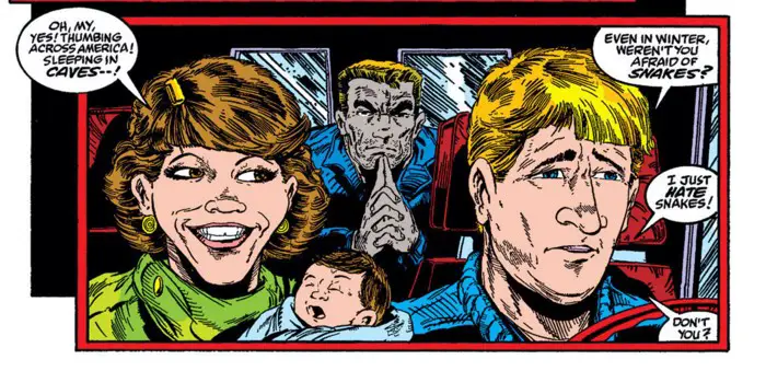
At first, it’s a pretty simple scene: A younger couple has picked up a hitchhiker and is driving him across the country in what appears to be a conversion van or an ice cream truck. It’s tough to tell from the previous panel.
Clearly, this couple is based on two real people. I don’t know who they are or if Todd McFarlane has ever said it, but they do have the distinct look of being a caricature of very specific people.
Second, the baby is microcephalic. Even newborn babies have bigger heads than this.
Third, the baby is not in a baby seat. He’s in his mother’s arms. In the front seat. I’m not sure where the state of the law was in 1989 regarding this. Was it still OK then? I didn’t think so…
Fourth, that car has a narrow front seat. It appears the husband and wife are fused at the shoulder. They’re so close together that his shoulder is, at best, slightly overlapping hers.
Fifth, I don’t care how friendly you are, but if you have a newborn baby in your arms in the front seat of a tiny vehicle of some sort on a snow-encrusted roadway, don’t pick up hitchhikers! It’s a series of bad decisions for this family, from the moment they bought their car to the day they brought their baby home from the hospital — no doubt in mom’s arms in the front seat, without a seat belt.
Oh, yeah, nobody on this page is wearing a seat belt, either.
Looking at this panel too closely finally made clear to me what the biggest problem of Todd McFarlane’s art is. His style is too cramped. It can feel claustrophobic at times. Look closely at any panel and you’ll see that it’s arranged to carry the bare minimum amount of data. The “camera” is zoomed in to show the people that are talking and their physical relationship with each other. There’s not much wiggle room around them. The panel often cuts them off in random ways.
I think that’s part of the reason the pages with splashy images of Spider-Man swinging across the city stick out so much. Those are the times when McFarlane loosens up. He draws full backgrounds and full characters, with plenty of negative space around them. Otherwise, most of the action happens right in your face, with characters close up to the reader in the front plane.
Take a look at some sample panels from just this issue:
You could run a funny caption next to 90% of the panels in this story. Flipping back to previous issues, it’s just as bad.
McFarlane’s storytelling has never been exactly straightforward or textbook. He broke into the industry with wild graphic design-inspired layout. He toned those down at Marvel and began to rely on his artistic style to shine. By the time he got this deep into his “Amazing Spider-Man” run, the strength of his art was often dictated by the script for the issue combined with the release schedule. The summer bi-weekly run messed with his potential and, as we’ll see soon enough, would lead to fill-in artists, not just fill-in inkers. The pages with superheroes, though, sang.
But there’s a recurring and never-ending issue in this run with the way he laid out his pages. He didn’t give his characters enough room to move or settle in. They were too often cut off or pushed too close to the reader. Even the establishing “wide” angle shots are too close. It’s uncomfortable to watch.
My biggest fear now is that I’ll spend the rest of my time re-reading these comics being annoyed at every close-up in every panel. Did I just ruin this for myself? We’ll see soon enough.
Felix Watch
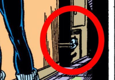
It might just be the sneakiest Felix yet. I almost didn’t find him.
But if you look carefully on page 9 of your digital reader or Omnibus edition, you’ll see him in the background. (It’s page 13 in the old newsprint version of the issue.)
I admit that I don’t quite understand what he’s doing there. He appears to be painted on the lower front panel of a washing machine. It almost looks like he’s an actual cat peeking out from around a corner of the machine, but when you look carefully you’ll see that’s not the right perspective.
But what’s that black rectangle that’s half painted around him? It almost looks like a doggy door. Or, from a 2022 perspective, it looks a little like the outline of an iPad. Neither of those make sense, though.
Hidden Spider Watch
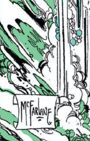
There’s one nicely hidden in the cacophony of lines that is the splashes around Hydo-Man. Look just above McFarlane’s scroll signature to see the familiar outline of a spider shape.
One other randomly interesting thing about this cover: I don’t own a copy of the original comic, so I can’t look at it to see. But the logo looks like it was done in a special silver ink, like the extra color they’d use for special/gimmick covers not too long after this.
If you own this issue, please leave a comment below. Is it the fifth color ink? Or does the regular silver coloring just pop well enough off the cover, given the other colors around it?
Statement of Ownership Has Fun Numbers
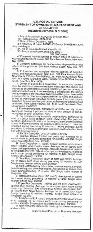
The letters column for this issue included that year’s “Statement of Ownership.” If you’ve never seen one of these before, here’s the short explanation: To get the good postal rates for their subscriptions, publishers had to annually publish this form declaring how many issues they sell every month, how many returns they get, how many subscribers they have, and some other numbers.
This is the October 1, 1988 filing. It shows that “The Amazing Spider-Man” was published 15 times a year: monthly, except bi-weekly in June, July, and August. Subscriptions cost $12 annually — which means those lucky kids got three issues for free.
Now, for the fun stuff:
Average number of issues printed over the last 12 months: 412,890. The most recent issue saw closer to 452,000 copies printed. The McFarlane train was building up steam, I’d say.
I know that sounds like an absolutely insane number of copies to anyone these days, but keep in mind they still had subscriptions and — most importantly — newsstands to deliver to.
Here’s the number that will truly boggle your mind: Returns from the newsstands averaged 179,800 comics every month. The returns, alone, would probably be the #1 best-selling comic of the month in 2022.
The bottom line is, they had to print 452,000 comics to sell a total of 271,230. What a system!
Next Issue!
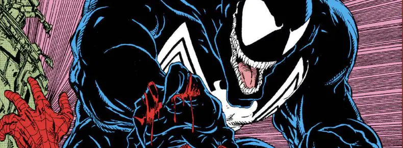
All Venom, All the Time! Things get bloody and beaten and serious.
That couple in the car – the man looks a lot like his brother-in-law Kim Kolomyjec.
Thanks — I’ve never seen him, but it does make sense for someone Todd would draw in there.
Regarding the title logo, on the original comics it’s not really silver, more a dark grey colour. If you look closely, this is mainly due to the way the black and white dots have been printed, versus the omnibus edition. Here are some pics comparing the two, but the omnibus printing looks to be smaller/finer black and white dots hence the colour appears more silver than grey. Either way, definitely not special ink on the original and the title barely pops.
https://i.imgur.com/jZ4pkaG.jpg
https://i.imgur.com/XULguwh.jpg
Ah, I see it. Thanks, that makes sense. The glories of modern publishing where you don’t get the moire pattern as much and can tighten things up, but then it looks different and — that all makes sense. Thanks for bringing the JPGs!