
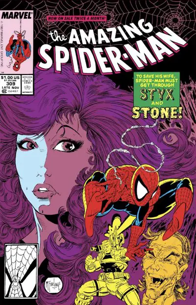
The Amazing Spider-Man #309: “Styx and Stone”
Mary Jane Watson-Parker fights back against Jonathan Caesar, as Spider-Man continues to hit dead ends in his frantic search. Then Caesar gets paranoid and sends two superpowered goons after Spider-Man.
Credits Sail Away
Artist: Todd McFarlane
Colors: Bob Sharen
Letterer: Rick Parker
Publication Date: July 26, 1988
A Boxing Good Start
The issue starts with Spider-Man flailing away at another opponent who doesn’t know anything about Mary Jane’s disappearance. This time, it’s Manslaughter Marsdale, who is another character from the somewhat recent past of “The Amazing Spider-Man.” He debuted in issue #271, and hadn’t been seen since.
By the way, if your friend’s nickname is a federal offense, please consider finding another friend.
Marsdale is a gym owner with a violent streak towards keeping boxers at his gym. This is, of course, completely unnecessary and over the top. Have you ever tried to quit a gym membership? That phone tree is enough to keep the person committed…
In issue #271, Spider-Man intervened to protect one such boxer. But while he did so, Aunt May’s friend, Nathan Lubenski, was beaten up over his gambling debts in a nearby alley. That’s why he’s in his wheelchair during the McFarlane years.
(Nathan’s gambling habit will reappear in this title later in McFarlane’s run.)
In any case, Spider-Man is taking out his frustrations on Marsdale at the start of this issue, but Marsdale has nothing to offer him, so Spider-Man turns tail and walks off. The gym rats for a moment feel liberated from Marsdale’s clutches up until the moment he breaks loose of the webbing by tearing the wall down behind him and they get back in line. It’s a cute moment.
It’s also a strong action beat to start the issue with, and another chance for McFarlane to draw a different character from the usual supporting cast. It’s a well-drawn sequence, minus the one Spider-Man figure as he walks away where something weird is happening with his legs. Eh, nothing’s perfect in life.
The Gargoyle of Near Doom!
That is followed by this issue’s three-page sequence of Spider-Man giving us all the exposition we need for the story while he swings across the city. These are usually the best-drawn and best-remembered images of McFarlane’s run.
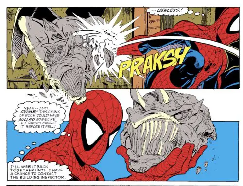
This time, though, he’s spending his time brooding with some gargoyles high up on a skyscraper. So upset is Spider-Man that he punches a gargoyle and knocks its head off. Quickly, he catches it and admonishes himself for an act that could have resulted in injured people at ground level, should the loose stone pieces have fallen.
What cracks me up is the second word balloon in the panel that was clearly added after the fact. It’s a completely different letterer’s work, likely someone in the bullpen who was available when an editor realized at the last minute that they needed to make Spider-Man look less destructive.
“I’ll web it back together until I have a chance to contact the building inspector.”
OK, Spider-Man, that’s going above and beyond the call of duty here. First, you help a guy who can’t quit his gym membership, and now you’re looking forward to dealing with New York City’s mountains of red tape — all while wearing a costume?!?
This guy’s a saint. Thank goodness the editorial folks caught that one!
I expect there to be a spin-off mini-series where Spider-Man roams the aisles of the local grocery store to grab items off the top shelf for the little old ladies who can’t reach.
Mary Jane Turns Into Jack Bauer
Mary Jane channels her inner Jack Bauer in this issue, but it doesn’t start off too effectively. Sure, she manages to surprise Jonathan Caesar by throwing a wine cooler’s worth of ice in his face, but her attempt to run out the door are stopped when she bounces off the two burly security guys that fill the space.
Caesar lets her know that while he won’t let her go, he doesn’t rule out harming her.
Hearing that Spider-Man is looking for Mary Jane, though, Caesar calls in his backup plan — Styx and Stone! This is an original David Michelinie/Todd McFarlane creation, right up there with the jackrabbit-powered guy and Venom. Styx can kill anything he touches with his lengthy, yet emaciated fingers. He gets a thrill from it. Stone is the brute with big high-tech guns on his shoulders. (Years later, he physically turns into a rock-like creature, but that’s long after this.)
They’re a great visual together. Styx is thin and lanky, wearing a tattered tuxedo. Stone is a gigantic man with cool guns straight to his back and ready to fire over this shoulders, too. They even have their own floating platform to carry them into battle, sort of similar to what you might see one of the ‘Goblins riding in the Spider-Man corner of the Marvel Universe.
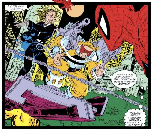
It’s a good combination of characters for McFarlane to develop. Styx has a ghastly horror vibe to him while Stone has that bulky body complete with the toyetic shoulder-mounted weaponry.
But, wait! We have to recap what Mary Jane’s been doing this whole time before we get back to Central Park and the Big Fight of the issue.
Mary Jane: Thinks Like a Spider-Man Can
In some ways, the whole issue feels a bit like a high-budget Lifetime movie of the week. You have your woman in danger and your ridiculous villain. You have some dangerous threats and some initial attempts at escape that don’t work out.
I mentioned the ice bucket before because it comes back in Mary Jane’s second escape attempt. She sees Caesar standing in that water and breaks a plugged-in lamp into the water so that the electricity is conducted through it and may electrocute — or at least shock — Caesar.
It doesn’t work. He has rubber-soled shoes.
So she whacks him across the face with the lamp. That knocks him right out. (Hey, it’s a comic book, we’ll buy that.)
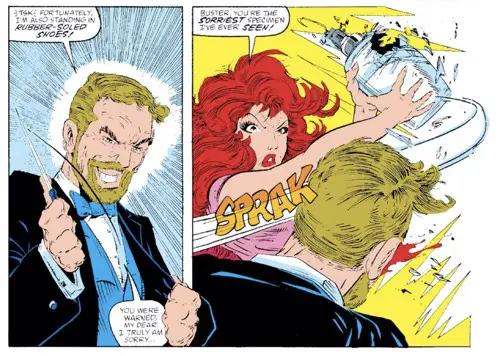
The two security guards rush in and stand in the water. Mary Jane tries the plugged-in-lamp-in-standing-water trick again, and it works! Their soles are not rubber! What luck!
And, because this is a kid-friendly comic, Mary Jane immediately thinks to herself, “Guards still breathing.”
Whew, thank goodness she’s not a murderer of any thugs who may have kidnapped her, locked her up, threatened to mutilate her and/or make her their sex slave, etc. etc.
She steals one of their guns and runs out the door.
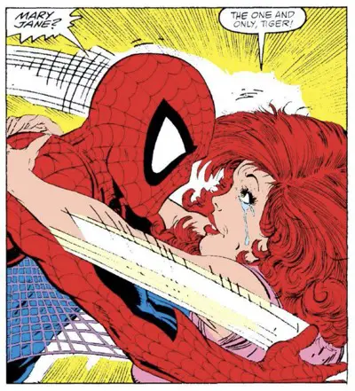
Back to The Battle of Central Park
Spider-Man is in a bad spot. He’s been flash-blinded and now glued to the ground. Styx reaches out his bony hand to Spider-Man’s face and —
Mary Jane fires multiple gunshots at him. They all miss.
Spider-Man uses the distraction to, er, web up Stone’s face — you know, the one who wasn’t about to kill him.
The two villains run off. Recognizing the absurdity of their situation, Stone helpfully points out, “She isn’t hitting anything!” Styx, being the pragmatist, points out, “Yes, but why give her time to practice?”
Self-preservation is a big skill for a long life as a superpowered villain, folks.
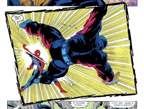
McFarlane gets to show off in the pages during the fight. It’s relatively short-lived, but there are a lot of cool panels in here. Spider-Man is getting the worst of it, no small part due to the fact that he can’t do a lot of web slinging in Central Park. He’s grounded while Styx and Stone have the aerial advantage with some longer-range weapons on Stone’s shoulders.
Part of the draw of McFarlane is not just the individual “cool Spider-Man” drawings, but also some of his interesting and dynamic compositions. We’re long past his crazy (but super interesting) “Infinity Inc.” graphic designs to the page, but he can still lay things out inside a single panel in an interesting way.
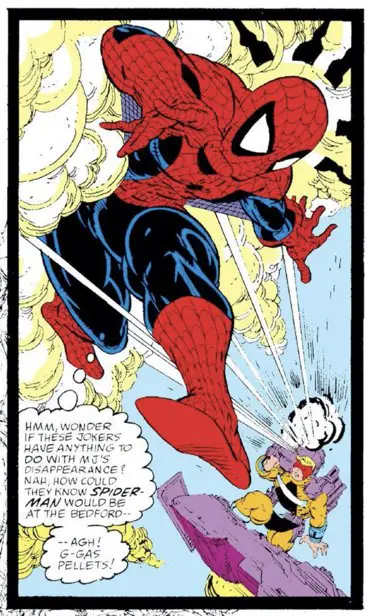
Here’s a great example that adds depth to the panel while filling it with easy to read items of interest, from the smoke to the villain to Spider-Man’s awkward attempt to get out of his own way. (All the while, he thinks the right thing and totally dismisses it at the same time. Oh, poor Spider-Man!)
All’s Well That End’s Well
Don’t you love a happy ending?
Hold those happy thoughts for a second, though. We need to talk about the bad part of this issue:
The Worst Digital Transfer Yet
The transfer to this Omnibus and the digital edition from the original newsprint edition is the worst of all the issues to date. Someone forgot to ramp up the contrast on the black, maybe, resulting in lots of thin lines looking too thin or disappearing outright.
The ongoing march to digitize all the comics in the past decade has resulted in plenty of calamities. These digitizations are not restorations. They’re not hoping to fix anything or to mimic the original look and feel of the printed comics. They are files that get shoved through the grinder to auto-copy the color as much as possible.
Better techniques have been developed over the years that make it better, but some of them rely on a bit too much manual intervention for it to be profitable for the publisher. Plus, the differences between paper and digital are often so great that there will always be nits to pick. You can’t help it.
Understanding that, it’s still frustrating to see books like this get so carelessly taken care of to the point of distraction.
I have no doubt that the original art looks more detailed than what showed up on the printed page 30 years ago, but the version in the Omnibus and digital edition goes too far. The lines hold no weight. Areas where smaller black lines would clump together and create slightly thicker and darker areas are gone, replaced with itty bitty lines that a perfect reproduction would give the art.
Here’s a good example of the differences in question. Here you can see the art from the Omnibus on the left, the original comic in the middle, and a scan of the original art on the right. The Omnibus looks too light, the newsprint version looks muddied, and the original art looks crisp and clean, from an original art owner who clearly took some care to present the art in its best light.
Check out floor patterns and watch how the lines just disappear randomly.
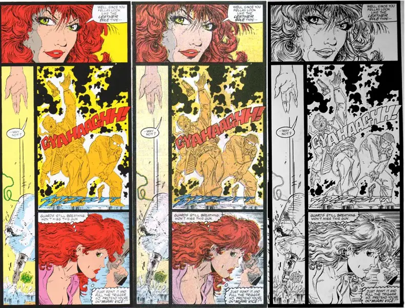
Here’s another example. Take a look at what happens to the lamp Mary Jane drops in that tall left panel. The loss of detail in the Omnibus is dramatic. You can’t even tell what it is. Look also in that panel at how washed out her hand looks. The black ink lines are fading away.
See the full original art here, where Mary Jane’s hair in the upper right looks drastically different in stark black and white.
This book was drawn for newsprint. I have to think McFarlane knew to draw in a certain style to get specific results once the book hit print. It’s clear that this Omnibus reprint is not a time-consuming recreation of the files and an extensive archival project. It’s an attempt to get the material out in a timely and budget-conscious manner. An Artist’s Edition, it is not.
Some of the color corrections feel overzealous, too. Some small minor pieces are colored wrong, like wisps of Mary Jane’s hair in front of her face not being colored at all, or little chunks of debris being colored in the same shade as the backgrounds. A few of the solid colors used to fill in the sky turn garish.
In general, the colors are far too bright and saturated. If you want to recolor the book to make it look brighter or, heaven forbid, more modern, then you should go ahead and get a colorist to recolor the whole thing in their style. Let them loose. It’ll make more sense.
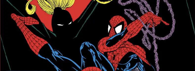
Check out the cover for a great example of how the new colors can practically blind you:
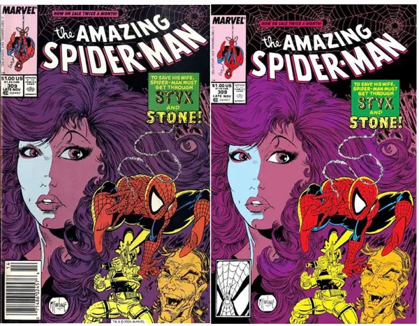
Mary Jane’s hair went from background-faded to neon purple, like she’s about to star in some movie about pop stars from outer space. On both covers, Spider-Man’s red costume pops, but the new digital restoration version of it competes with the bright purple behind it. Spider-Man has to have neon red in his costume to stand out. Even then, Stone’s new yellow highlighter color is the brightest thing on the cover and distracts from that.
This style of grabbing the colors, reducing the dulling effect of newsprint, and then amping them up to 11 isn’t what’s best for the book. The colors should not compete with the line work, which is what winds up happening here.
It’s a shame that the reprint didn’t fare better in this case, because it’s one of McFarlane’s more consistently strong issues, in everything from his superhero skills to his quieter personal moments. Thankfully, his art continued to grow and we’re far from the best of it yet.
Felix Watch
McFarlane continues to up his game in hiding Felix in these comics. This one is another beauty.
Hint: He’s in this panel:
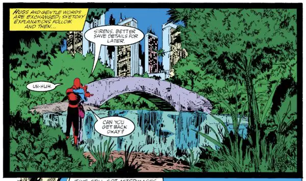
Let me zoom in on the lower right corner and help you a little bit:
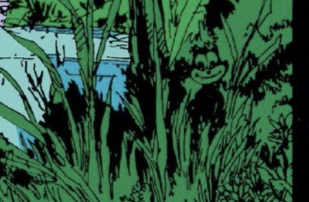
Felix is hiding in the tall grass of Central Park.
It’s harder to find him in the newer digital/Omnibus printings, because he’s completely colored green. In the original newsprint comic, his face was colored white:
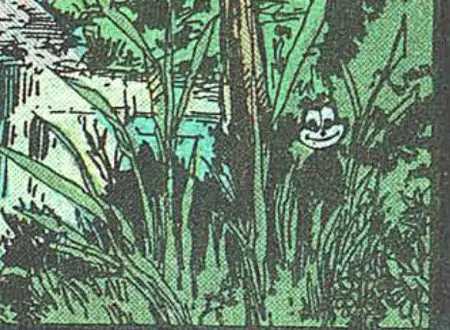
In retrospect, proper coloring feels like a cheat, but I still prefer it.
Hidden Cover Spiders
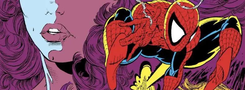
You see this cover and you immediately look in Mary Jane’s hair.
This spider hunt is turning into the comic book equivalent of looking for “NINA” in an Al Hirschfeld drawing.
The spider is not in Mary Jane’s hair, though. It’s in the back of Styx’s. Tricky devil, that McFarlane…
One last note on the cover: I like Spider-Man’s extreme closeup in the UPC box. He’s arching his left eyebrow, which you can just see through the little crease in the mask. Subtle, but nice.
BD Recommendation
If you liked this issue, I have a recommendation for you from the world of les bandes dessinées, or Franco-Belgian comics.

“Jerome K. Jerome Bloche” v1 has a title of “Aina.” That’s the name of the kidnapped girl in the story who’s being held by a local priest until something proper can be done about her situation. Jerome is the young detective who gets called into the case to help figure out what’s going on and how to get her to safety.
Alan Dodier both writes and draws this book, and it is stunning. He’s a skilled artist who can draw anything and make it look interesting, but he’s also able to tell a story with ruthlessly efficient skill. His comic reads like a storyboard. Everything is laid out super clearly. It’s an impressive read.
There are two more books in this series from Dodier available now, which I never followed through on. Excuse me while I go pick those up for my upcoming reading material…
Read my review of the book here.
Next issue!
Shrike! Who? It’s a guy in a black and gray costume with a long flowing cape. Not Batman. But a cool design, anyway.
One Comment