
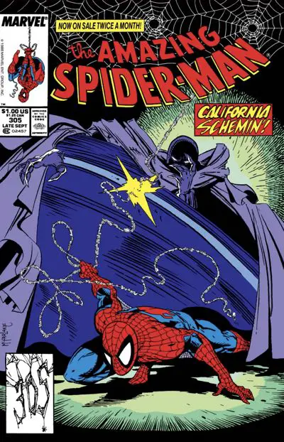
The Amazing Spider-Man #305: “Westward Woe!”
The Black Fox has stolen a chalice that Spider-Man wants to get back, but The Prowler has a good reason to want it, too. Just how many people can Spider-Man let get away with it?
Caped Credits
Pencils: Todd McFarlane
Inks: The Magnificent 7+
Colors: Bob Sharen
Letterer: Rick Parker
Publication Date: May 24, 1988
Slinging the Inks and the Inkers
This review’s sub-title: “The Inkers of McFarlane”
“Amazing Spider-Man” #305 is inked by “The Magnificent Seven,” a team of inkers that Jim Salicrup outlines in the letters column of the issue.
Jim Sanders, who inked McFarlane during his “The Incredible Hulk” run, was originally scheduled to ink this issue. The scheduling didn’t work out. Sanders inked the first page and some random bits across the issue, but the rest of the pages were farmed out to all available hands.
The list of “Magnificent 7+” inkers is Mark McKenna, Ken Lopez, Rodney Ramos, Joe Rubinstein, Pat Redding, Chris Ivy, and Hector Collazo.
The nice part about this Inker Jam Issue is that it gives us a chance to look at a number of different inking approaches on McFarlane’s pencils. The unfortunate part of it is that it’s another stutter-step in getting McFarlane to the point with his own inks where it looks like what we think of today as his style. He’s on and off again. It’s frustrating.
I mean, it all worked out fine in the end, but the it’s a struggle to get there… Thankfully, things get a bit more consistent after this issue.
Jim Salicrup offers a breakdown of which pages where inked by whom in the letters column. Unfortunately for us today, those page numbers include the advertisements in the issue. Since today’s collected editions don’t have the ad pages and none of them bother reprinting the letters column, I’ve gone ahead here and translated the print comics page numbers to the story page numbers. This will be a big help in dissecting who inked what when you’re reading this as a digital comic or in the Omnibus collection.
Inkers on Todd McFarlane’s “The Amazing Spider-Man” #305 [Table]
| Inker | Story Pages |
|---|---|
| Jim Sanders | 1 (and “a few assorted heads and figures throughout the issue”) |
| Mark McKenna | 2, 3, 9, 17, 20, 22 |
| Ken Lopez | 4 |
| Rodney Ramos | 5, 7, 8 |
| Joe Rubinstein | 6, 10, 13, 14 |
| Pat Redding | 11, 12, 15, 18, 21 |
| Chris Ivy | 16 |
| Hector Collazo | 19 |
Reviewing the Inkers
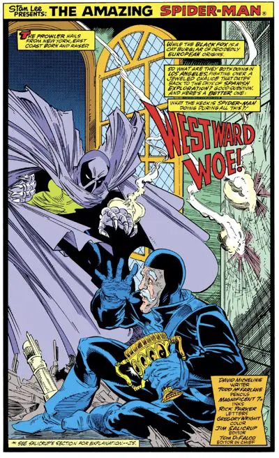
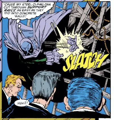
Jim Sanders‘ inks fit McFarlane’s style well. It’s too bad he couldn’t ink the whole thing. His first-page ink job is the most faithful to McFarlane’s style.
That could be because McFarlane spent more time on the page and provided more detail for the inker, or it might be their previous work history together. We may never know. But it’s a good look. Before I read Salicrup’s explanation, I had assumed McFarlane inked that opening splash, too.
The nit-picky technical side of me that nobody likes keeps looking back at that open door behind them, though. I’m not sure the perspective is right on it. From the way the window panes are lined up, there’s something… off.
Also, the wall or the stack of boxes or whatever they are just behind the Black Fox appear to be pointing to a completely different vanishing point than the door. I think that might ultimately be what’s confusing me.
Wait, let’s draw this out:
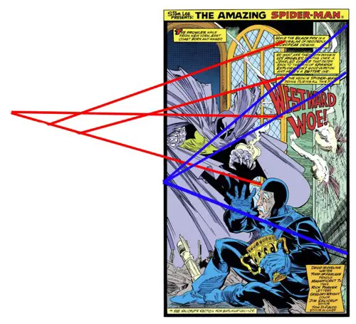
Yeah, that’s what I was afraid of. The door, itself, is a criss-cross mess of vanishing points when there should only be one. The wall behind the Black Fox is pointing to a third vanishing point on a third horizon line, but is at least internally consistent.
I’ve only taken Aaron Blaise’s perspective course, but I’m pretty sure that’s not how this works.
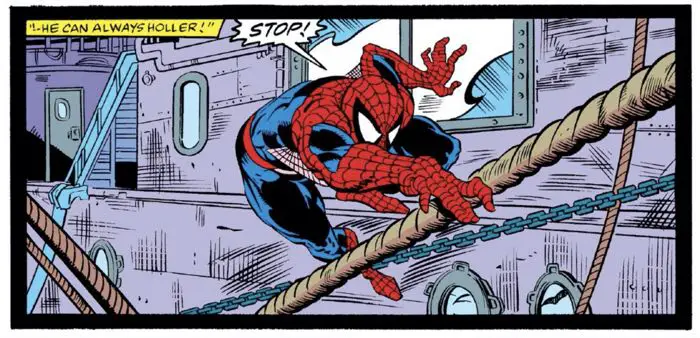
Mark McKenna handles McFarlane’s line particularly well. His inks look very faithful to McFarlane’s style.
McKenna handles all the niggling, almost nonsensical details and the speed lines, not trying to add extra thickness to the line to beef it up. He plays to McFarlane’s strengths.
In this panel, look at those lines on the ship behind Spider-Man. McKenna adds some interest to the lines on the ship by adding streaks of whiteout across them.
The rope in the lower left corner looks a little flat and the chains (a McFarlane specialty) look a little two dimensional, but nobody will see that because they’re all looking at the cool Spider-Man pose.
A couple other pages McKenna had featured Black Fox without his costume on, and those look great. McFarlane draws a very buff old man there, but the facial construction is classic McFarlane.
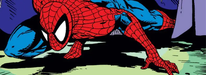
One thing I noticed a lot of the inkers had an issue with in this issue is Spider-Man’s costume’s webbing. There are many flat looking heads that I think are caused by the webbing pattern not wrapping around Spider-Man’s head in three dimensions. It’s just a flat series of lines radiating out from between his eyes. Sometimes, the webbing lines don’t even connect.
I said it in a previous review, but McFarlane’s Spider-Man always looks best from a more three-quarters angle. Heck, even a profile shot from issue #305 looks a lot like his latter, better era Spider-Man. Any angle where Spider-Man directly faces front can be tricky.
The profile panel above is inked by Joe Rubinstein, who we’re going to talk about next:
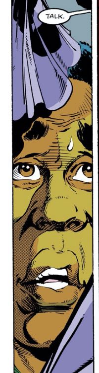
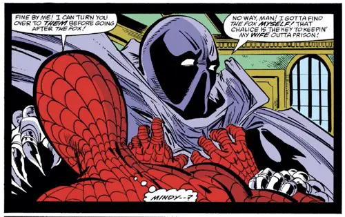
Joe Rubinstein has the inking style that stuck out the most for me. Having seen Rubinstein’s inks in issue #304, it is instantly recognizable and enjoyable. He adds the most of his own style over the other inkers, using chunkier ink lines and the bits of toning. It sticks out the most when Spider-Man unmasks the Prowler (above on the left) and we see Hobie Brown’s face. It’s not pure McFarlane, but I like the final result. It has extra dimensionality to it while retaining McFarlane’s construction.
Honestly, the more I look at Rubinstein’s inks over McFarlane’s pencils, the more I like them. It isn’t a natural pairing, but it produces some great work that combines both of their strengths.
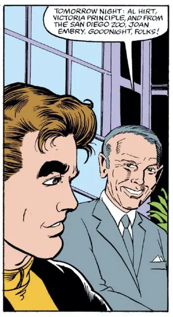
Pat Redding’s inks might be the most mismatched, but it’s not fair to judge when Redding pulled the short straw and had to ink the Johnny Carson likeness. It’s horrible. Like in issue #299 with the Paul Schaffer likeness, I don’t know if someone else did that likeness, but it doesn’t look like McFarlane’s style at all. Carson looks more like H. Ross Perot here.
Michelinie never flinches from inserting pop culture references in this series. As the flagship Spider-Man title at the time (with two supporting series running in “Spectacular” and “Web of”), Michelinie kept the series set in the most modern times. This issue not only features Johnny Carson, but even has a Church Lady line in it. As with most “Saturday Night Live” references, it’s a forced catchphrase in search of a point, but it kept the book au courant, I suppose. I wonder if “kids” reading this today would miss a lot of the references. Heck, I missed the “L.A. Law” one originally in issue #298…
The rest of Redding’s inks look fairly consistent with McFarlane’s choices. You can see a lot of the noodling in there, particulalry with textures in the background. But it also looks like he did everything with a single line width and a ball point pen on his page with all the superhero action in it. There’s a lack of thin-to-thick ink lines on his pages that flatten them out.
The exception to that is the panels with hair. Redding really got what McFarlane was going for with Peter Parker’s hair. I keep thinking back to how much Bob McLeod changed the hair in McFarlane’s first couple of issues. By now, either McFarlane’s style was known well enough by his inkers or his drawings got more detailed to show what he was going for.
Rodney Ramos’ pages are too smooth. He tries to simplify McFarlane’s line. It’s structurally sound, but not exciting to look at.
He even got to ink a smoke grenade’s explosive smoke, which is the kind of thing McFarlane’s ink line makes interesting. Here, it looks repetitive and too straight-on. There’s not enough variety in the line weight or direction. It looks lifeless, like a repeated geometric shape and not an active smoke screen. Inked like this, it might work with someone else’s style, but not here.
Ramos, of course, would go on to ink Darick Robertson in “Transmetropolitan,” which is about as drastically different an art style as you could ask for.
Chris Ivy’s page isn’t a terribly exciting one. He has one panel at the end with Spider-Man and Prowler slinging through the city, but Prowler is too small for much detail and Spider-Man is solidly inked, but nothing special.
The rest of the page is a guy on the phone and then a closeup of him talking. It’s just a boring page to begin with. Ivy’s inks don’t work that well for McFarlane here. Some parts of it are too smooth, while the “rougher” parts don’t look right somehow. It’s not totally McFarlane, but it’s also not far enough away to be its own thing. It’s an odd mix.
Hector Collazo’s page holds up very well. He even adds a slight bit of texture to the Prowler’s cape. The rest of his page remains faithful to McFarlane’s style and shows promise. I wish he had inked more.
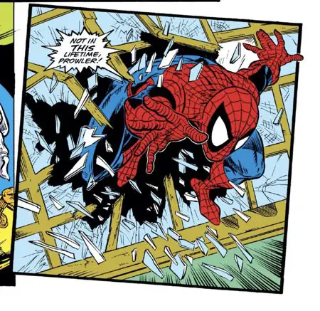
Ken Lopez got assigned a great page and does rather well with it. That Spider-Man leaping through the window in the last panel is prime McFarlane work, and the final inks show it off well. There’s no obvious and immediate issue with the webbing on his costume. There’s a good mix of heavier brush ink lines and thinner McFarlane-esque pen lines to add details, like in the window cracks or the shadow on Spider-Man’s back leg.
What’s most impressive about this page is that it’s Lopez’s only credited Marvel Comics inking work that I could find. Lopez is a letterer and logo designer (“Excalibur”!) who started at Marvel in 1986. Today, he heads up DC’s digital lettering department as well as being their cover editor.
Good to see that the Hunt 107 works on art as well as letters…
A Friendly Reminder
Check out this article for a full history of McFarlane’s spaghetti webbing — where it came from, how it got its name, and how it’s stood the test of time.
Now, back to the review:
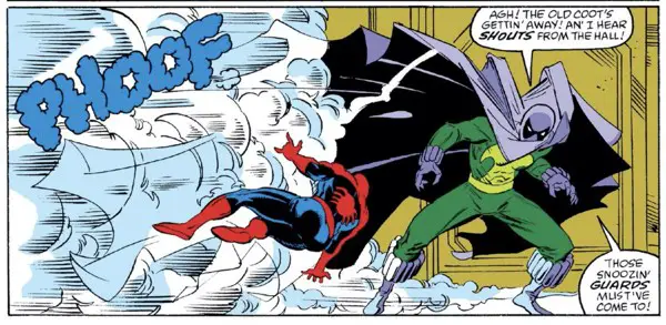
The Prowler and Black Fox: Similar Stories
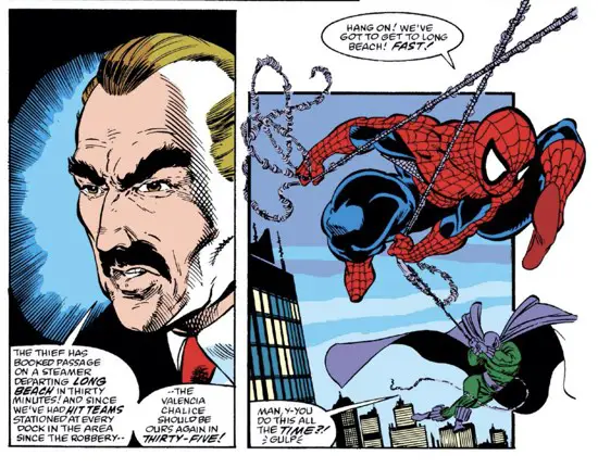
This is the second part of the story that began in the last issue, with Spider-Man chasing after the Black Fox. It’s Spider-Man versus two sympathetic villains.
One is a good guy who supposedly had hung up his costume but now has returned to clear his wife’s good name. The other is an elderly man who just wants to retire and hang it up.
Spider-Man’s reaction to both of them is kindly and favorable. He knows the Black Fox is likely putting one over on him, but he can’t be tough with an old man. Aunt May has softened him up too much.
And he knows The Prowler deserves a second (or third) chance, but feels let down when the Prowler leads him astray. Still, he can’t give up on him and helps him out. It’s the Right Thing to Do, right?
It’s a cute issue with a couple of fun costumes for McFarlane to draw. In total, there are only 4 or 5 pages without any costumed characters on them. Giving McFarlane more opportunities to draw Spider-Man and a caped character is always a good thing.
The endings on both Black Fox’s story as well as The Prowler’s are both strong. One covers Spider-Man doing his best work in giving someone the benefit of the doubt and helping an innocent person out. The other is the classic case of the softness of Peter Parker giving a character a second chance that he doesn’t deserve while not letting him get away with the big crime.
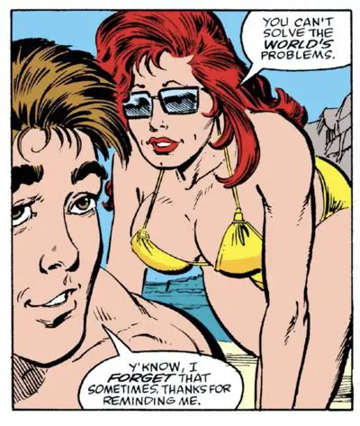
Michelinie also includes some Peter Parker time, if only to let McFarlane draw Mary Jane in a bathing suit that leaves little to the imagination.
Spawn Watch
Just look at The Prowler. That cape, that mask, those eyes, those pointy-fingered gloves…
He has all the elements there. It’s like looking at a shadow of the future.
He just needs more chains and, later, some unwieldy red boots with spikes on them.
Felix Watch
The Cat shows up twice in this issue.
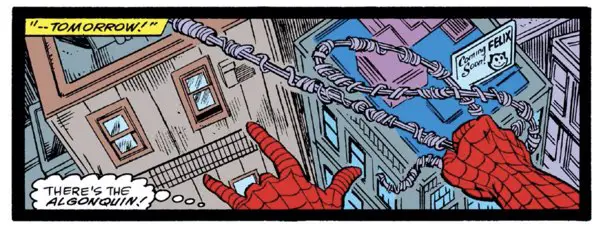
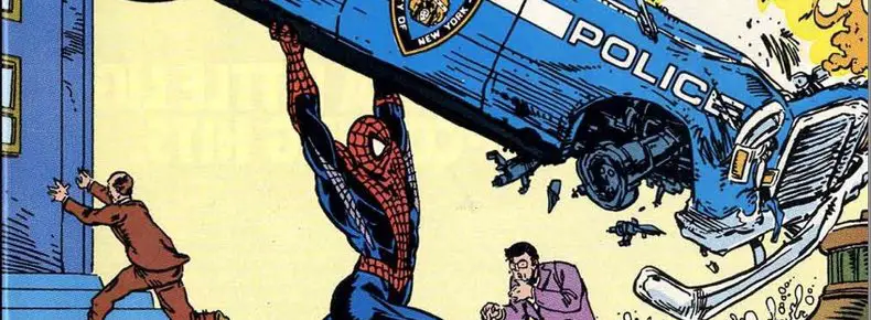
First, you can see him on a billboard as Spider-Man swings over the city on page 7:
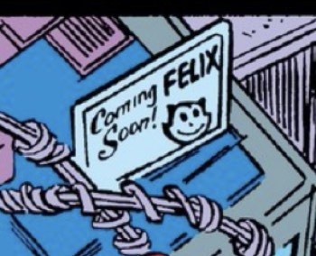
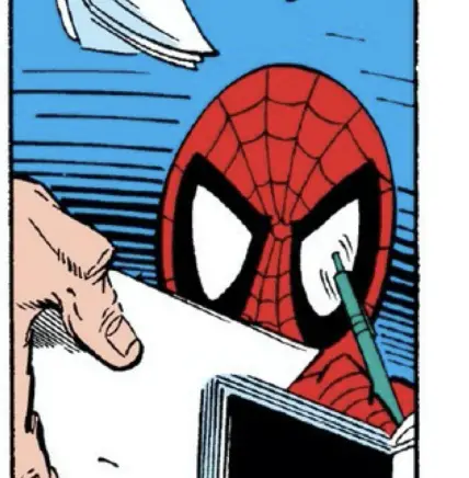
Second, at Peter Parker’s book signing on page 11, Felix is at the end of the table on a sign.
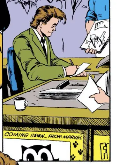
The sign reads, “Coming Soon… From Marvel.” Sorry to say, that never happened. Dark Horse did eventually print a Felix the Cat trade paperback with a back cover by Todd McFarlane, though.
Hidden Spiders – And a Cover Coloring Issue
None on the cover again this month.
There’s one thing I don’t understand about the cover and that’s the inside of The Prowler’s cape. Why is it purple? Why not just have everything inside of the open cape be solid black. That would be menacing and kind of cool, what with this steel-clawed hand waving across the opening and leaving a lighter trail in its wake. With the purple color, it feels like there’s another section of cape coming across, which I don’t think there is. It flattens the whole image out.
Was it too tricky to ink that way? Was there concern that it would make the total cover too black? I would think it would allow Spider-Man to pop out more if he was surrounded by shadows.
Maybe a colorist today could go back in and add a blur effect and darken the purple to make it work. Still, it’s a cool McFarlane Spider-Man pose.
I’m also enjoying the UPC box art from McFarlane. He’s on a roll with drawing the issue number as a spider web. Clever and fun.
My Favorite Original Art Comment of the Month
Page 2 from this issue sold at Heritage Auctions in 2009. No doubt Mark McKenna is kicking himself for not holding onto this page for a few years more to take advantage of today’s ridiculous art market.
Thankfully, Heritage maintains an archive of high-quality scans of the pages they’ve sold, so we can take a careful look at this one.
Two things jump out:
First, the top of the art has been ripped diagonally. Thankfully, it didn’t tear down to the live art section of the page.
Second, and my most favorite art correction of the year, is the lettering correction in the upper right corner. In blue pencil it is written, “Fix lettering boo boo.”
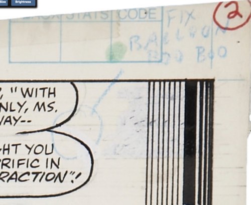
Zooming in on the art, I can’t quite tell what the error is. Looks like maybe the balloon was the wrong shape and needed to be tightened up.
There’s also a lot of white-out used in the corner there. Did Rick Parker originally do the lettering up there? That black stripe pattern was added on top of the white-out, perhaps to help cover the lettering faux pas? If you look at the printed version of the page, a couple of specks appear between those lines that weren’t whited out enough.
Or maybe McFarlane had tried to draw a chandelier in that corner, it didn’t come out right, and he went in a different direction. The more I look at it, the more it looks like a hanging plant or a chandelier. It looks like little leaves in the bottom left corner of the area.
These are the stupid mysteries that keep me up at night…
BD Recommendation
If you liked this issue, I have a recommendation for you from the world of les bandes dessinées, or Franco-Belgian comics.

“Curtain Call” is a 128 page standalone graphic novel by Wilfrid Lupano and Rodguen that tells another story in everyone’s favorite story type: one last big heist. Black Fox couldn’t pull it off in this issue, but perhaps Vincent can?
Vincent needs the money to return to the woman of his dreams and the kid he had to leave behind with her. He and his friend, Gaby, make a daring plan to rob an armed truck. It’ll give them all the money they need to have the lives they dream of.
It’s never that easy, though.
“Curtain Call” is available digitally or in print through Magnetic Press
In The Next Issue
We hit issue #306, featuring McFarlane’s inks and naturally cartoony style, a silly insect-based villain, and Spider-Man dealing with the paparazzi while on a book tour to promote photography of himself. So very meta.
2 Comments