
The Amazing Spider-Man #304: “California Schemin'”
Peter Parker begins a book tour in support of his book of Spider-Man photography, but The Black Fox’s plans interrupt his superhero time off.
Credits Tour Stop
Pencils: Todd McFarlane
Finishes: Joe Rubinstein
Colors: Bob Sharen
Letterer: Rick Parker
Publication Date: May 10, 1988
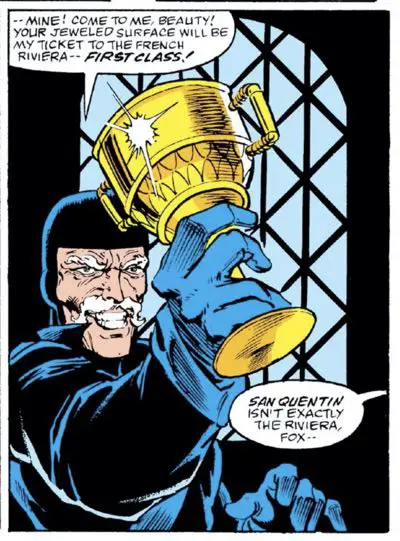
Return of the Black Fox!
Ooh, this is a fun one!
I like The Black Fox. He’s one of a number of the goofier villains we’ll see in the course of this series, but one with a certain charisma and charm. He’s not a terrible threat to Spider-Man. He’s not at all dangerous on his own.
He’s a thief, and an old man who – cue the Hollywood cliché — wants that one big payoff so that he can retire to the Riviera. But then Spider-Man always gets in the way.
I like his simple black and blue costume paired with the shock of white hair and generous mustache. It’s a costume that also worked well for Erik Larsen when it was his turn to draw him a couple of years later. It’s an interesting contrast to see the young and lively Spider-Man taking on the presumably old and slow Black Fox.
It’s the Fox’s charm and quick thinking that gives him any chance of staying ahead of the ol’ webhead. It works so well that I find myself rooting for him. That might also be because I’m so much closer to his age now than when I first read the character 30 years ago…
Like Spider-Man against bigger and badder foes, The Black Fox has to use his wits. That chess match combined with the unlikely physical battles makes for a fun match-up, whenever the two find each other.
Wait, before we get to what he’s doing in this issue, let’s set the scene:
What’s Going On?
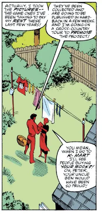
Those men in the smoky room at the end of last issue wanted Peter Parker because they’re publishing a book of his photography. J. Jonah Jameson pulled off a contract that made a freelancer’s work entirely the property of the Daily Bugle. There’s a comparison here to Marvel Comics’ rich history of owning everything that I’ll leave as an exercise for the reader.
Parker doesn’t stand to make much money on the book (again, make your own comparisons to today’s Marvel Comics), but the publishers are ready to send him on a book tour and pay him a royalty that might amount to $25,000. That will get a photographer’s interest!
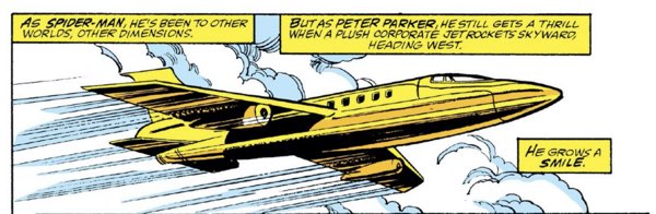
Also, it’s 1988 and book tours are still a thing. This one does seem a little over-the-top, though. My favorite part is the plane departure panel that looks like was set during the golden hour. At first glance, you’d think the private jet (ha!) was gold-plated.
The real reason for the book tour is, indeed, marketing, but not the marketing of Peter Parker’s photo book, “Webs: Spider-Man In Action.” No, this is an actual Marvel Comics marketing move.
This is the first issue of the series’ twice-monthly spring run. The releases and the storylines were timed to coincide with major comic book conventions and book fairs. In this case, they timed the story to be available for the American Bookseller’s Association (now called “BookExpo”), which was held in Anaheim, California in 1988.
Here’s the Washington Post’s report from that week:
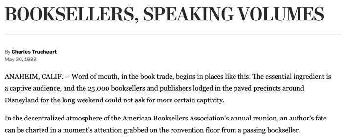
The comic was released on May 10th on a bi-weekly schedule, which means that by the time the conference started, the next issue was already on the shelves. From what I remember back then, though, the newsstands would get the comics a week or two after the Direct Market, so it all checks out for booksellers who shop off the newsstand, not the local comics shop.
A Glimpse Into the Future
Mary Jane accompanies Peter Parker on his book tour. On the way to their hotel from the airport, their publicist mentions that they have the afternoon free. Peter immediately knows what he wants to do — he wants to go to DisneyLand!
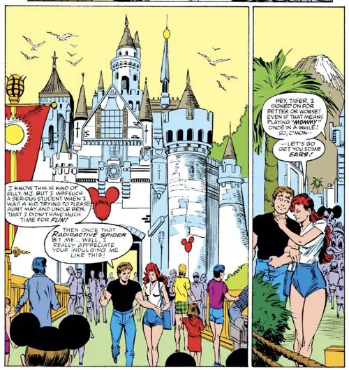
You can tell this is 1988. In 2021, the park would already be sold out for the day and there’s no way he’d be able to afford the day pass (even without park hopping) on his photographer’s pay.
Don’t accuse Disney of planting this plug, though. Marvel wouldn’t sell to Disney for another 20 years. The book conference just happens to be at the conference center next to DisneyLand, so it all works out. The Parkers could possibly walk to the park from their hotel.
(Also, they’d be right off Katella Ave, a street that would lend its name three years later to an alien species in Rob Liefeld’s “Youngblood”.)
There is one major DisneyLand faux pas on this page, though, and it’s in McFarlane’s drawing of Splash Mountain:
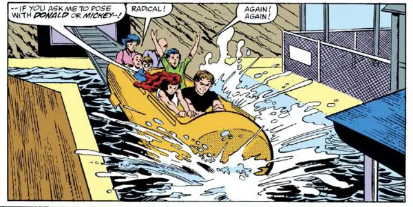
The Splash Mountain car in Disney World in Orlando, Florida has seating for two across. The Disneyland version of the ride in Anaheim is a single file car.
That might be the nerdiest thing I’ve mentioned so far in The McSpidey Chronicles.
(I know, I gave him a pass for drawing a generic castle instead of Sleeping Beauty Castle, but jumped on Splash Mountain. I’ll give artistic license on one, but the other is an unforced error. )
The Story Weakness
If there’s one weakness with this issue, it’s that it doesn’t have a strong focus. It feels like a collection of random scenes, with a few of them themed on Peter’s book deal. Michelinie had a lot of ideas for this issue related to the book or in carrying on certain background stories, so he threw them all in.
After the opening at the Bugle, Spider-Man stops two friends from killing each other over a $5 bet. It’s a cute scene that fills up a page, but doesn’t add anything to the story. Mary Jane cleans her closet. Peter tells Aunt May about his book and the tour. She’s thrilled to be able to pick up a copy at K-Mart. Peter and Mary Jane fly across the country. The Black Fox uses someone’s house as an unpaid AirBNB while they’re on vacation. Peter and Mary Jane go to a theme park. They attend a charity event.
It’s the latter part where things get interesting.
That’s where Black Fox just happens to be. It’s a coincidental meeting, but Peter takes on the responsibility of finding out what’s going on, leading to a very short chase scene with the Black Fox. The issue ends in a cliffhanger, with The Prowler showing up at the last minute.
We’ll have to think of this story as a two-parter where this issue is all about the setup.
In some ways, it’s a feature and not a bug. If you think of “The Amazing Spider-Man” as a soap opera, then you expect plots to roll across many books. You expect to have small character moments that don’t add up to anything but help show the character off. You get incomplete overlapping plots that resolve in the long run.
Chris Claremont proved the model in “Uncanny X-Men” long before this. Denny O’Neil taught the art of A and B plots threading through a series. Spider-Man had three monthly books to carry. The parts that carried across the books were mostly the soap opera happenings with Peter and Mary Janes’ families and friends. Thankfully, they still had editor’s notes in comics back then.
It just feels like the balance of the main villain-of-the-month plot and everything else felt a little out of whack in this particular issue. The villain gets screen time, but his plot is so simplistic and spare that there’s not much Michelinie can do to make it feel more serious. Devoting more time to it would probably be a waste.
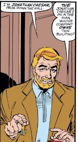
So, Michelinie uses that spareness to include a page where Mary Jane meets Jonathan Caesar, the owner of the building she lives in. He’s slightly creepy, but it’ll get worse fast in a couple of months. Michelinie is just starting with that plot.
He’ll be a bigger threat than The Black Fox, in the end. He’s just getting started.
Another Chapter in the McFarlane Inking Saga
The big artistic talking point for this issue is Joe Rubinstein’s inks. With the book going into its bi-weekly crunch, McFarlane needed to bring in outside inkers to hit his deadlines.
Joe Rubinstein gets the call for this issue. His ink line couldn’t be more different from McFarlane’s. It’s thick and chunky. It reminds me a bit of how Klaus Jansen’s inks looked like over Frank Miller’s. It’s a new feeling.
McFarlane has always had a very thin line with his inks, using multiple lines to shade things in with crosshatching or to add texture. Rubinstein is more of an old-school, Neal Adams-era comics artist in all the best ways. He has a huge variation in his line weight from thin to thick. He doesn’t use as many lines as possible. He’s more about simplifying them and making them bold.
There’s a tension between McFarlane’s designs and Rubinstein’s inks. It’s tough to say without seeing the original pencils, but I’m guessing McFarlane did work closer to layouts in this issue. I know that later in his career he was more comfortable with drawing more directly in ink, but I’m not sure when that started. This issue might be proof that it started earlier than I thought.
McFarlane’s figures occasionally look stiff and lumpy under Rubinstein’s ink lines. Sometimes it works, but many times it falters; as a McFarlane fan, you just know what that panel is supposed to look like. Rubinstein has his own style, though, and it’s powerful enough to cut through.
There are spots where it works to the art’s advantage, even when it seems to overwhelm McFarlane’s pencils. And there are times when it looks like McFarlane’s finishing touches were needed to sell the drawing.
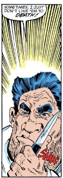
This might very well indicate a weakness in McFarlane’s art; if a style is needed to save the underlying forms, it’s a weakness. There’s a panel at the bottom of the second page that has both examples in it:
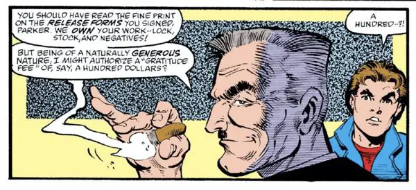
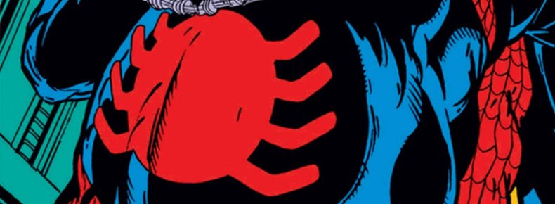
J. Jonah Jameson looks great under Rubinstein’s inks. I like the thick outline by the chin and over the forehead. I love the tone added on the right half of his face, and even the rectangular pattern behind him. The hand holding the cigar — they were still allowed to draw those in Tom DeFalco’s Marvel of 1988 — maintain their shape and form, distinctively McFarlane’s with a nice finishing touch by Rubinstein to add a variety of line weights in there. It helps separate the pinky finger from the busy background with a thicker line, and keeps the fingernail lines thin to emphasize the shapes of the fingers overall more.
But then there’s Peter Parker in the background. His hair doesn’t look right somehow, and that’s mostly due to the ink line. Again, this is likely not Rubinstein’s fault. McFarlane’s style works with his own ink line best. But the face looks piggish and unsure. The upturned nose looks distinctively un-McFarlane-esque, and those eyebrows are far bushier than normal.
It’s a great example of how important it is to match an inker up to a penciler’s work. I send my sympathies to the editors who have to traverse those landmines.
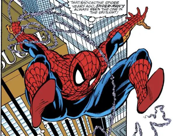
Other details are off, too. Again, there’s no way to tell how much of it was McFarlane pressing to get the issue done on time, or how much was Rubinstein’s style clashing or having to fill in blank spots left to him. The webbing on Spider-Man’s costume looks wrong. It’s just not wrapping around Spider-Man’s body in a convincing way, leaving some body parts to look flatter than usual. Compare it to the work McFarlane does with his own inks and the difference is dramatic.
Check out Spider-Man’s right leg (the reader’s left) on this one, where the webbing on his costume disappears around the ankle and wraps around his shin in a twisted way.
You know what the crazy thing here is? I’d probably be praising the art in this book under any other circumstances. I love Rubinstein’s inks. I love the contrasts between the thick and thin lines. I love the extra touches with the tones. I love the way Peter’s hair looks in this issue. I love the faces in this issue, which reminded me a lot of Rubinstein’s inks over Kevin Maguire’s pencils in the Justice League around the same time. I love the way his feathering of lines and the added lines to indicate shadows make a lot of sense and help to contour the art and add dimensionality.
That’s why I’m mostly guessing the pencils had to be rushed a little bit and that’s why this issue has its highs and lows. It’s not all bad by a long shot.
But if you know too much about McFarlane’s style, you start to only see what’s missing when he isn’t inking himself. (Check out those weblines. I know they were “new”, but Rubinstein inks them more like coils than as a core string with an outer line wrapping around it.)
The one thing I do see changing with this issue, though, is the amount of black in Spider-Man’s costume. McFarlane left a lot of open legs for big seas of blue as recently as the previous issue. I don’t know how much of it here is his work or how much is Rubinstein’s, but there’s a lot more of the traditional McFarlane black in those legs with blue lines to delineate the musculature.
In the end, it’s just another bump in the road to get to the McSpidey most of us remember and love. The next issue does a great job in putting the art back on that road, and I can’t wait to talk about it.
Black Fox History and Future
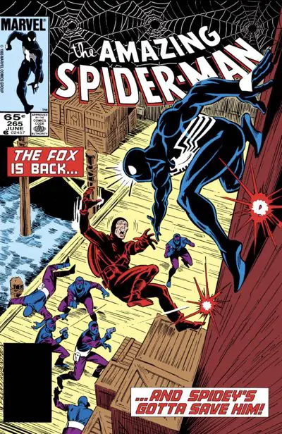
Black Fox had two previous appearances in “The Amazing Spider-Man.” He debuted in #255 and returned in #265. That latter issue also featured Silver Sable. Ron Frenz drew it, with inks from Josef Rubinstein. I should review that issue someday. It’s a pretty good one.
Black Fox will appear in the next issue, three issues of Erik Larsen’s run, and a couple of issues of “Silver Sable and the Wild Pack” (the two were inseparable in those days).
After that, uber-Todd McFarlane fan Robert Kirkman would include the character in his (very very very very good) “Irredeemable Ant-Man” series for a few issues. Recently, he’s had a major supporting role in the “Black Cat” series.
That “Irredeemable Ant-Man” appearance is interesting to me because it helps to show the cycles of comics and comics creators. There were a number of characters from the late 80s and early 90s that disappeared for ten or fifteen years. They suddenly reappeared when the next generation of writers appeared on the scene — all people who had grown up reading these books from this time period. Suddenly, characters like Silver Sable, Black Cat, and Paladin (we’ll get to him eventually in The McSpidey Chronicles) became players in the Marvel Universe again.
Another fifteen years later, it feels like the characters are being recycled again. Marvel tried to do something with a Silver Sable mini-series. Sony tried to make a movie. Venom is suddenly the most popular character in the Marvel Universe. Black Fox is now not just a wily old man, but Black Cat’s mentor.
I suspect that in another ten years or so, Black Fox will be leading the next major crossover event at Marvel. Or he’ll star in a series patterned after “The Old Geezers.” One or the other.
Finding Felix
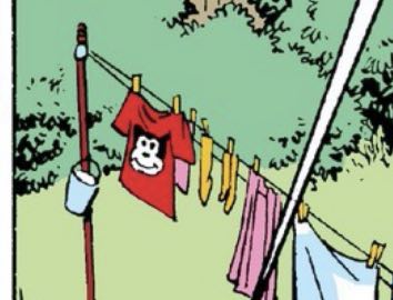
Aunt May is hanging Felix in this issue.
No, not with a noose. His face is on her laundry that she’s hanging out to dry.
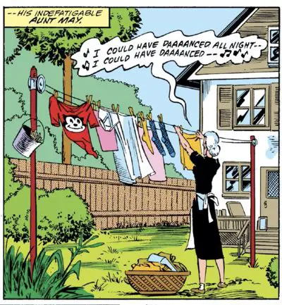
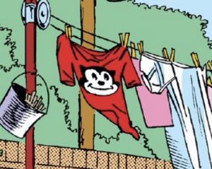
Felix gets appearances in two panels for this one.
Hidden Spider Covers
There is no hidden spider on this one. McFarlane may have started the practice with last month’s cover, but it didn’t become a regular feature until issue #307.
Spawn Watch
This random bookie on the street reminds me of Sam from “Spawn.” And, yes, he looks a little like Harvey Bullock, too. It’s one of McFarlane’s stock figures, I guess.
The whole page is a cute gag, even if it doesn’t impact the overall story one bit. Give it a read.
BD Recommendation
If you liked this issue, I have a recommendation for you from the world of les bandes dessinées, or Franco-Belgian comics.

This issue features The Black Fox smoothly working his way into an event to quietly steal a precious item that is destined for a museum. If you want to see more museum heist hijinks, “The Grand Odalisque” is a great book. It’s about a pair of women who plan a daring daytime heist at The Louvre. It’s a classic “one last big heist” move. Fantagraphics has even made a print edition of the book and its sequel.
You can find my review of the first book at PipelineComics.com.
In The Next Issue
Inkers Galore! And McFarlane’s glorious capes! So very many capes with so very many folds in them…
Bonus: Daily Bugle Stairwells
The quickest way out of The Daily Bugle’s headquarters is a quick change and an escape out the roof.
The panel on the left is by Todd McFarlane and Bob McLeod in “The Amazing Spider-Man” #298. The panel on the right is by Todd McFarlane and Joe Rubinstein in “The Amazing Spider-Man” #304.
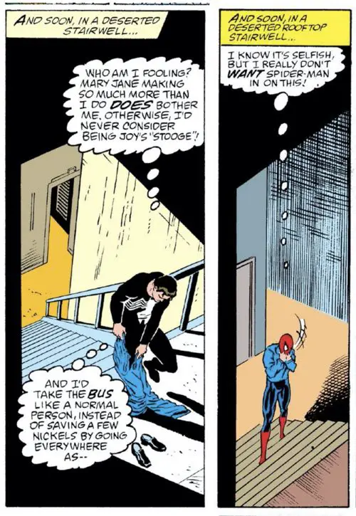
Michelinie’s caption box is one word away from being an exact copy. Peter only made it halfway up the stairs this time, resulting in him covering up the line that would normally continue straight down to indicate the wall on the side of the stairs, but which fooled the colorist into thinking was the floor.
The handrail is gone, which I’m almost certain is a building code violation.
Will this be the last of the Daily Bugle stairwells we see in the McSpidey Chronicles?
No, it won’t be. Stay tuned….
3 Comments