The Amazing Spider-Man #312: “The Goblin War”
The Green Goblin returns to protect his family from the Hobgoblin, while Inferno makes New York City even weirder than Austin, Texas and Portland, Oregon combined. Bonus Debate: Is Spider-Man a Non-Mutant or a Mutant?
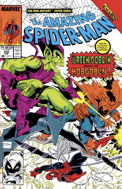
Artist: Todd McFarlane
Colors: Bob Sharen
Letterer: Rick Parker
Publication Date: October 11, 1988
Attack of the Goblins
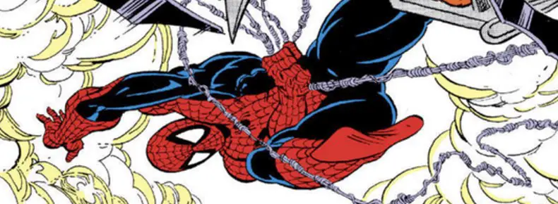
Without a doubt, this is the best-drawn issue of the “Amazing Spider-Man by David Michelinie and Todd McFarlane Omnibus” so far. It is everything you want in a superhero book drawn by Todd McFarlane. You have Spider-Man slinging around the city with his webs. You have a dramatic cityscape or three. You have capes. Pointy-fingered hands. Monsters. More capes that are tattered and long and perfectly folded. Slouchy boots with lots of surface area and pointed upturned toes, like a Don Martin drawing made into a supervillain. Aerial fighting.
I can’t get enough of it.
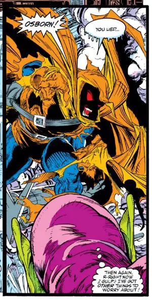
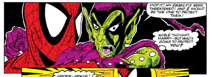
But before we lose track of the story: Harry Osborn is forced to become The Green Goblin again to protect his family from The Hobgoblin. From a different Spider-Man title at the time (thanks, footnotes!), we know that the Hobgoblin wanted to know “where it is” from Harry. To protect his wife and new son, Harry lied that “it” was at his office. With the time that bought him, he went up to the attic to pull down the Green Goblin costume that once threatened to drive him mad. Then, a fight ensues.
It’s a classic thin plot for a superhero comic: Throw in a MacGuffin. Have a man protect his family, with the slightest bit of rage over his wife and/or kid being threatened. With his back against the wall, Harry does the unthinkable and returns to his superpowered past self. Even crazier is the ending where — spoiler warning — Harry find out the Hobgoblin was looking for something that no longer exists.
The story has a MacGuffin that is its own MacGuffin.
So his family is safe now, right? Nobody in their right mind would assume that, but Spider-Man and the Green Goblin do and walk away happy. Why? Because there aren’t enough pages left in the issue, maybe?
If you were like me and just getting into comics in 1989, making sense of the various goblins and their storylines was a lost cause. It’s more than thirty years later, and it’s only gotten ten times worse. I can’t tell you who either goblin is, why they are that way, how they’re related to previous goblins, or what their relationship to Spider-Man is. We’ve also added a couple more generations of goblins and history on top of this issue.
Any day now I expect an announcement of a Multi-Goblin-Verse mini-series featuring Goblin Stacey and Venom/Goblin.
I didn’t know when I read this book that the true identity of one of those goblins was an historical sore spot, and would have to be fixed with a mini-series a few years later.
So, credit to David Michelinie for explaining enough in this issue to get me through it. Ultimately, I know one guy is on offense, one is on defense, and Spider-Man is caught in an awkward middle spot. There’s lot of goblin bombs and webs and mid-air acrobatics. That’s cool. That’s Good Old Super Hero storytelling right there.
I’m OK with leaving it as an exercise to others more deeply concerned with the continuity to figure out the larger meaning behind it all.
The plot is thin because it’s not the star of the issue. By this point, Michelinie clearly realized what was selling the series. That’s McFarlane’s art. Half this book is between the two Goblins. Why waste this chance? Throw some angst in there and give some sort of reason for this fight to happen. Making it personal jeopardy just makes it more intense. Give it a whiff of desperation and heroism and you have all the trappings of a roller coaster superhero comic.
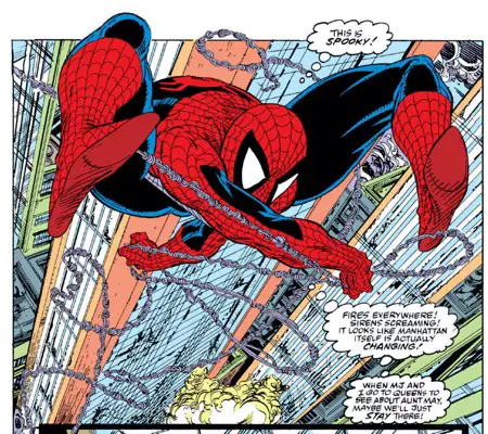
Those fights crowd out the rest of the issue, but there’s not much else going on there, either. The Lizard is set up to come to the fore next month. Mary Jane has a photoshoot that goes wrong due to Inferno. Mary Jane, as it turns out, is the one who’s most affected by the events of Inferno, thanks to some jewelry on a photo shoot she was doing coming alive. And attacking. But of course. And J. Jonah Jameson is obsessed with the entire city being the story right now and Peter should go shoot that.
David Michelinie puts “Inferno” into the background, for the most part, with Mary Jane’s moment excepted. Everything else just happens to be going on while other more important things are keeping Spider-Man busy. Would it have been more fun for Spider-Man to have been directly involved with the events of Inferno? I don’t know about that, though the idea of seeing McFarlane drawing the Silvestri-era X-Men is drool-worthy. We’ll have to settle for his “Spider-Man Team-Up” covers that featured the mutants. (Good news: They’re reprinted in the back of the Omnibus edition.)
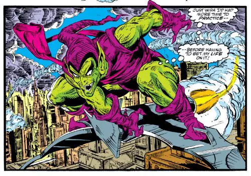
The point of this issue, though, is that half of it is filled with two similar flying dudes fighting it out over the city. Visually, it’s awesome. McFarlane uses lots of different angles. He fills backgrounds with speedlines, but also tosses in a couple of high-angle looks down the concrete canyons of Manhattan.
The panel layouts are fairly restrained once the fight hits, but there’s still some interesting overlapping going on, such as the little pumpkin bombs and the Hobgoblin’s razor-bat things. McFarlane breaks the 180-degree rule once or twice, but you’ll forgive it because it just looks cool.
While there are one or two simpler panels during the civilian scenes, I don’t see anything else in this issue that looks remotely rushed or simplified. Even Rick Parker does a good job when given the chance to shine with sound effects or special dialogue moments.
A Tangent Into Print vs Reprint vs Digital
There were times in reading this issue that the whole thing felt a little silly. This is a prime example of forty-something me reading this versus teenage me, yes, but there’s more to it.
I’m reading these issues from digital versions of the comics. We’ve talked before about how fraught with problems that system is. Usually, we talk about how the linework might break up or wind up thicker than ever. We talk about how the colors are garishly bright.
Those are both true, but they’re also part of a bigger whole. This comic, I think, looks better on newsprint. It’s a horrible thing to have to say because McFarlane’s line work can be so fragile. You’d think a higher definition presentation of it would be demonstrably better. However, there’s something that’s lost in the purer vision of the art. There’s nowhere for the art to hide. Colors and inks aren’t seeping into the pages and putting the reader to more work “reading” the art. There’s a certain mystery on those darker and less saturated pages. Your mind fills in the blanks and that makes it look cooler.
None of that mystery happens in the digital realm. That’s great news for an artist who relies on heavy detail work and high fidelity. It’s like the changeover from 4:3 television sets to high definition 16:9 sets. That high-definition picture doesn’t let you hide anything.
Newsprint lets you get away with a little more. It’s imperfect. It muddies things up a bit.
Not only that, but the artists took that into account when they made their work, whether they realized it or not. Much the same way no writer would name a character “Clint” (Hawkeye was a learning lesson) or have anyone “flick” something because the letterer’s work might melt into the page and make the “LI” looke like a “U,” I’m sure there are inking techniques that are traditional to comics (likely still to this day) that are there because paper soaks up black ink.
That’s changed in recent years as printing processes and paper have gotten better, and as artists move to digital. I think modern comics look better on my iPad than they do in print. They’re clearer and richer in their colors. They’re also brighter and easier to read for that reason. The lettering is stylish, but readable.
Here, you can slide back and forth to compare and contrast a scan of the original comic with a screen grab from the recolored digital edition. The pink on goblin’s bag, in particular, will sear through your eyes.


All the original newsprint edition needed is blacker blacks and a little clearer reproduction of the line work. Brightening up the colors to the point where it looks like the book was colored by PAAS using the available colors they had leftover from the previous Easter is not the solution.
Getting back to this issue, there are panels that look very silly, like Spider-Man is fighting two people in ridiculous rubber masks with oversized ears and big honking noses. Some of that is intentional, no doubt, but I think some of that is caused by the digital cleaned-up reprint. That will hold true with the print Omnibus edition, too, since it uses the same files in lieu of the original film. Things are just brighter than they were originally intended to be. The ink lines aren’t blending together and aren’t soaking into the virtual or real glossy paper.
The art does actually look different. They help sometimes, and it hurts occasionally. McFarlane’s dynamic layouts and stylish renderings look great in both presentations, but I think the modern cleaned-up digital reprint with the modern attempt at imitating the original coloring techniques hurts the art just as often as it helps it.
That all said, when McFarlane went for a second try with the Hobgblin his adjectiveless “Spider-Man,” he changed the design around completely. Gone was the rubber mask face and out came the horror/monster look:
One More Tangent
Check out the tangent between Green Goblin’s right ear and Spider-Man’s left eye. It, unfortunately, destroys the illusion of depth in this panel. It looks like their faces are side by side, but then you see Goblin’s hand on Spider-Man’s shoulder and realize Goblin’s head is supposed to be further back.
That’s when I get a headache from being unable to comprehend the two bits of art in the same panel screwing with my depth perception so much.
Every artist has tangents in their work. It’s almost unavoidable, as much as everyone tries. They usually don’t screw up a panel as much as this one does, though.
This tangent is even more avoidable when you realize how awkwardly Goblin’s right ear must be sticking out from his head to be so visible from this three-quarters angle perspective.
Craft and Endings
There’s a great bit of craftwork on the final page of this issue. David Micheline deserves credit for the great bit of pacing and the hint of menace.
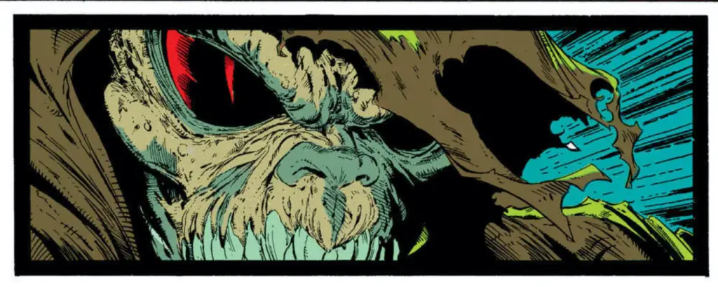
It’s a three-panel sequence. The first two are side-by-side and are a half-page high. In the first, Spider-Man thinks about all the crazy Inferno things he’s seen across the city in recent days. In the second panel, as demons destroy a hot dog vendor’s cart, a single line from Spider-Man asks, “Could things possibly get any worse?”
Cut to the third panel, narrow and wide across the bottom of the page as The Lizard emerges from an office with Curt Connors’ name on the door, hissing “Yessss…!”
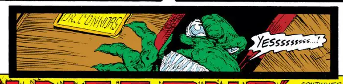
I really like the rhythm of that sequence and the perfect tease for the Lizard, who we knew was coming from his cameos in this issue and the previous one.
The Most Controversial Moment of “The Amazing Spider-Man”
The letters column lit up in issue #320 discussing this issue. Nope, it wasn’t about rubber-faced goblins or dark coloring or Mary Jane’s latest modeling triumph.
Controversy erupted over an update to the cover design:
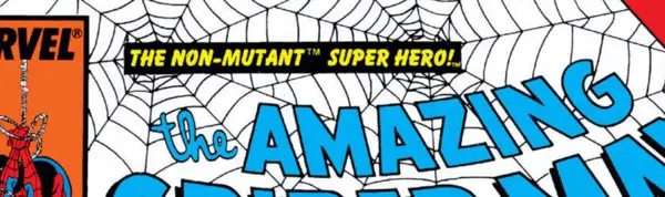
Here, in the middle of a crossover with an X-Men event, Jim Salicrup added a new trademarked tag line above the title: “The Non-Mutant Super Hero.“
In retrospect, it seems clear to me that this is a gentle ribbing from Salicrup at the X-Office. “The Uncanny X-Men” was Marvel’s best-selling book with all the hottest artists and characters. Todd McFarlane’s run on “The Amazing Spider-Man” was a challenge to that dominance.
In fact, I’m pretty sure I can remember an interview with Salicrup on a podcast somewhere recently where he said his goal was to outsell the X-Office with his main Spider-Man title.
And so here he is, poking the bear.
The response from fans, though, was “Spider-Man isn’t a mutant? He ingested radioactive spider blood! It mutated him! He’s a mutant!”
It’s a silly argument that I don’t want to get into, but here’s the editorial response to this:
There’s a controversy raging at the Marvel Bullpen right now that has to deal with this mutant issue. It was inspired by our trouble-making editor, Jim Salicrup, who insisted on placing that infamous phrase above the cover logo. We were surprised at how many people disagreed with the idea. Their argument is that any characters who received their powers due to radiation (e.g. Spidey, Daredevil, the Hulk, or the Fantastic Four) are mutants due to the fact that they did not die. The Marvel Dictionary coins the phrase “latent mutant” to describe such a phenomenon. For instance, it has been established that Cloak and Dagger were latent mutants whose powers never would have manifested without the catalyst of certain drugs. So what does that make Spidey? We’d like to hear what you have to say about the matter. In the meantime, to keep our definitions from being all-inclusive, we’re calling our webslinger a “non-mutant.”
Tsk, tsk, editorial, for avoiding being “all-inclusive” like that. You’re going to get canceled now.
We all know the correct answer to the timeless question, “Who is a mutant?” It’s whoever Chris Claremont says is one.
Letter of the Month
Speaking of the letters column, let’s enjoy the opening letter from this issue, where the reader points out the beginning of the Hidden Spiders movement on McFarlane’s covers.
I like the coy response from Spider-Man Editorial:
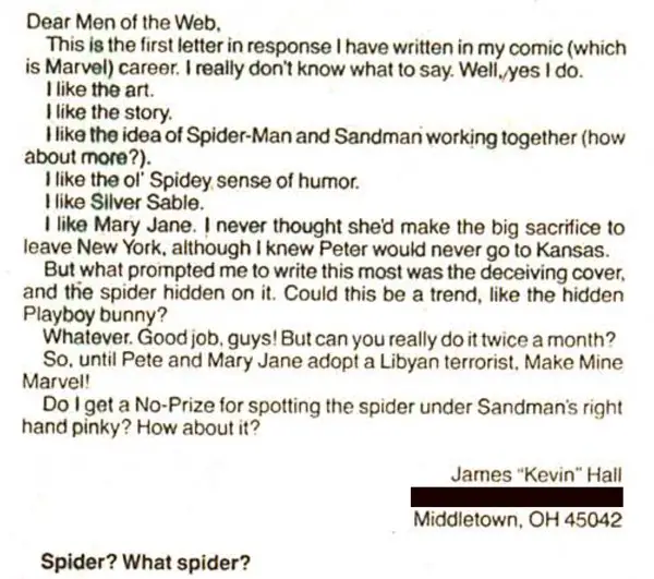
I also enjoyed the letter writer’s somewhat timely reference to Libyan terrorists. It brought me back to the kinds of newscasts I watched growing up. Kids, ask your parents…
Hidden Cover Spiders
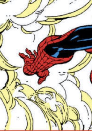
When in doubt, look in the clouds/smoke/fog. It’s a natural hiding place, and it works on this cover, too. Look in the lower left corner, just below Spider-Man’s outstretched hand.
Felix Watch
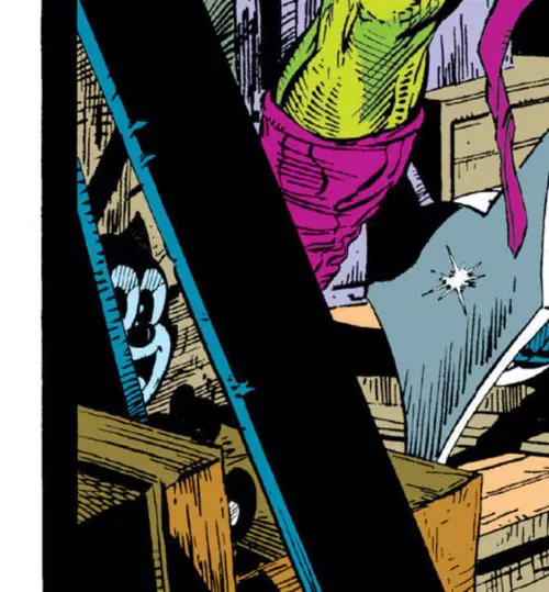
He’s right there on the opening splash page. Can’t miss him in Harry Osborn’s attic on the far left side. I guess it’s a stuffed animal of some sort? I thought at first he was printed on a box, but then I saw his foot in front of him. It’s weird that the toy went from his daughter’s arms in bed at the end of last issue to a hidden corner of the attic in this issue.
Who Are Laura and Phil?
They’re named on the roof of a skyscraper during one of the aerial flights in this issue:
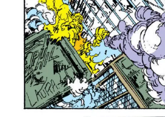
Family friends of McFarlane’s? A wedding present to a betrothed fan couple? I haven’t found an answer on Google. Does anyone know?
BD Recommendation: “The Ghost of Gaudi”
If you liked this issue, I have a recommendation for you from the world of les bandes dessinées, or Franco-Belgian comics.

While I haven’t reviewed any European books about goblins, I have reviewed a book about a ghost! “The Ghost of Gaudi” is a murder/mystery/thriller set in Barcelona, Spain, but centered on the architecture of the famous architect, Antoni Gaudi.
Decades after his death, a series of murders is happening at buildings he designed, and the hunt is on for the killer — with the help of Gaudi’s ghost, of course.
It’s a great story from El Torres, but the animated stylings of Jesus Alonso Iglesias sell the story so well. The characters are great actors with unique and interesting designs illustrated with a skilled ink brush. It’s everything I love in comics illustration.
As a bonus for the non-digital readers out there, the book is available in print through Magnetic Press, which packaged it beautifully.
Read my full review of “The Ghost of Gaudi” here.
Next issue
Issue #313 is where Inferno brings Shark Week to “The Amazing Spider-Man.” Here’s a preview:

Isn’t it glorious?
One Comment