
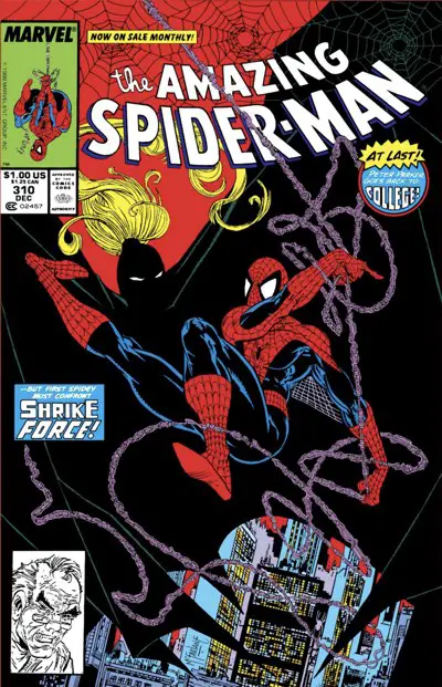
The Amazing Spider-Man #310: “Shrike Force”
Peter Parker returns to school, and immediately comes across suspicious activity that leads to The Tinkerer and Killer Shrike.
Slice and Dice Credits
Artist: Todd McFarlane
Colors: Janice Cohen
Letterer: Rick Parker
Publication Date: August 9, 1988
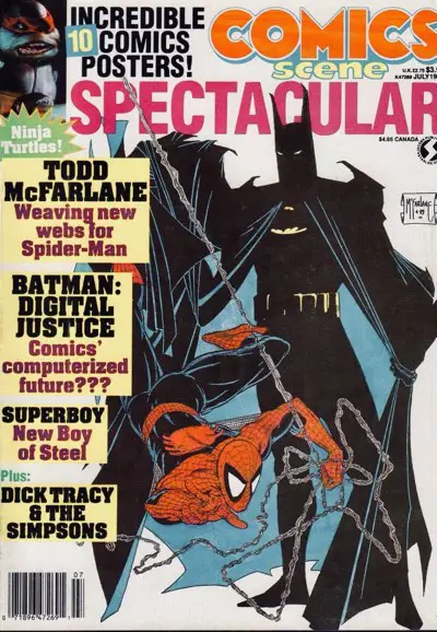
Todd Mcfarlane at Bat(man)
There was a time in comics fandom when the ultimate crossover possibility was — well, it was probably still “Avengers/Justice League of America”. But we all knew that would never happen, am I right?
Instead, there was talk of a Spider-Man/Batman crossover drawn by Todd McFarlane. It was a natural character pairing for McFarlane. He drew three issues of “Batman: Year Two”, and then moved on to become the definitive Spider-Man artist of his time.
Such a book would have made a million bucks, too. Sadly, it didn’t happen. Blame politics or editors who didn’t want to get shot down, or cheapskate publishers who didn’t want to foot the bill, or creators who couldn’t get their schedules lined up.
It did get talked about, but nothing official ever came of it. The recommendation to McFarlane (who wanted Frank Miller to write it, if schedules so aligned) was to do the book and deliver it to the publishers. They would never turn a completed book like that down.
They’re not complete idiots, after all.
Right?
In the end, the best we got was this “Comics Scene Spectacular” cover:
We did eventually get a 1995 crossover event by J.M. De Matteis and Mark Bagley, followed by a 1997 outing written again by DeMatteis, with art by Graham Nolan and Karl Kesel. (The former features the classic line by the Joker, “I always thought of myself as the Orson Welles of crime and chaos– while you, apparently, aspire to be nothing more than… David Hasselhoff!”)
McFarlane was off to Image by then and not looking back.
He did eventually get Frank Miller to write an issue of “Spawn” and then work on a “Spawn/Batman” crossover event. The dream kind of came true for McFarlane that way.
The Next Best Thing?
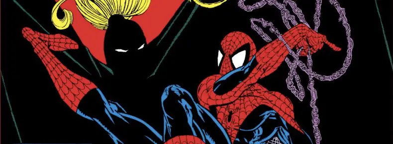
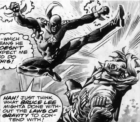
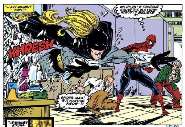
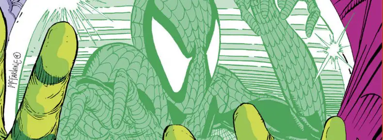
We’re left with “The Amazing Spider-Man” #310, instead, in which Spider-Man fights a mostly forgotten villain by the name of Killer Shrike, who bears an uncanny resemblance to Batman: Gray suit, yellow emblem on his chest, yellow belt, ridiculously long black cape, a black cowl.
The biggest difference from Batman is Shrike’s four-foot-long yellow ponytail flying in the breeze behind him. It looks great but is highly impractical. But, hey, this is comics! Let’s have fun.
He also wears some unwieldy shiny blades on his arms that can cut through Spider-Man’s webbing or decapitate someone who gets in his way. I hopw he’s careful if he has an itch on his nose…
Being a Spider-Man villain, he is patterned after an animal. This is mostly coincidental, though, since Killer Shrike’s first appearance was in “Rampaging Hulk” in 1977.
It being the 70s, naturally, he did Kung Fu:
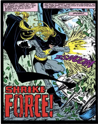
Still, it’s fun to read up more about the shrike, a killer bird best known for impaling its victims. It also has this trick up its sleeve:
They grasp mice by the neck with their pointed beak, pinch the spinal cord to induce paralysis, and then vigorously shake their prey with enough force to break its neck.
Read more about the bird. They’re fascinating and scary creatures. (Surprisingly, they’re not Australian.)
The issue opens as Spider-Man stops Shrike before he can kill a security guard trying to protect a money truck. Shrike gets away and Spider-Man moves on with his life.
But you know how comic book storytelling goes — this is an open loop. It will need to be closed by the end of the story. It will be, and it will be done with all the subtlety of a brick crashing through a stained glass window.
It’s just another day in the life of Spider-Man, randomly stopping major crime in the city. Welcome to New York City, where there’s always a crime to be stopped, even in broad daylight, but especially where Spider-Man might be randomly swinging by.
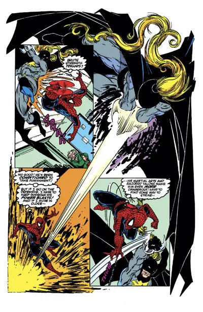
The Shrike sequence makes for a great action piece, and McFarlane shines in it. There’s one slightly confusing storytelling moment where Spider-Man has to deflect a dumpster Shrike throws at the guards, but David Michelinie’s script covers that in the next panel with some thought balloons.
Comics is a team sport, kids. The artist tries to make the scripts look spectacular. The writer tries to make the art make sense.
That scene leads into another two-page sequence of Spider-Man webbing his way around the city and thinking about the issue’s plot. It’s a convenient trick that works for serialized monthly comics like this. Plus, McFarlane fans won’t ever complain because it leads to nice splashy superhero-in-costume art.
And make no mistake — comics have a strong visual component. There’s no shame in leaning into that sometimes.
It is, indeed, good old super hero storytelling.
How Quickly They Forget
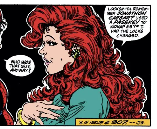
You may remember in the last couple of issues that Mary Jane Watson-Parker was kidnapped by a stalker who lived in the same building. He threatened to mutilate her, and she had to fight him and two security guards off before grabbing a gun and running into Central Park to save Spider-Man with some errant shots. The effects of this horrific event are not forgotten as —
— wait, no, we’re glossing right the heck over them. And we’re using some clunky exposition along the way. We’re only a half step removed from the classic “As you know” dialogue trick here:
And that’s that. Then we’re back to newlywed chat with inferred plans for adult relations that night, using the code word “dessert.” Wink wink.
Before dessert, though, there must be popcorn:
The Disney Connection
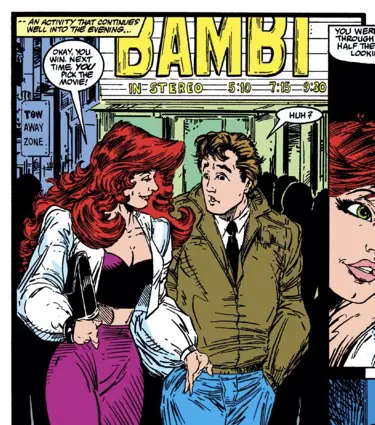
David Michelinie first sent Peter and Mary Jane to Disneyland on Peter’s “Webs” book tour.
Now, on a romantic date night, the two are hitting the city and catching a movie.
Which movie? “Bambi”!
I thought it was an odd choice, but the math seemed to work so I looked it up.
In the age before Disney Plus, Disney had their “vault.” Movies would be re-released every so many years (7-10-ish), about the time you’d think the next generation of kids had come into the world and grown old enough to enjoy the movies.
In the days before DVDs and even VHS tapes, that meant new theatrical releases. I know I saw a couple of Disney movies like that as a kid.
Disney released Bambi in theaters originally in 1942. They sent it back to theaters in 1947, 1957, 1966, 1975, 1982, and — in 1988, when this issue was also published.
Why Disney released Bambi twice in the 80s is probably the biggest question in this scene…
Also of note: Mary Jane again rocking the athleisure, which cycled back into fashion thirty years later. She looks like something out of the Athleta catalog here.
Back to the Story…
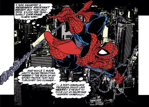
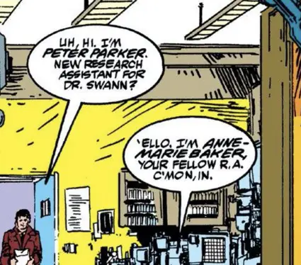
Peter goes to Empire State University to sign up for two classes and to work as a Research Assistant for Dr. Evan Swann, a white lab-coated researcher who’s getting strange deliveries and working in a locked lab room that nobody is allowed in but that sets off Peter’s Spidey Senses.
It’s almost as if something shady was going on in there…
Peter does what any rational thinking adult would do, and pays Dr. Swann a visit as Spider-Man, where Swann immediately folds and admits he’s basically being blackmailed by the Tinkerer.
That didn’t take much effort.
The Tinkerer, you see, is working on a new device for — you guessed it — Killer Shrike. It’s an amazing coincidence. So amazing, in fact, that the author cops to it to help deflect criticism:
In writing, they call that “hanging a lantern“. It’s when something so silly, so coincidental, or so unbelievable happens that a character has to point it out (shine a light on it, as if they were the lantern) to let the reader know that the author knows this is silly and please just go along with it.
There’s a second nice Shrike/Spider-Man fight scene, with McFarlane even going wonky on a page layout with Shrike’s cape. Lovely stuff.
To make a long story short, The Tinkerer defeats Shrike, and Spider-Man hands Swann off to the authorities.
Don’t worry, Swann will get a light slap on the wrist and be back soon.
Where Did Shrike Go?
I couldn’t remember seeing Shrike at all since this issue, thirty years later.
Turns out, I have a very short memory. He was in the “Secret War” miniseries in 2004, and joined The Thunderbolts during Civil War, then The Masters of Evil. Dan Slott used him during his Spider-Man run.
After that, I think he handed down his costume to someone else and — I don’t know. The Wikipedia summary loses me at about that point. I can’t imagine trying to read all those stories.
He’s not forgotten, after all. He turns out to be another one of those lower profile characters of this era that the fans of the time who later became professionals would keep bringing back. See Paladin’s return in Brian Bendis’ “Daredevil,” or Dan Slott including Slapstick in “Avengers: The Initiative.”
Lots of people have tried to bring back Silver Sable, for another example, but she hasn’t stuck. That one surprises me the most. Someday, she’ll be a big player in the Marvel Universe. She has too much potential, despite a ridiculously bad series from the early 90s.
Spawn Watch
The credits to this issue include “With a background assist by Terry Fitzgerald.”
I don’t know where that assist came in, but there is a piece of scientific equipment whipped around at one point that includes “T.F. + C.C.” on it. Fitzgerald and wife, perhaps?
Original Art Watch
Page 12, the Bambi page, is up on ComicArtFans.com. It’s owned now by Dinesh Shamdasani, better known as the former CEO of Valiant Entertainment from the 2010s version of the company.
There’s a picture drawn on the back of this page in which McFarlane indicates his relief that the bi-weekly schedule is over with a drawing of a steaming pile of poop.
Hey, kids, we didn’t have emojis back then! McFarlane had to draw his own, complete with the buzzing flies…
Also, page 29 of the issue is on CAF, with the possibly sad note on it that it’s “Missing Since San Diego”. I wonder if they ever found it?
Reproduction Problems (As Usual)
When I look at those two pages of original art, I can’t help but notice that the final Omnibus/digital version of the issue is a bit… blacker? It looks like all the black ink lines have soaked into the page a bit too much. You can see it easiest in the lettering, where lots of white space between characters shrinks.
I did a couple of quick screenshots of a word balloon to show you the difference. On the top is the original art. The Omnibus/digital edition is below.
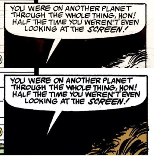
It might feel like nit-picking when you see one sample up close like this, but it shows up across the whole page. It’s not just the fine lines of McFarlane’s inkings, but also the lettering of Rick Parker.
It looks slightly blurry.
I can’t help but think that one day the technology to reproduce art from a combination of original art scans and original comics is going to improve to the point where we’ll get a “Special Edition” of books like this with the art looking 50% better. And we’ll likely have to rebuy things all over again.
The most unfortunate thing is that most of these issues could be fixed today, but it takes more time and money to get it done. And we all know how notoriously cheap Marvel can be…
Speaking of Lettering…
There’s something different about it in this issue. It’s still Rick Parker, but it looks different.
Maybe it’s the reprint quality, but things feel a bit more crowded than usual, and the word balloons feel misaligned. The words inside them have too much open space around them, and often feel shifted a bit towards one side of the balloon.
The thought balloons — and there are many of those, because this is still 1988 — look and feel better. They’re the perfect sizes for the lettering inside them.
Some of it is the reproduction issues, sure, but not all of it.
The circular balloons, in particular, let in too much air.
That’s one of the problems, actually — Parker’s balloons are rarely perfectly circular or oval-shaped. They’re usually lumpy, adjusted to fit the lettering inside.
In this issue, he appears to be using a template to draw a few perfect round shapes. Those, in particular, just don’t work. Look at all that dead space at the top of the second balloon in this example.
I noticed in the original art samples that some lettering was done directly on the boards, while some had to be done separately and pasted in. I wonder if that had anything to do with it?
I’m just not sure.
Hidden Spider Watch
With half the cover taken up by Killer Shrike’s cape, there aren’t too many places for McFarlane to hide the spider this month.
Don’t worry, he worked it out.
Check out the right side of the building at the bottom of the cover.
Felix Watch
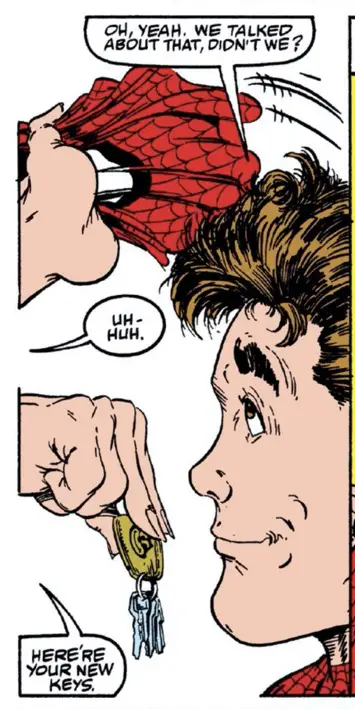
He’s on the keychain Mary Jane gives Peter. You really have to squint to see it, but trust me. That’s Felix.
Spider-Man Was Sick of Covid in 1989 Already
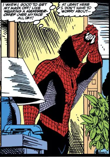
Unlike that jerk Batman, whose mask leaves his mouth and nose uncovered!
BD Recommendation
If you liked this issue, I have a recommendation for you from the world of les bandes dessinées, or Franco-Belgian comics.

“Miss Endicott” is a two part series featuring a Victorian-era woman who is something like Mary Poppins crossed with a superhero. Not that she has any powers, but her long dress can be drawn to look like a cape and she carries a pair of knitting needles up her sleeves that she can use to fight her way out of any situation.
Look at that hat on top of her head! It’s a cowl! You might as well draw a couple tall pointy ears in the back and make it official.
Stretched metaphor aside, “Miss Endicott” is a great steampunk-style book with amazing visuals from artist Xavier Fourquemin and colorist Scarlett Smulkowski. It’s a wonderful blend of cartooniness and storytelling.
Read all about it in my reviews of part one and part two of the book, plus my special appreciation for the art and storytelling skills of Fourquemin and Smulkowski.
Next Issue
The first of two “Inferno” related issues brings us Mysterio. But really, it’s the issue after that where things go completely bananas.
Be careful, you wrote 1998 there instread of 88.
This is one of my least favourite periods of ASM as Todd’s art was becoming even cartoonier than when he was on the Hulk and the writing saw a significant decline with that batch of issues where MJ is a pure plot device, an excuse for her to be in trouble and justify stuff to happen to Spidey, recalling the worst Aunt-May’s-medication-drama days of yore.
This issue is so poorly written that before now I didn’t even notice the obvious Batman references that you point out, Shrike being such a lame villain and all. Michelinie was bearable on Iron Man, probably saved by the JRJR+Bob Layton art team, but here he totally lost me. This is about the time I started straying from mainstream comics and discovered Cerebus, Omaha, Jon Sable and Grimjack, a whole new world for me from the bargain bins.
This one post I’m coming to from the newsletter link, let’s see if it shows up on my RSS feed this time, as the previous ones on that section of the site didn’t.
Thanks for the date correction — it’s been fixed. I’m surprised I haven’t done that more…
I had to make the decision when I started The McSpidey Chronicles to not let it be me poking fun at the stories and McFarlane’s maturing art. I did that more when I wrote the original pieces. It seems like more fun now to let a bit of the nostalgic glow come through. That doesn’t stop me from pointing out issues or taking shots here and there, but it’s too easy on the internet to be that all-knowing jerk who corrects every stupid little thing from thirty years ago as the world has moved on.
This book definitely rates highly on the scale of old-fashioned storytelling that is not so common these days, and a large part of that is just from the way comics are made and distributed. Everything has to be an event. Everything has to be a six-issue story arc. Everything has to be so damned serious and, even better, “dark.”
This book, like all the books I read when I first got into comics — even though I was still a few months from starting to read comics as of this issue — has this style. It’s the monthly serialized comic book thing. Recap everything, use everyone’s names constantly, jam everything in for the first-time reader, etc.
I’d probably be bored to tears by the older stuff where things were completely overwritten and the art was more boring, though the storytelling was stronger.
I am an imperfect vessel. 😉
I did get to Cerebus a few years later, and read a little of those classic First Comics out of quarter bins and later reprints. Some I liked, and some I just couldn’t get into.
I’m sorry if the RSS feed is acting up. This one is a separate feed from the main PipelineComics.com site, so make sure you have a separate subscription.