
Before and After: Todd McFarlane’s Pencils and Bob McLeod’s Inks
When Todd McFarlane first joined “The Amazing Spider-Man,” Marvel Comics sent retailers a photocopy of the pencils of his first issue, #298, to show them what the new guy was capable of.
Thankfully, I was able to procure one of them. They printed out a little light. These might have been faxes, for all I know. You lose some detail from Todd’s pencils, no doubt, but the gist of what Bob McLeod had to work with is there.
It gives us a great opportunity to see how an inker’s work can emphasize, enhance, or change the original intent of the pencil artist.
It’s also interesting from the perspective that Todd McFarlane wanted to ink himself and may have been penciling with the final look in mind. There are definitely places in the pencils where you can see how his inks would look, but that McLeod went another direction with.
Let’s take a look at a few panels from the issue to see how McLeod inked over McFarlane’s pencils.
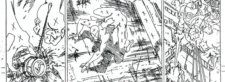
The Redrawn Panel
This is the bottom of page 7. The most drastic change we see is in the first panel.
It’s completely redrawn.
Spider-Man Doesn’t Sit!
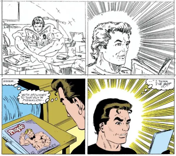
I don’t know if McFarlane redrew it, or McLeod. It might have been someone in the Marvel Bullpen, for all I can tell. Given how little of it would be identifiable as any particular artist’s style — let alone McFarlane’s — I would guess the Bullpen fixed this one.
No matter who did it, I wonder why? The point of the panel is to show Peter seeing the copy of “People” magazine and it sparked an idea to play the role of a Chippendale dancer for Mary Jane.
I’m guessing the reason here is that it was seeing the cover that sparked this idea in Peter, not from sitting down and reading the magazine. It wasn’t an article on the inside of the magazine, but the image on the outside that he just happened to see from across the room.
I think the original pencil version of the panel is far more interesting. It still shows the cover of the magazine, so the reader is getting as much info as they need. But the sight of Spider-Man sitting on the coffee table is much more visually appealing than the look over Peter Parker’s shoulder.
The Face of Peter Parker
The second panel stays more true to the original pencils, but still has tweaks to talk about.
This panel always jumps out at me in this issue. The speed lines are a wild addition, but Peter’s face is just… weird.
It’s all McFarlane’s fault as far as I can tell. McLeod remains true to the speed lines, but his changes to Peter Parker are minor. The biggest is just the hair. McFarlane’s hair is always constructed with lines that trace the direction of the hair, from start to finish, front to back. McLeod inked it as a solid chunk of black with room left in the highlighted section for the color.
I bet if he had inked this as issue #320, he’d recognize better what McFarlane was going for and aped it better.
This happens throughout the issue, and we’ll see more of it in later examples. Again, we have the gift of hindsight here to know what McFarlane was really going for. McLeod didn’t have that. He had only what was on the page, and he was being paid to give his interpretation of that. And he was from a different school of art, so to speak, so things wound up looking different.
The lines McFarlane drew on Peter’s neck to indicate a shadow are gone and a couple of outlines on his chest and shoulders are eliminated completely. Peter’s eyebrows are naturally bushier. MUCH bushier. The crease line coming out of the side of his nose along the cheekbone is gone, likely for fear of it making him look older. There are, instead, some new lines that help outline his cheekbone.
Finally, in keeping with the change in the previous panel, the final inked version has Peter only looking at the cover of the magazine. McFarlane’s original pencils show Peter opened to the middle of the issues somewhere. I like the look of the open magazine better.
I’ll Make This Brief(s)
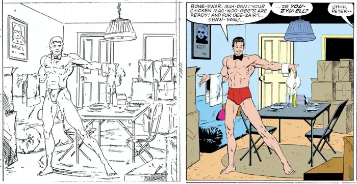
Pete’s underwear showed a little less coverage in the pencils over the final inks. He went from thong to briefs there. I bet Editorial made a suggestion. (Also, this is not the last time McFarlane will draw Peter in naught but his Fruit of the Looms. Stay tuned for “The Amazing Spider-Man” #317.)
Behind Peter, McLeod has fixed some issues with the table. The chair to the right sat way too low in the pencils. The diagonal crossbar supports are much higher up.
Where McLeod may have made a minor error is that his two chairs have two different backs. The one on the left has a rounded top along the back, while the right one is squared off. In the pencils, McFarlane drew both folding chairs with a rounded off back.
This is the peak of my nit-picking in this article. No sane person would notice that.
Here’s the biggest change in those chairs, though: McLeod fixed them to look like real folding chairs. Maybe they have a different style of folding chair up in Canada, but McFarlane got them all wrong here. McLeod fixed the chairs so they would work and actually fold up on themselves. McFarlane has the back of the chair sticking up from the back of the seat. McLeod reattaches it to the leg underneath the chair, the way a real folding chair works.
The Troubles With Hands
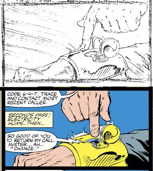
Here, Chance is doing something with the wristband of his costume.
The first problem is that Todd McFarlane drew six fingers on Chance’s visible hand.
The second problem is that he drew Chance with two left hands.
McLeod — or perhaps, again, someone in the Marvel Bullpen — cleaned that up with a brand new hand.
It also now points to the opening in the gauntlet. I think McFarlane’s original intention was that Chance was touching a button on the opposite side of the gauntlet, and that caused the top to pop off on the near site. Those are motion lines in the pencils showing the top opening up. Those motion lines were covered by the newly redrawn hand, though, so that action may have been missed entirely.
The speed lines — “burst lines”, maybe? — on the left side of the panel aren’t inked in. With all the lettering there, they would have been a distraction. Also, they weren’t at all necessary.
Nit-Picky Texture Change
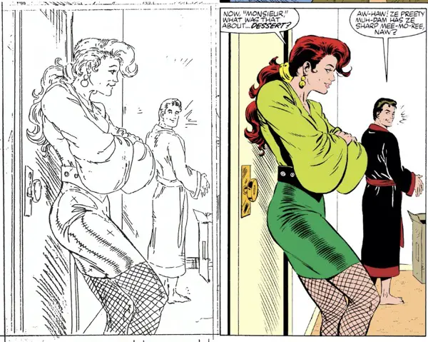
In McFarlane’s pencils, Mary Jane is wearing a leather mini-skirt. In a previous panel to the one shown here, McFarlane even has the “x” marks to fill it in all black.
The final inks ignore those requests and make it something else entirely. In fact, the lines left open on her skirt in the pencils is the area McLeod drew in the shadow line. It’s at the high point of the side of her leg where the shine would be the greatest, not the least. (Unless he’s indicating strong light sources from both sides of her leg here, where a shadow in the middle would then make sense. That kind of lighting, though, is very specific and I don’t think that is what’s happening in this room.)
I wonder if the concern was that it clashed with Peter’s black robe. It might have flattened out the image to have those two black areas just about touching in this large panel. But, then, McFarlane’s art doesn’t indicate that Peter’s robe would be black anywhere.
Why reverse the two color choices in the inks, I wonder?
There is a note from McFarlane written next to the panel that says, “Inker: Keep MJ’s belt open.” That definitely mean he’s trying to offset it from the black of her skirt.
Bonus non-inking point: McFarlane blatantly breaks the 180 rule in this sequence from the first to the second panel:
The crazy thing is, it almost works here. You are flipping the virtual camera around, but it’s also a mirror image on the page. You need to combine the camera angle with the panel position of the page, and the placement of the two panels relative to each other. Your eye follows the movement very easily.
This is where the parallels between film and comics can break down — comics aren’t a single viewport through which everything has to be seen. Comic artists can create their own viewports. And the layout of those ports helps to tell the story. Filmmakers don’t have that luxury, so their rules need to be a little tighter
Film directors don’t need to worry about word balloons guiding a reader’s eye across the screen, or left-side panel stacking.
The comparisons are mostly valid, but still require thought and analysis on a case-by-case basis, depending on the medium.
McFarlane’s Windows on the World
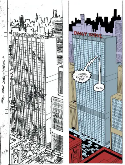
This is an establishing shot of the Daily Bugle building on page 5. I’m fascinated by the shines in the windows. McFarlane clearly draws some thin diagonal lines across lots of the windows in the front of the building. To my eye, it gives a reflective quality to the building, probably echoing the sky above it and the angle of the sun in some way. It looks cool, and it’s something I know we’ve seen McFarlane do in other books when he inks himself.
They’re all gone in the final art. Also gone is the extra thickness on the vertical lines between every pair of windows. That helped add a bit of dimension to the front of the building.
Curiously, there is a note in the margin that might explain it: “Inker: Forget Shines in Windows?”
McLeod forgot them, indeed. Plus, let’s be honest, there’s more than enough line work in that building already.
OK, so maybe McFarlane was unsure if they worked or not. I think they did. He wouldn’t figure it out until later issues when he could ink himself.
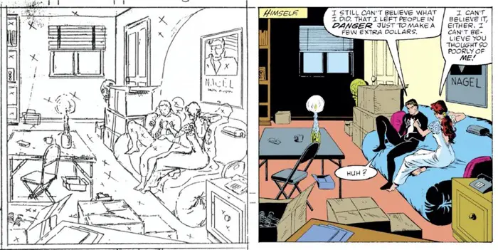
Peter and Mary Jane At Home, Part 1
There are two things worth looking at in that first panel:
First, McLeod fixes Peter’s left hand. In the pencils, it appears that the thumb is folded into the palm upside down, and then the left side of his hand bows out in an unnatural way. It might have worked if that finger was pointed another 45 degrees to the right, but not with it straight up like that.
It looks like McFarlane was drawing the whole hand tilted down more to give you a down angle on that thumb, maybe? It’s tough to tell because the rest of the fingers are hidden behind Mary Jane’s face and are just blacked out.
Second, the front of Mary Jane’s hair is completely different after the inks. It looks like McFarlane was drawing something like bangs that pop off the forehead and curl up into the air, while McLeod drew that portion of the hair going in the same direction as everything else on top of Mary Jane’s head.
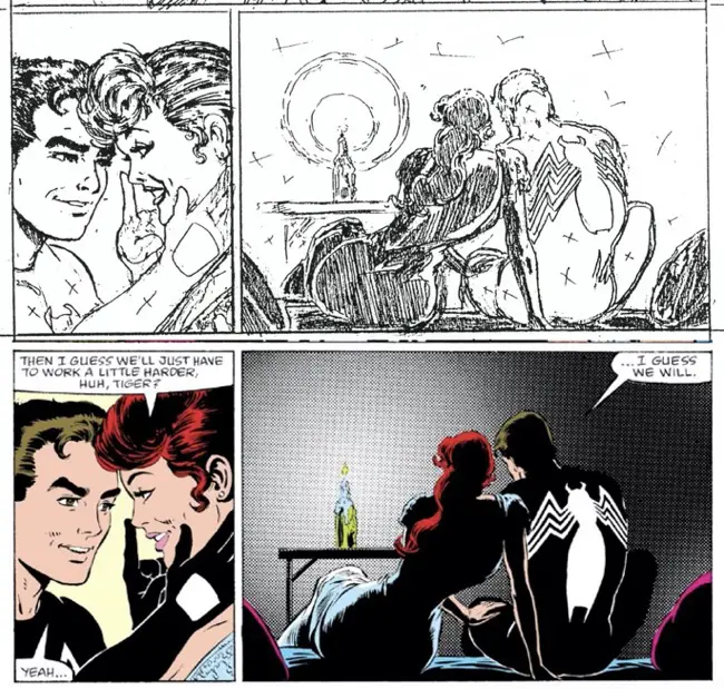
One Well-Toned Panel
The most interesting part of the second panel is the way McLeod added a tone for the background here. Even more impressively, it’s one that gets dark radiating away from the candlelight. This is a long time before Photoshop became a common inking tool. He had to have that sheet somewhere to cut out and use. It’s the perfect tool at the right time. I like the way it works.
Also, it would have made for a VERY dark panel if that back wall behind the candlelight was black. The entire panel would consist of nothing but a couple of outlines. McLeod did a good thing here by giving Mary Jane and Peter something to be more contrasted by. McFarlane’s all-black approach to the panel would have made it look like the candle’s light only radiated out about six inches.
Also, an all-black panel like that with thin highlight lines might have printed poorly on the newsprint of the time. It’s a bit of a miracle that it printed out as well as it did in the original comic.
And with a few small and deft brush strokes, he even made sure to show the small lit-up portion of the couch where they’re sitting with the crumpled-up parts coming off of them. The couch is reacting to them sitting in it — they’re not just sitting on top of it. They sink in a tad.
Peter and Mary Jane At Home, Part 2
There are a lot of occasions in this issue where McFarlane indicates black walls in the background. Often, there’s a circular shape cut out of it, like the single light source is shining just to those edges.
This panel is from the same scene as the previous example, just from a different angle. That tall candle that appears to be sticking out of a wine bottle on the table seems to be that light source, but McFarlane’s black walls seem to suggest that the light was only shining towards the couple of interest.
McLeod kept the black back wall that would be further away from the light, but kept the light on the side wall behind Peter and Mary Jane.
He also added the black shadows to the front-facing sides of the boxes in the foreground, facing away from the candle. That makes sense.
McLeod also fixed the calf muscle on Peter’s leg that’s up on the couch.
The Venom Page
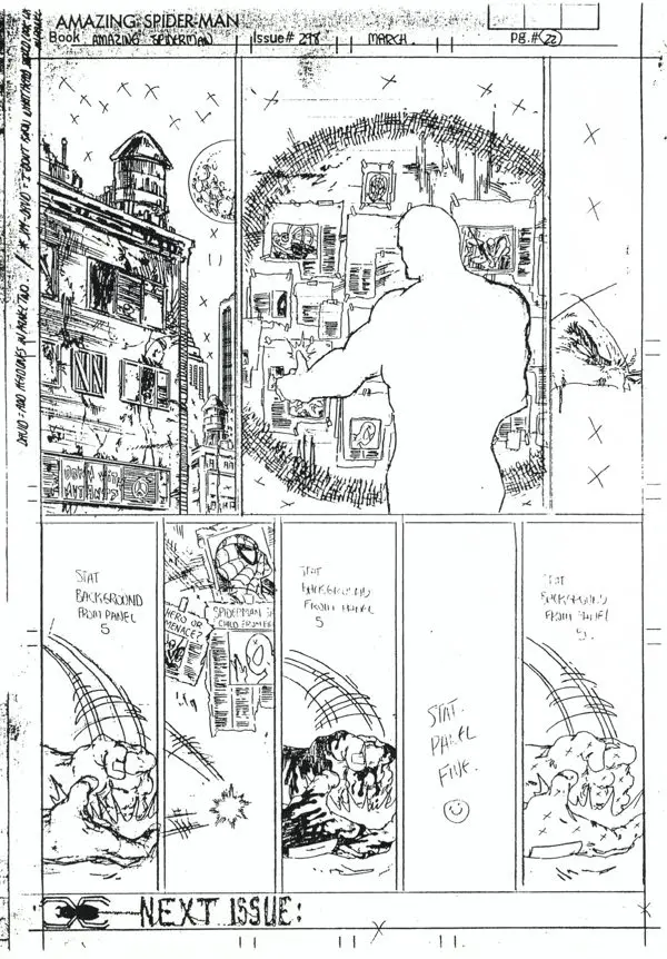
This is the last page of the issue, and the one you’ve probably seen the most often — Eddie Brock standing in front of a wall of newspaper headlines, banging his fist and turning into Venom.
You can see in the bottom tier of panels that McFarlane wrote in his own headlines for the newspaper clips on panel 5. His handwriting stands out. That panel then got statted — photocopied — across the rest of the tier, with the fist in the foreground in three of those five panels.
But in the bigger panel above that, he didn’t write in the headlines. Either McLeod did those or someone in the Bullpen. It might even have been one of the credited letterers, Rick Parker or Ken Lopez. (You can tell the difference when they trade off pages, but don’t ask me which is which off the top of my head.)
McFarlane wrote a note in the margin, “David: Add headlines in panel two.” I don’t know if Michelinie wrote the headlines or not.
You can see the difference between the handwriting in those headlines and the ones that McFarlane drew, for sure.
One interesting note in the left margin:

“Jim-David: I don’t know what head should look like in panel”
It was cut off there in the photocopy, but it has to be Eddie Brock he’s talking about in Panel 2.
Those who enjoy arguing about “Who created Venom?” may use this as whatever grist for their mill they need… I offered my opinion on that debate in my review of “The Amazing Spider-Man” #300.
Two last quick thoughts:
- McFarlane started the lettering at the bottom of the page to tease the next issue, using a spider web to form the letters. The letterer filled in the rest.
- About half the pages of this book weren’t drawn on boards specially make for Marvel Comics. Nope, these boards were “The Amazing Spider-Man”-specific artboards. (See the stamp all the way up at the top of the page.) Fancy!
The Point of This Whole Thing
Inkers don’t just trace. They also assist the penciler and make small tweaks and fixes. They think about the scene, the lighting conditions, and what makes sense. They think about what lines help and hurt the final product. They try to balance the heavier dark areas with the lighter, more open areas.
In McLeod’s case, he also helped to fix some rookie mistakes from a young artist who was over-committed, drawing two books a month. Simple mistakes bleed through with those kinds of deadlines.
McLeod was, overall, very faithful to McFarlane’s pencils, made a few changes to improve them, and had an overall style that feels a lot brushier and more traditional than what McFarlane must have envisioned for his art.
Like most artists, McFarlane wanted total control of his art. Inking was the key to getting that.
After two issues with McLeod on inks, McFarlane got his wish with “The Amazing Spider-Man” #300.
The rest is… McHistory.