
Venom In the Sewer Splash (Hyperanalysis)
Have you ever stared at a page of comic art for so long that you start to see all new things? Have you ever questioned every decision an artist made on a page? Have you wondered why he made that mark or if the page would be better without that mark, etc. Do you question anatomy, perspective, and detail?
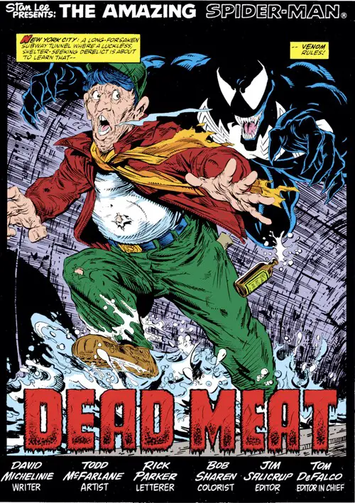
It happened to me recently with the splash page to “The Amazing Spider-Man” #316.
At the risk of ruining the page or all of Todd McFarlane’s art for you, I’m going to share all the silly little things I thought about.
The Page Writ Large
First of all, let’s be realistic. The average consumer of this comic spent roughly 10 to 15 seconds on this page. That reader probably thought Venom looked cool and then turned the page as quickly as possible.
Some decisions made on this page are a product of their time, and we’ll discuss those as we get there. Printing technology had only come so far. Colors were limited. Coloring techniques were in the stone age compared to what Photoshop gives you today. Work that was once done by the artist or inker is now finished by the colorist.
And, of course, the image you see above comes from the digital edition reprinting the issue. The actual newsprint edition from 1989 has the same colors but looks wildly different. I won’t be covering the coloring too much in this article, so I’ll let that slide for argument’s sake.
Having said all that, let me nitpick this page to death.
Speed Lines
McFarlane loved his speedlines, even when they made absolutely no sense. There are panels in this run of comics that feature a headshot of a character standing absolutely still that include speedlines as the background.
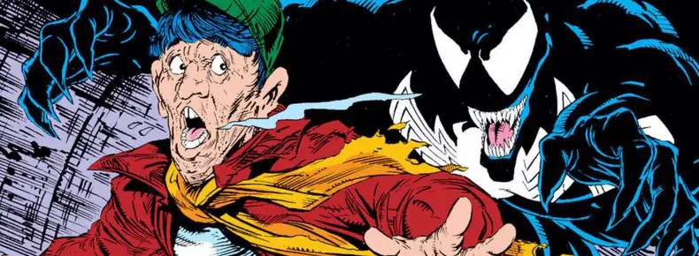
With this page, there’s definite motion happening. The, uhm, homeless person (we can’t say “bum” anymore, but I wouldn’t be surprised if that’s how David Michelinine characterized him in his script) is running as fast as possible through the sewers away from Venom.
McFarlane drew speedlines behind him against the walls of the sewer tunnel. It’s a logical place to put them, but are they necessary? Doesn’t that purple area behind the homeless man just look ridiculously busy for little reason?
The arcing vertical lines that help define the shape of the tunnel make sense. There’s a nice bit on the far left side where one of those lines is inverted along the shadow of the homeless man. It’s the same technique that Frank Miller used gloriously in “Sin City” when someone’s shadow would reveal a brick wall behind them where the bricks were black and the area between them was white.
It’s a simple little inking trick, but it always looks good to me.
What about those straight, horizontal-ish speedlines behind him, though? They don’t run completely across the page. They’re broken up by the lines that indicate the curvature of the tunnel or where the homeless man or Venom intersects them.
What if they weren’t there at all? If you removed all of those, you’d help put the spotlight on the two characters on this splash page. The background would be cleaner and function more as negative space.
I think of the kind of work Chris Samnee does today where he can pop a character off a white background like that.
Not all of the lines are excessive, though. The ones at the bottom of the tunnel and the ones in the upper left help make the tunnel look darker. At a time when colorists weren’t able to do gradients well due to printer technology, the line work had to sub in for that. We’ll get to more of that later.
But if he had just drawn in those lines, the whole composition would look lopsided.
One thing’s for sure — everything in this panel is about action and motion. The secondary characteristics are what sell it. Look at that splashing water all around or the bottle that’s dropping from his hand. See the scarf flying back, the man’s breath crystallizing and moving backward, or how he leans forward as he runs, one leg stretched all the way out and the other raised as high as it could go.
McFarlane chose a moment of peak action to sell the moment. It works.
Melting Into the Shadows
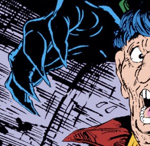
The way McFarlane inks this page so that Venom is practically melting out of the shadows is an effective trick. It’s just cool. He only has to draw the rim light on Venom’s shoulders and he’s done. The hands are more detailed because it’s easier to see what’s going on.
It’s not a unique thing. It’s a trick Batman has used countless times in comics. You can see Cloak and Dagger using variations on it. It’s a neat trick that fits this character well, and McFarlane was never afraid to use it.
Look at the excerpt from the splash page at the top of this article. I chose that composition to excerpt because it fit into the template I use for these articles, but it also works well to illustrate this point. The composition is great: the shadow surrounds the homeless man, and Venom is a part of that shadow. They have matching outstretched hands toward the reader, but Venom’s other hand is reaching around to grab the man from behind. It’s great.
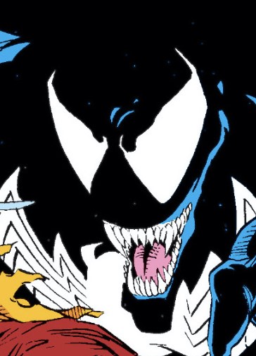
What’s going on with Venom’s mouth, though? That left cheek line starts pulling up and off his teeth above his fang instead of at the corner of his jaw where the upper and lower mandible meet. It looks really freaky. You could easily argue that Venom is a horror character and having his evil smile be lopsided while he bares his upper gums like that is perfectly in character. Having the line move across the side of his face starting at the meeting of the jaw would likely make him look more like The Joker.
Also, nobody reading this comic in 1989 stuck around long enough to notice that on this page. The coloring and print reproduction probably hid the whole thing.
McFarlane would draw Venom again melting into the shadows a couple of pages later. It’s another excellent use of the technique. I love it a lot. Again, the speedlines are questionable, but I’ll forgive it here.
That “Keep Out” sign in the upper right strikes me as funky, though. It looks like the kind of thing where the sign would spread across the whole door, but now the lettering is shoved in the lower left corner just so the reader could see it.
Or, I might be assuming far too much about a simple sign on the door. Also, the “Keep Out” sign is redundant to the bar that’s keeping the door shut under it anyway. That is not very welcoming.
The Face
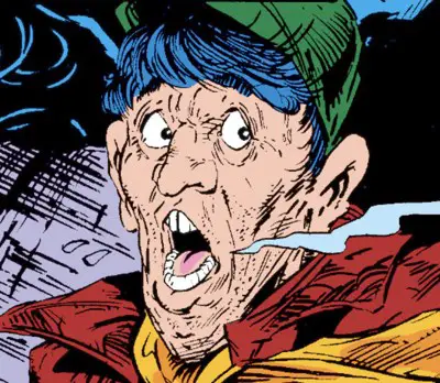
Is it Moe from the Three Stooges? That hair makes it look like him, but I don’t think that was an intentional choice on McFarlane’s.
His regular humans always have a bit of a grotesque look to them in some way. Their ears or their noses are abnormally large. Their heads have funny shapes. Their chins double up or disappear. Buck teeth or fangs start sticking out. (It’s buck teeth with a gap here.)
McFarlane cartoons the crap out of “average humans.” The second he doesn’t have to be On Model with a Marvel Universe character, you get to see what he really wants to draw. I enjoy seeing how crazy he can draw them. He peaks, I think, during the Morbius storyline of the adjectiveless “Spider-Man” series. Those people were outright cartoons.
The homeless man is also so drunk or so scared that he’s lost all the color in his eyes. All that is left in there are the pupils. The colored irises are missing completely. (I told you I would be nit-picky here, didn’t I?)
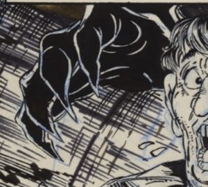
If you look closely at the original art, you might see something else that McFarlane changed between his blue line pencils and the final inks. It looks like Venom’s hand behind the man was meant originally to show Venom’s thumb sticking out forward. Look for the blue line outline of a thumb right behind where the two inked-in sweat droplets can be seen.
I think it would have helped the face jump off the background to have a black outline around it more. It might also have been more threatening to see one more claw. McFarlane must have seen it differently — maybe leaving the hand more open made it look more like it was about to latch onto Moe’s face.
Yeah, I’m calling this guy “Moe” from here on out…
The Feet
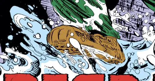
I love Moe’s floppy clown shoes. Or, “shoe.” That back foot is hidden by the water it’s splashing in, as well as the tall title lettering. I should add “Hide Behind the Lettering” to my comprehensive list of ways comic book artists avoid drawing feet. To be fair to McFarlane, there’s no hint of that foot with the blue lines in the original art, either, so it looks like it was always meant to be hidden in the water.
But that front shoe! It’s round and bulky and feels like the right size for the splashes in the water that it’s making.
It’s round and bouncy almost in the same way the man’s face is. I like it.
Appreciating Rick Parker’s Lettering
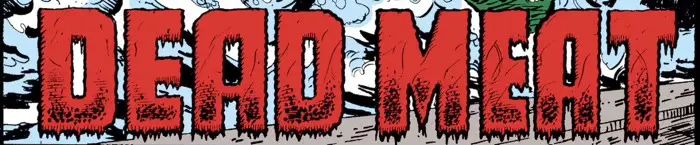
I admit that I was never the biggest Rick Parker fan. His lettering gets the job done, but it never looked clean enough to me. It always felt too irregular and just a little messy. His letters don’t have the clean precision of Tom Orzechowski’s or Todd Klein’s, nor do they have the enjoyable style of John Workman’s.
But I love this title lettering on the bottom of the splash page. It fits the tone of the story and the story point it references, including the red coloring from stalwart Spider-Man colorist, Bob Sharen.
It’s the texture in the lower half of each letter that sells me, along with the dripping edges along the bottom edge of the letters
It’s also not all straight, perpendicular, squared-off lines. Every straight line is drawn with bumps or a slightly wavy line. Check out the rounded top-left edge of the “A”s to see the little extra variety he added to create more interest and avoid another 90-degree angle.
I also imagine his panic as he’s drawing the second word, realizes quickly he’s running out of space and shortens the width of the “E” and the “A” to accommodate it.
If I really wanted to be nitpicking, I’d also point out how tight the kerning is between those two letters, particularly next to the bigger gaps with their surrounding letters.
But that’s diving DEEP into the realm of lettering nerdery and I just want to apologize in advance for that one. This is the glory of hand lettering! The imperfections make it organic.
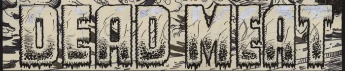
It looks like he made a late change in the lettering on the original art, too. There’s a lot of whiteout used to remove details from the top of each letter. I think he realized he wanted to keep the tops of the letters clean and have something of a gradient effect going down the letter to the heavily-textured and bumpy bottoms of each letter. The way he mixes ink dots and slashed lines at the bottom looks McFarlane-esque. In fact, if you told me McFarlane lettered this title treatment on the page, I’d believe you.
Hyperanalyzing Things
I’ve clearly overthought this page, but it is interesting that a page that might take an artist a full day to draw is a thing we usually skip past in less than a minute. With a splash page like this, it might be less than ten seconds.
Yet, hours of work went into it, including a lot that might not be shown on the page — rough layouts, alternate poses, maybe even a test-drawn hand on the back of the page to make sure the perspective or anatomy was correct before laying it down for the final image. This is to say nothing of the original pencil work, which is mostly hidden by the inks.
If you just spent ten minutes reading this article, you’re still hours behind the work McFarlane and Parker put into this page.
It’s worth stopping to consider what we read and how it’s made sometimes, I think. We can learn a lot about what works and doesn’t work from an exercise like this. It’s why I enjoy doing it so much.