
Origin of The Spaghetti Webbing
Todd McFarlane did not originate Spider-Man’s spaghetti webbing style. He’s always been open about crediting it originally to a Michael Golden piece in a portfolio he remembered from the early 1980s.
Let’s look at the evolution of Spider-Man’s webbing, then, before we get back to what McFarlane remembered and how right he was.
Steve Ditko’s Webbing
This picture comes from the Library of Congress’ collection. They have the original art to “Amazing Fantasy” #15, which was Spider-Man’s first appearance.
You can see in Ditko’s art that the webbing is very single-stranded. When the streams cross, they magically form some kind of webbing.
Don’t think about it too hard. It’s a comic book meant to be drawn to look cool, not to apply all the laws of physics. Webshooters are a made-up technology, and their webbing can do whatever its creators say.
Keep in mind that that panel is from Spider-Man’s first appearance. Ditko settled quickly into a webbing that looked wider and flatter. It looks like an Excel spreadsheet shooting out of Spider-Man’s wrist and getting wider as it goes.
It also only carried so much momentum. In some panels, you can see how a long shot would only go so far before gravity would take hold and give the line a long arc. We’re so used to seeing Spider-Man’s web shooter spitting a web straight to the building he’s trying to attach to, we don’t often stop to think about gravity’s effect and just how fast the shooter can shoot.
Side note: I had to flip through a lot of Ditko-era Spider-Man comics to get a good webshooting panel. Spider-Man spent a lot of time early on walking on wires to get places. He’d climb the side of buildings. He didn’t just randomly swing everywhere.
John Romita’s Webbing
By the time Todd McFarlane came around, it was John Romita’s Spider-Man that I think most people associated the character with. It was the drawing of the character on the paychecks and the Marvel letterhead. It’s the one that showed up most often on the Underoos and all the licensed apparel.
So how did Romita draw the webbing?
He drew it like Ditko did — flat and wide, with an array of webbing. Romita does give them some curves and shapes to accentuate a movement, at times and when appropriate.
But there’s no change there.
Pre-Todd McFarlane
Alex Saviuk preceded Todd McFarlane on “The Amazing Spider-Man.” You can read my review of issues #296 – #297, but his webbing does form an interesting bridge between Ditko and McFarlane.
It definitely feels more coiled up here. It’s a series of circles around a core line. It’s not the flat web shooting out anymore. It’s not completely consistent. There are panels where it looks flatter, but most of it is drawn like this.
It isn’t yet drawn to the specific degree that McFarlane did it, but it is interesting that it’s evolved this far.
Obviously, there’s a lot of Spider-Man being drawn between Romita and Saviuk here. I can’t narrow it down to exactly when this rounder style of web started, but it had started to change by 1988 when McFarlane started.
Michael Golden: The Portfolio
In an interview his then-editor, Jim Salicrup, did with McFarlane in “Comics Interview” #81 in 1991, McFarlane said this about the origins of the webbing:
The webbing idea came from an old black-and-white piece. Years ago, you guys used to put out these black-and-white portfolios, around 1980 or something like that, and there was one piece that was The Defenders by Mike Golden, and for whatever reason he had Spider-Man in it. He did this great Spider-Man with this funky webbing, and I kept that piece out of all the pieces. And I go, “If I ever turn into a comic-book pro, and if I ever work for Marvel Comics, and if I ever get to do Spider-Man, I’m going to do webbing like that!”
Todd McFarlane
[…] He had to do it straight, it was my idea to make it kind of like a cowboy guy…”
McFarlane spoke off the top of his head, a decade after seeing the portfolio. We can look back now with the gift of hindsight and Google to fill in the blanks and correct the minor details for the record.
By the early 1980s, portfolios were a thing. They were limited edition collections of 11 x 14 prints (sometimes black and white, sometimes painted colors) in an envelope. It’s not something we do anymore in comics, outside of a few done by IDW. But in the 1970s and 1980s, some amazing portfolios showed up.
It looks like the portfolio that McFarlane always references is not a Golden-specific portfolio, though those do exist. There’s a Doctor Strange one that you can find easily enough if you Google around.
The origin of the spaghetti webbing came from a piece by Golden in the “Marvel Team-Up Portfolio”, published by SQ Productions in 1981. Here is what it looked like on the outside:
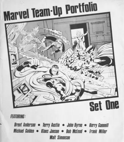
Other artists in that collection include (but are not limited to) George Perez, John Byrne, Frank Miller, Walt Simonson, and Brent Anderson.
You can see how Byrne drew Spider-Man’s webbing on the sleeve (“cover”) of the portfolio above. It’s more of a liquid line that shoots out in a slight arc.
Spider-Man appears in several of the pieces in that portfolio that I’ve seen, but he’s not shooting his webbing in all of them.
He does fire away in George Perez’s contribution:
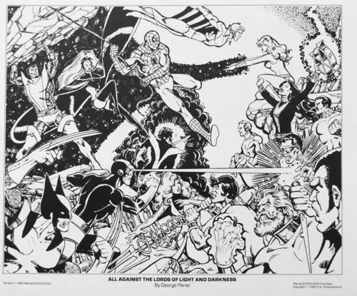
Here’s a close-up:
It’s not quite spaghetti webbing, but it does look like a silhouette of it. It is a line with a series of ridges or bumps on it.
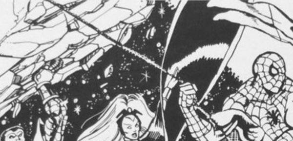
Let’s get to Michael Golden’s piece now, which is a Marvel Team-Up of Spider-Man and the Defenders:
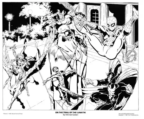
Here’s the close-up:
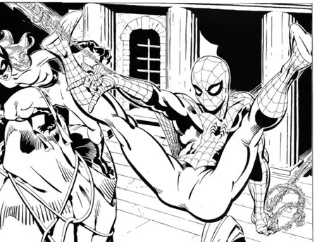
Yup, that’s definitely the style McFarlane went for. Golden’s is a bit looser than the final design that McFarlane would land on. McFarlane’s webs started fairly close to this, but tightened up and became more intricate the further along he drew them. We’ll take a look at that next.
Also, that looks like a prototypical McFarlane Spider-Man pose. McFarlane would bend both legs, but that back arm straight down looks right out of McFarlane’s pose book.
McFarlane would also color in Spider-Man’s pants with more black ink, which would help deflect from the glaring crotch shot that this art is.
There’s not a huge sample of the spaghetti webbing there to inspire McFarlane. The back arms with the lasso-like loops of webbing are the best, most action-packed part of it. McFarlane said he wanted to “cowboy up” the webbing, but it looks a lot like a lasso there in Golden’s art already.
McFarlane would definitely use this style, but push it even harder, giving the webbing a life of its own. Sometimes, it didn’t obey the laws of physics. That’s OK, though, because it LOOKED cool. That’s enough sometimes.
Golden also, in 1982, drew a Marvel promo piece that featured Spider-Man front and center, hanging off one of his webs:
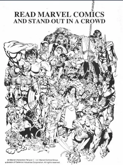
Here’s the close-up:
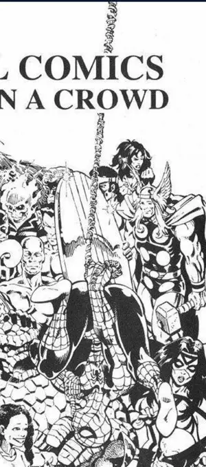
The webbing wasn’t a one-off thing for the portfolio. It was the way Golden chose to draw it.
Also, in looking at some of the kids’ faces in this ad, I can see the influence of Golden’s style on McFarlane’s, overall.
(If you want to see more portfolios of the day, check this blog out.)
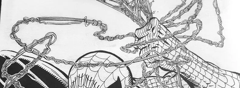
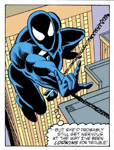
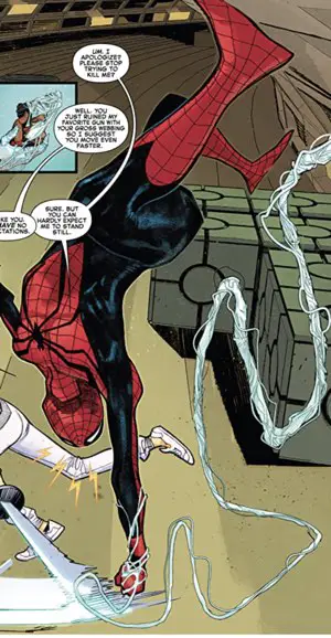
Todd McFarlane’s Spaghetti Webbing
Here’s the first panel of “The Amazing Spider-Man” #298 where McFarlane drew the webbing. Keep in mind that he didn’t ink this page.
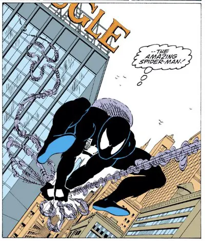
This is a really loose version of what McFarlane’s webbing would become. It looks like a core of several strands with a familiar set of squiggly lines hanging off it. But it feels more like an impression of McFarlane’s final webbing design. This is a loose interpretation of the final spaghetti webbing.
It is, however, a dramatic difference from what Saviuk drew the month before. It looks more three-dimensional, more organic, and slightly wilder.
We’d get a better idea of McFarlane’s initial vision of the webbing by looking at the cover to the issue, which McFarlane did ink, himself:
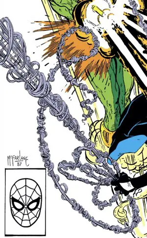
We can see here how he draws the webbing in three dimensions. As it shoots out at the reader — as it does in the upper left of this section — the inner strands separate and the strings of webbing wrapped around it get bigger and more dramatic.
Compare that to the webbing from adjectiveless “Spider-Man” #1
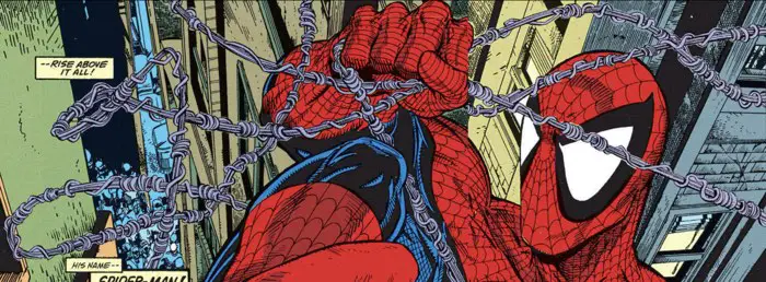
None of this is sticking out towards the reader, but it does look tighter and more defined. It’s a solid tight three-string center. The webbing wrapping around it is better defined and even includes some carefully placed shadows to show how it overlaps.
In all of these examples, we can see the colorist doing their best to color the webs. This is all pre-Photoshop. Picking apart single strands of webbing and trying to color in the background between those strands was just about impossible. The cover example above does a great job with it where the webbing is closer to the reader and the spaces are bigger, but even there things become an amorphous grey blob as you go further back.
You’ll see below how much better and more specific the coloring is today, thanks to computer technology.
Where Did That Name Come From?
“Spaghetti Webbing” is a term coined by Tom De Falco. He was editor in chief at Marvel at the time McFarlane started on Spawn. He didn’t appreciate the changes McFarlane was making to Spider-Man’s costume and his whole cast of characters.
McFarlane tells the story in his “The Art of Todd McFarlane” book:
Tom De Falco wasn’t a fan of the webbing when I started drawing it the way I did, and, in a moment of frustration, called it “spaghetti webbing.” He actually told me to stop drawing it that way, but, in my head, I thought, “I have a name for it now!”
To go further, editor Jim Salicrup instructed the artists on the other Spider-Man books at the time to start drawing Spider-Man with the larger eyes and more black in his costume. He didn’t want it to look like there were multiple Spider-Man characters around.
He didn’t want the artists to draw like McFarlane. He just wanted them all on the same page with the costume design. The webbing was all a part of that.
Thirty Three Years Later
I went over to Comixology and opened up the previews of a few recent Spider-Man comics. I wanted to see if the spaghetti webbing was still going. I haven’t read the Spider-Man titles in a while, so I wasn’t sure.
Here’s Chris Bachalo David Finch from “Non-Stop Spider-Man”:
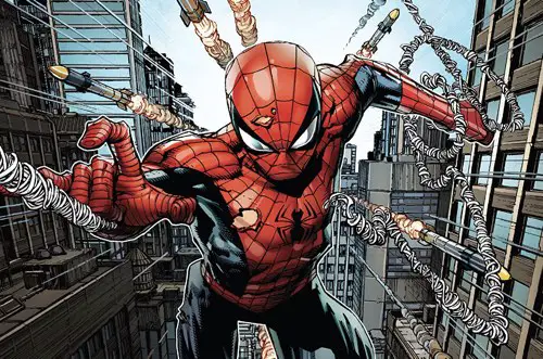
Here’s Sara Pichelli from “The Amazing Spider-Man”:
They’re slight variations, but it’s still spaghetti webbing. It’s not just the way there’s webbing wrapping around a core line, either. They’re still wildly active components of their panels. They add style and energy to every panel they’re in. The colorists are able to color in each individual strand. Look at all the detail on Bachalo’s webbing for the different colors on each strange.
These webs are wild and stylistic.
They’re not realistic.
They don’t make logical sense.
But they look cool.
And that’s all Todd McFarlane was trying to do in the first place in 1988.
Fact Checking and Nit-Picking
McFarlane’s recall is correct. He saw the webbing in a portfolio that Golden was a part of, though it wasn’t a Golden-specific portfolio.
Marvel didn’t publish it, but they did license it.
And Spider-Man was in that piece because the portfolio had a Team-Up theme.
The greater shock is that McFarlane only kept that one page from the portfolio and didn’t keep any of the other pieces by Perez, Byrne, Simonson, Miller, etc?
That’s the true craziness coming out.
Hi Augie,
I love your piece about the Spaghetti Webbing. I have also research this topic and Eric Larson used Spaghetti Webbing in ASM #287 that was before Alex’s Spaghetti Webbing. I had no idea Alex did Spaghetti Webbing. Do in your timeline Eric would go before Alex.
“Pre-Todd McFarlane
Alex Saviuk preceded Todd McFarlane on “The Amazing Spider-Man.” You can read my review of issues #296 – #297, but his webbing does form an interesting bridge between Ditko and McFarlane.”
This is a great piece, and a great find on the Michael Golden art. One minor fact-check: The Spider-Man drawing you described as by Chris Bachalo is definitely by David Finch.
Ack! You’re right. I’m guessing that the interiors of that issue were by Bachalo, but the cover was from Finch. I’ll make the corrections. Thanks again!
I’m reading Amazing Spider-Man 129 and the Spider-Man’s webbing is totally spaghetti webbing in this. There’s webbing in the middle and encircling webs. This is Ross Andru’s penciling. The earliest instance I can find of this is in ASM 127. You can clearly see it in the opening splash page. Even if you don’t consider it spaghetti webbing because the main strand which is encircled is noticeably thicker, it’s a design that could totally be seen as leading to spaghetti webbing as we know it now. This was in 1973 so quite a bit away from Michael Golden’s contribution.