
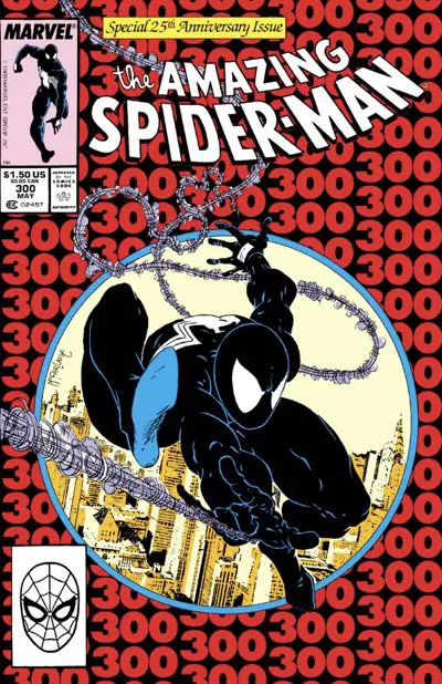
The Amazing Spider-Man #300: “Venom”
It’s the debut of Venom! Mary Jane and Peter move into the upscale Bedford Towers for a few issues! And — spoiler warning! — the red and blue costume makes its magnificent return. But, first, Venom and Spider-Man have a rumble in the urban jungle…
Evenly Divisible By 100 Credits
Pencils: Todd McFarlane
Inks: Todd McFarlane
Colors: Bob Sharen
Letterer: Rick Parker
Publication Date: January 12, 1988
My Venom Origin Story
The local Waldenbooks (kids, ask your parents or Wikipedia) had a spinner rack of comics when I was a teenager, just getting into comics. I remember it vividly.
Amongst the comics it held, there was a trade paperback collecting a few issues of Todd McFarlane’s run on “The Amazing Spider-Man.” Specifically, it collected all of the Venom appearances in the series.
Did I convince my mother to buy it for me one time — a birthday present? good report card reward? I don’t remember — just because I had gotten into the series and McFarlane’s Spider-Man without realizing that everyone else loved it, too. Back issues were hard to come by, and likely out of my meager price range.
That trade paperback, though, filled in a few early gaps, including the two issues of “The Amazing Spider-Man” prior to when I bought my first comic, and “The Amazing Spider-Man” #300.
I pored over that book repeatedly, soaking it all in. There was some beautiful McFarlane art in there, all right. We’ll be getting to the rest of those issues as the McSpidey Chronicles continues, but here we’re talking about the first complete issue featured in that trade paperback.
When McSpidey Really Started
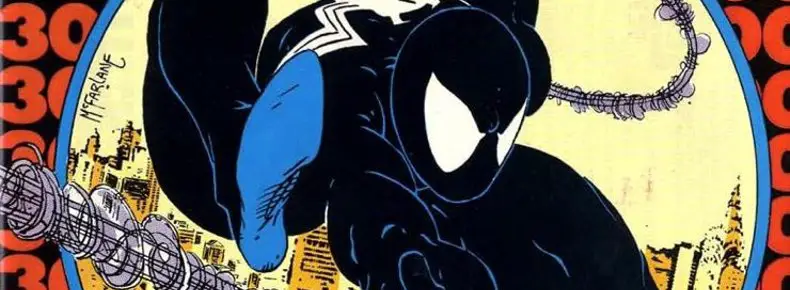
“The Amazing Spider-Man” #300, to me, is where it feels like Todd McFarlane’s run really begins. It ends with Spider-Man throwing away the black and white costume and returning to the red-and-blues, ushering in a new era for the character.
However, it’s more about McFarlane starting to ink his own work and thus bringing us closer to the look we all associate with his run on the title.
Even with it being a double-sized anniversary issue, McFarlane’s inks wouldn’t look as good on the book for months as it did in this issue. In trying to prove to editor Jim Salicrup that he could handle his own inks, he outdid himself. He may have burned himself out a bit or blown his deadline lead along the way, but let’s concentrate on the here and now, for the moment.
Oh, and did I mention he was still drawing “The Incredible Hulk” at the same time?
It’s impressive. This book has no right to look as good as it does.
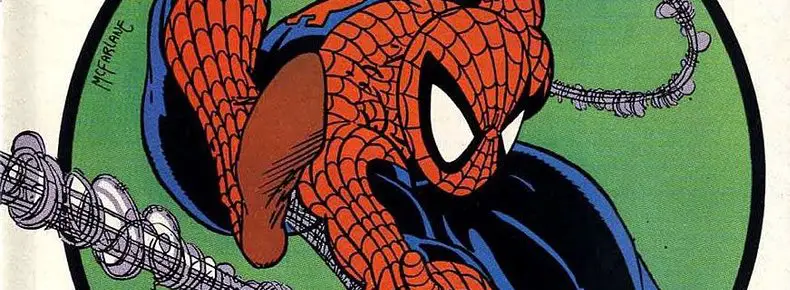
McFarlane’s ink line is vastly more stylistic than Bob McLeod’s. McFarlane didn’t try to simplify anything here. He used lots of smaller thinner lines to finish the art off, with lots of feathering and ink splattering to indicate background shadows, face wrinkles, and five o’clock shadows.
It’s still nowhere near what it would become by the end of his run, but you can at last start to see what excited readers picking the issues off the stands from month to month in 1988/1989.
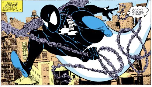
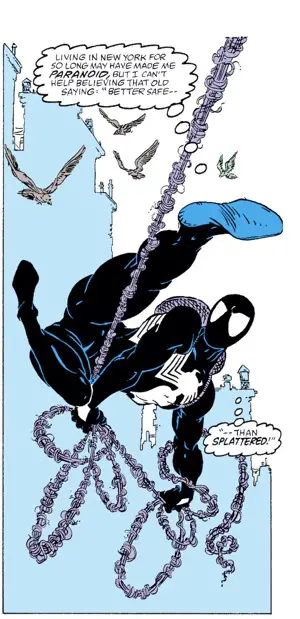
McFarlane’s famous Michael Golden-inspired Spidey webbing took its final form here, too. McLeod’s inks on that webbing were looser, more suggestive, and vague compared to the length McFarlane goes to. He’s very careful about showing a single strand of webbing wrapping around a core with random fly-aways providing a break from the potential monotony of circles around the webs.
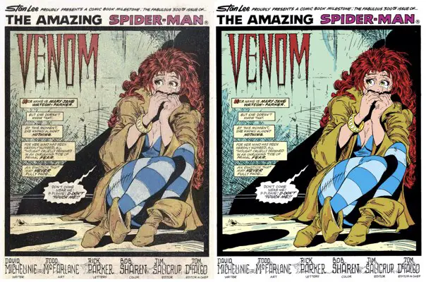
At a time in comics pre-Photoshop, McFarlane’s excess in lines was often used to indicate the outlines of shadowy or highlighted areas. Colorist Bob Sharen does a good job in this issue keeping up with that. The seemingly stray lines on Mary Jane’s boots on the opening splash panel get converted into shadows with a darker color tone than elsewhere on those boots. The same goes for the folds in her jacket and the texture on the back wall. With a limited palette available to him, Sharen did as much as he could with the tools at the time.
The effect in the Omnibus edition is far stronger than in the original comic. For starters, the coloring has been “fixed” so everything stays inside the lines, like with the darker blue areas of Mary Jane’s tights. But the contrast between the green shadows and the yellow floor is far more pronounced on glossy paper.
Overall, there’s a more plastic feel to it. It feels cleaner, but I can’t help think that it looks a little fake. The newsprint look that even the early trade paperback had is what I’ll always remember, but I don’t blame Marvel for cleaning this up for the reprints, nor am I disappointed in it. It’s just different.
Every medium should have its own set of rules. The rules that guide a glossy Omnibus are different from those that constrained the cheap newsprint of the day in 1988. There’s always a better way, but sometimes you learn to take what you can get. I talk more about it in my review of the McSpidey Omnibus.
Flashbacks and Design
Some of the design elements are the same in this issue as in the past couple. Venom’s origin story is told with flashback panels over a large figure shot of Venom/Eddie Brock as he explains himself. McFarlane is back to keeping a profile of the person next to the panels on the other half of the page. That gives the letterer room to put the word balloons where they belong. That was a failure pointed out in the flashback sequence of issue #298.
Artists today don’t need these flashback pages so much anymore. Trade paperback collections mean that all stories are multiple parts and the reader will likely read through from start to finish. Stopping the story to recap it every 20 pages or so stands out in an ugly way. In the newsstand days, you needed to do that for potential new readers.
McFarlane would get plenty of practice in this series drawing flashback sequences. This run was still long before the trade paperback revolution..
There’s always a need to have pages with a lot of words on them. The trick is to have an artist whose style is so dynamic that it distracts the reader from that. Give the reader interesting visuals to latch onto, and they’ll forgive an exposition dump and a whole lot more.
Introducing Venom
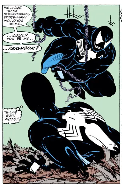
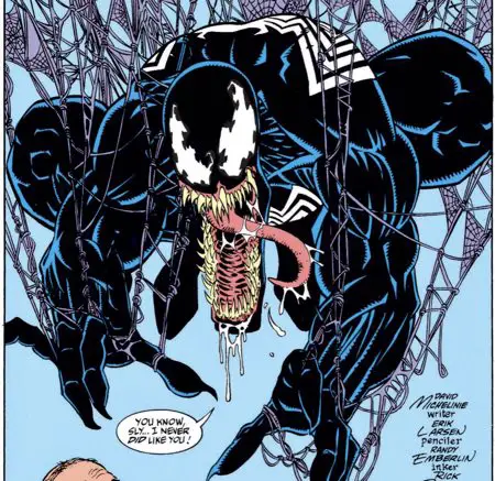
Most notably, this is the issue that gave us Venom’s first serious outing. As a first draft character, he’s pretty well fleshed out. There’s also not much depth to him, anyway.
Michelinie lays it all out on the page here, with a complete origin story, a reason for Venom to hate Spider-Man and know Peter Parker’s secret double life, and the perfect way to go about confronting him. There’s even a twist in his powers that specifically impacts Spider-Man.
Visually, Venom’s head is a little goofy-looking. It wasn’t until Venom’s return in later issues that McFarlane upgraded him to look a little more monstrous and demonic in the face. Here, he just looks like a cartoon character with slightly wacky facial features.
The mouth hasn’t yet given way to large-scale pointy teeth. The jawline isn’t outrageously jutting out from below his upper bicuspid. The visual of Venom’s black inkiness oozing over Eddie Brock is strong and creepy, though. (The trademark long tongue was an Erik Larsen invention based on his faulty memory of McFarlane’s cover drawing to the trade paperback I mentioned at the beginning of this review.)
He looks a lot like a muscular and angry black costume Spider-Man. Imagine Spider-Man bulked up like a weightlifter, instead of his more traditional scrawny form, where agility and litheness compensate. It would be as if he didn’t have the proportionate strength of a spider, and so makes up for it with obsessive weight lifting.
The book ends with Spider-Man ditching his black costume to return to his red and blue togs. This is in deference to Mary Jane’s wishes, who was briefly terrorized by Venom at the beginning of the issue when she came home to him waiting in the shadows for Peter.
The classic costume is something McFarlane took an issue or two to warm up to, but it’s fun to watch him work it out on the page. We’ll discuss more about that with the next issue.
Venom’s Third Fourth First Apperarance!
No, But Seriously, We Mean It This Time
In “Web of Spider-Man” #18, a hand attempts to push Peter Parker into the path of an oncoming train.
In “The Amazing Spider-Man” #298, we saw a silhouette of Eddie Brock as Venom. We saw his hand across multiple panels.
In “The Amazing Spider-Man” #299, we saw the Venom costume in a panel that showed most of his body. We got his name at the bottom of the last page. He’s taking direct action against Mary Jane.
That issue would be the first appearance of Venom, right?
Nope, conventional wisdom and everything that goes along with that give “The Amazing Spider-Man” #300 the nod as Venom’s First Appearance.
I almost want to attach a “[sic]” somewhere in the previous sentence.
The rules for this kind of thing are completely arbitrary and unwritten. This is a classic case of just going with the definitions agreed upon by the most serious people from this part of the hobby. Ultimately, a “first appearance” designation is just to goose the value of the book in the aftermarket.
There’s no point in arguing with the mob. They’ve already spoken.
It’s the 300th issue that gets the credit and the concomitant value hike.
It’s also the first where McFarlane inks himself and the series truly starts to look as people remember it. It’s not technically McFarlane’s first Spider-Man issue, but it does feel like it’s where his run really starts.
And, of course, it’s a milestone 300th issue. It has multiple things going for it.
But, mostly, it’s because it’s movie star Venom’s first [sic] appearance.
As I write this, the comic is valued at over $7000 if you have it in CGC 9.8 (mint) condition.
Who Created Venom, Anyway?
Oh, boy.
This has been a topic of debate in the comics community for almost as long as Venom has existed. David Michelinie and Erik Larsen feuded over it in Wizard Magazine back in the teen issues of that magazine.
It’s not an easy answer, but that makes perfect sense given the way superhero universe comics are made. They build upon one another. Nothing is created in a vacuum. Nothing is truly unique.
“We stand on the shoulders of giants” is one popular phrase.
Another one that might be even more apropos here is, “Everything is a remix.”
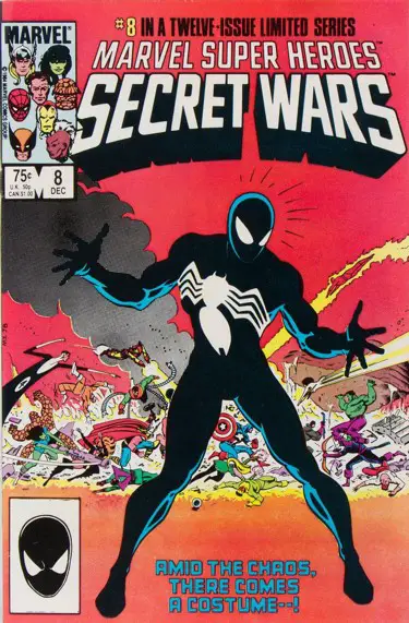
Venom’s history dates back to the symbiote costume from Secret Wars. The idea of making the black costume a villain goes back to a fan suggestion that Jim Shooter bought for $200 a decade earlier. Parts of the mythology come from work by Tom DeFalco and Ron Frenz. John Byrne claims credit for a biological costume which he didn’t use, but let Roger Stern run with.
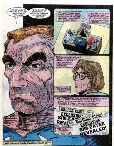
Eddie Brock is a David Michelinie creation that is retrofitted into Spider-Man history, dating back to the Peter David-penned “Sin Eater” saga.
But Todd McFarlane designed Brock and made Venom a scary, more monstrous character than perhaps Michelinie’s script detailed.
Erik Larsen added the crazy tongue years later.
It’s… complicated.
Comics is a medium that is composed of both words and pictures. You don’t have a comic without both. To my mind, then, Michelinie and McFarlane created Eddie Brock and Venom, based on the works of countless others before them. Because the character turned out to be so popular, those “countless others” are going to pop up.
“Success has many fathers; failure is an orphan.”
So, it’s a Michelinie/McFarlane thing. Michelinie likes to credit himself as the “originator” now, which is as good a description as anything else, but feels a lot like semantic nonsense (welcome to the internet!) to get around the impossible task of “Who created what?” here.
That said, I’d give Michelinie a larger percentage of the credit. He was there first. It came out of his mind. He didn’t consult or work with McFarlane to develop the character before he appeared. It’s classic assembly line comics. He wrote the script, described the character to some degree, and threw it over the wall. McFarlane ran with what he was given.
The character would not have been so popular without McFarlane’s visuals, both with the costume and the way it moves on and off of Brock.
Yes, it’s built on pieces left behind in the Marvel Universe from other things. So is just about everything else created at Marvel in the last thirty years. You could make an argument that Steve Ditko deserves some credit for being the basis of the costume, if you really wanted.
Nothing exists in a vacuum. Everything is a remix.
Let’s not get worked up over semantics because, let’s be honest, it’s not like Marvel is going to pay any extra to the creators of their characters who make the Disney corporation billions of dollars every year. Ultimately, it’s bragging rights and little else.
Boom Chikka Pow Wow
Mary Jane tries to cheer up Peter by talking him into a career in fashion photography. He hesitates. So she takes her shirt off.
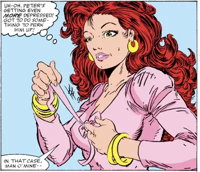
Now, I can’t claim to have a complete understanding of the construction of women’s garments, but there’s something that rings hollow here. I don’t buy that the bow in the front of her top is holding the whole thing on her body. It looks purely superficial and ornamental to me.
Having the visual moment of her untying it puts the right thoughts in the reader’s mind, but it seems like an ultimately useless gesture.
Am I overthinking this? Yeah, probably.
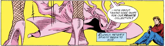
The caption box says, “Slowly, Peter’s spirits begin to rise.” I bet that wasn’t the only thing…
That’s So ‘80s
Peter Parker uses a telephone booth to call the doorman of his building to leave his wife a message. Kids today must have no idea what life was like without always-on communications in our pockets and purses.
Also in the issue, we see Mary Jane’s tape-based Sony answering machine. There was life before voice mail? Yes, and you had to wait for it to rewind to your first message.
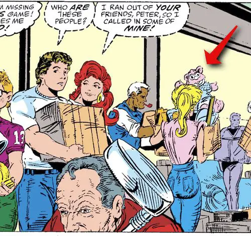
That looks like a Muppet Babies appearance during Peter and Mary Jane’s move. Marvel’s “Muppet Babies” comic ran 26 issues until it ended in July 1988, just a few months after this comic saw print.
The Moment You’ve All Been Waiting For! THE FIRST FELIX!
Todd McFarlane started hiding Felix the Cat doing his run on “The Incredible Hulk.” It carried on into both “The Amazing Spider-Man” and “Spawn.” It took a couple of issues, but McFarlane started hiding Felix in this series starting at issue #300.
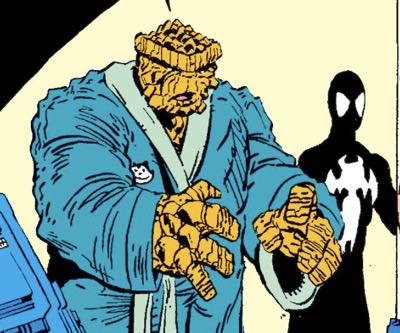
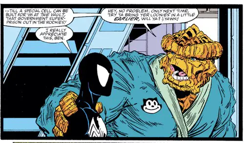
When Peter visits the Fantastic Four at their home near the end of the issue, the Thing is walking around in his robe with Felix the Cat embroidered on the front of it. It’s a nice contrast between the rocky character and his soft robe with the cutesie cat on it.
I’ll be tracking Felix’s appearances in all the issues as we go along. Please leave a comment if I ever miss one.
It’s also worth noting that McFarlane’s version of Thing is far rockier than most. He really leans into the monster form here. It’s almost alien. In other words, it’s right up McFarlane’s monster-loving alley.
Prelude to a Spawn
In a Facebook video, McFarlane showed the original sketch he did to sell the cover concept for this issue to Jim Salicrup. He doesn’t own the original art anymore, but he does have the original pencil sketch. It’s pretty faithful to the final pose but is definitely a lot looser. There’s a lot of energy in that sketch.
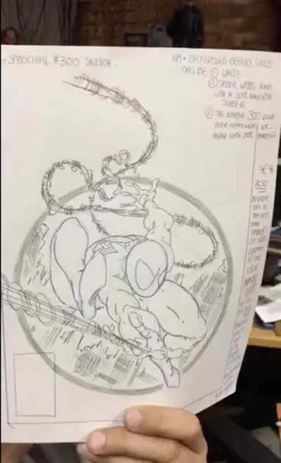
The sketch purposefully leaves the details out of the costume so it can be drawn as either the black costume or the red-and-blue costume. There’s a note on the side of the art where McFarlane suggests that maybe they should release two covers for the issue — the red and blue for the newsstand and the black costume for the Direct Market. That idea, he says, got shot down by marketing.
Alternate covers weren’t a thing yet. A couple of years later, they’d be pushing at least three different covers for “Spider-Man” #1 with only coloring changes and a polybag. Times change fast.
His margin notes also discuss other ideas for what to do with the background outside the circle. Some extra webbing was one suggestion. Watch the video and he’ll walk you through it all.
Just as he did with issues #298 and #299 of Spawn, Todd McFarlane drew a cover in the run up to Spawn #300 in this style:
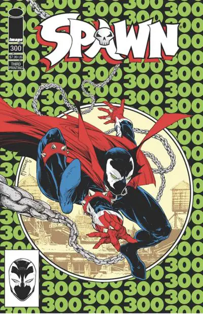
It was for the third printing of the comic, so it might be hard to track down, if you’re so inclined.
BD Recommendation
If you liked this issue, I have a recommendation for you from the world of les bandes dessinées, or Franco-Belgian comics.
Peter Parker is a newspaper photographer, but there are other kinds of photography that report on happenings around the country.

In Aimée de Jongh’s “Days of Sand,” we meet John Clark, a newspaper photographer in New York City who is hired by the federal government to head out to Oklahoma to document what’s happening in the Dust Bowl during the Great Depression.
It’s a beautiful and well-researched book that’s nominated for an award or two these days during French comic awards season.
It’s available in English across two parts. I reviewed the first half of “Days of Sand” and have part two on my reading pile. Soon, I hope….
Next Issue
Silver Sable! McFarlane draws more generic military guys in cool outfits! No Peter/Mary Jane newlywed shenanigans! And did I mention Silver Sable yet? Read all about it now!
I really hated Venom at the time and everything about it, it’s that ultimate bizarro/reverse Flash tired cliché. The symbiote costume story so far was intriguing and unpredictable, they had to bring up Eddie Brock, the reverse Parker. and those were the late 80’s so the fangs and the tongue were so obvious. How many symbiotes are there today, I lost count, they really milked that cow didn’t they…
I liked Venom, though I wasn’t excited about him like many others were. I was still new to comics, so every villain seemed cool to me. But, yeah, they figured out quicky back then how to overexpose him to the point of making him unexciting. And these days, I can’t even begin to explain it. I’m glad people are happy and they’re getting comics they like, but did Venom really need this huge mythology attached to him and all these spin-off characters and craziness?
Eh, I’m just a cranky old man.
At least Venom never wore a leather jacket!
Just FYI, McFarlane did a more accurate homage (with the 20% magenta colour) for Spawn 300 in the initial print run, it’s cover J.