
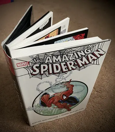
The Amazing Spider-Man by David Michelinie and Todd McFarlane Omnibus
The McSpidey Chronicles started as an excuse to read through this Omnibus after I had purchased it in 2011. It only makes sense, then, to review the book, itself. I have 30 other articles talking about the story contents inside of it, so let’s just talk about the book now.
What’s In It?
The omnibus collects issues #296 through #326 of “The Amazing Spider-Man.” That will give you every issue of the series that Todd McFarlane drew, plus a couple of fill-in issues that he didn’t, and the one issue after he left that completed that storyline. Erik Larsen drew two of those fill-in issues, and Colleen Doran did the other one.
If you want to talk about stylistic whiplash, imagine going from McFarlane to Doran. I’m afraid to see what the letters column looked like a couple of months later.
The Omnibus also includes “The Amazing Spider-Man” #296 and #297, the two books before McFarlane’s run began. I’m not sure why. Maybe Omnibus editions need to meet a page count? Maybe they wanted to give you some material to compare and contrast to McFarlane’s style? It worked for me on that last point, and I discussed it in the McSpidey Prelude article.
It goes beyond even those issues, though. This book aims to compile all of the Marvel-owned work McFarlane did with Spider-Man in it through this run,
It also includes the short story McFarlane did for a “Spectacular Spider-Man” annual featuring The Prowler, as written by Glenn Herdling. There’s the two-page story he did for “What The — ?!?” featuring “Bat-Man”. And there are the spot illustrations he did for “The Official Handbook of the Marvel Universe.”
The last thing it includes that I loved to see is all of the covers McFarlane did for “Marvel Tales” featuring the X-Men. They’re reprinted at full size, too, one cover per page. They didn’t try to cheat by putting three on a page and shrinking them down.
I remember picking up those issues as I found them on the newsstands at the time just for the covers. I didn’t get them all, though, so now I’m happy to have them in one place. They look great, even when McFarlane ran out of ideas and got silly.
::shrug:: I like silly.
It made me wish there was enough material for a “Todd McFarlane’s Marvel Universe Omnibus” book. You could throw his “Incredible Hulk” issues in there, along with his “Daredevil” issue. Then you’d need to get the “G.I. Joe” rights back for his issue. There was a New Universe book somewhere, as I recall. And that could be filled out with his covers from titles like “Conan,” “Quasar”, and “Marvel Comics Presents.” All of that together still isn’t likely enough for a full sized Omnibus, but might still make a nice hardcover.
DC should do the same with his work there, from “Infinity Inc” to “Invasion”, his “Sandman” pin-up, those “Detective Comics” issues, and whatever else I’m missing. It’s also not a full Omnibus, but might make for an attractive digital bundle or hardcover collection.
Physical Construction
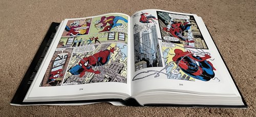
Despite having a spine that’s two inches wide, the book can open flat from any page. Nothing gets lost in the margins, either. Open the book up to the dead center of the page count and you’ll still be able to see everything across those pages. To be fair, there are no double-page spreads in this book, so I couldn’t test that out.
I flipped open my copy of “The Ultimates Omnibus” to see how it handles this issue. It does a good job with the spreads. You might lose a hair on one or two, but it’s not enough to worry about missing a word balloon or seeing limbs suddenly cut off.
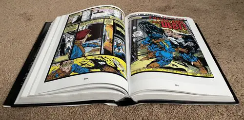
So let’s just take it that Marvel knows what they’re doing with this format and it works particularly well with a series like “The Amazing Spider-Man” that didn’t do double-page spreads in the late 1980s.
The book includes a dust jacket on the cover. Some people like those, others are not terribly enthused by them. I always take it off when I’m reading the book and then slide it back on before returning the book to the shelf. I like the way the dustjacket looks, but it’s a glutton for punishment. It’s just too easy to bend it at corners, and it doesn’t feel good in your hands when you’re reading the book. On a book like this, of course, you’re more likely to read it with it sitting flat on a table or desk in front of you, but still…
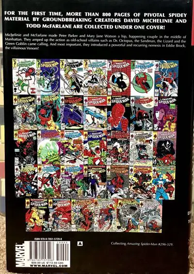
I like the back cover, in particular. I’m a sucker for a cover line-up like that.
Also, when you see it like that, you realize that McFarlane didn’t draw the series for all that long. Remember that six of those issues were extra issues in the bi-weekly periods, three books are fill-ins, and the first two and last issues are all by other artists, too.
Reprint Quality
These issues were all originally on newsprint. I have a few of them that I bought off the stands and a couple more that I traded for in my earliest days of comics reading.
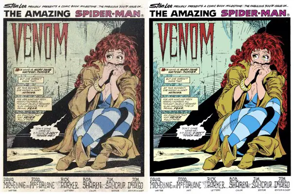
Something always gets lost with modern reprints of books like these. When you convert everything to modern printing and digitize all the issues and their colors, some very odd things can happen. Black ink lines can be over-sharpened. Thin lines might get lost.
This is a particular issue with McFarlane’s style, particularly once he starts inking himself and uses more thin lines. Some of those thin lines start to fade out or look a little pixellated. It’s particularly obvious in issue #309, and again in #316. Weirdly enough, it looks like they overcompensated in the other direction for issue #317, where the black lines look noticeably stronger and thicker.
Part of me wonders if they pulled the files from the trade paperback that reprinted #316 and #317 for this book, instead of grabbing a fresh scan of the issue and processing it accordingly. I wish I still had my copy of that trade to flip through to see if it had similar issues…
Colors that looked great once they were soaked up by the newsprint in the original issues might look garish when seen on slick white paper stock like this book uses. You can’t help that. I see that in a few places in this book, only because those panels from the original comics are burned into my brain. I’ve stared at them long enough. I don’t need to pull up the originals to confirm that the new reprints can be brighter than expected.
Again, issue #309 has some great examples of where the color can fade out pretty badly. I’ll show examples there.
But, pragmatically speaking, there likely will never be a perfect reprinting of these issues. The only way to solve the issue is to buy the original comics, and that might be more than you’re willing to spend. I don’t blame you.
You lose a little fidelity with the Omnibus, but you get the whole package together in one book. Everything in life is a trade-off, and this is no different.
Let’s just be glad it’s still so easy to get a complete collection of Todd McFarlane’s “The Amazing Spider-Man” work. (I have a guide on how to collect it digitally, too, but it’s a little trickier.)
Evens and Odds
The one thing that shouldn’t bother me, but does, is the pagination. It’s something you probably wouldn’t ever think about until you crack open this book and see it start happening.
Each issue reprints the cover at full size and then all of the pages after that. Each issue is 22 pages. That means that, basically, alternate issues will start on the left-hand side of a spread. The page turns are ruined for the rest of that issue. If McFarlane constructed something so that it would be a surprise when you turned the right page over, now that’s on the left page of every other issue and the big surprise is on the facing page.
Or, to put it more simply, the first page of alternating issues is on the left side instead of the right. It’s as if they published the first page on the inside front cover for all the even-numbered issues.
It’s not completely consistent like that. Occasional issues are one page longer or shorter, and so the pagination rights itself again. But it happens often enough that I felt it.
In some collections, they’ll force a blank page or put something extra in somewhere to accomodate double page spreads in this fashion. Those have to start on the left page. However, Todd McFarlane didn’t use any double-page spreads in his 28 issues here, so that was never needed. I don’t think he used any in the adjectiveless “Spider-Man” series, either. It’s not his thing.
There’s not really a good answer for it, besides publishing a pin-up or the letters column where they’d need it to help push the next issue to the right side of the spread. Thankfully, it’s only a very minor concern in practicality. But it is a change from the original storytelling. If you remember reading any of the original issues, it might feel weird at first. Your memory isn’t playing tricks on you.
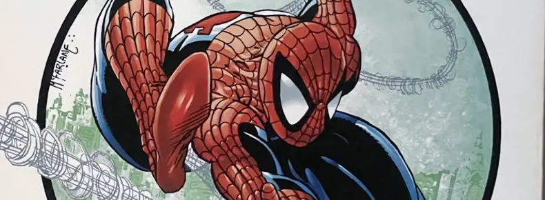
The Cover’s Colors
I’m not entirely a purist when it comes to my comics reprintings. When it comes to a cover, I’m all for a more modern sensibility being applied to an older image to help it stand out.
Having said all that, I have a problem with this cover. It’s not a deal-breaker and it’s almost barely noticeable, but it does annoy me.
The coloring on Spider-Man’s costume makes it look like he’s wearing a puffy costume. The web lines look like stitches and the costume is quilted. Each section is getting its own highlight from a light source high above.
I remember this was a thing during the J. Michael Straczynski/John Romita Jr. run on “Amazing Spider-Man” back in the 2000s. It didn’t bother me there so much. That was just the style for that run. That was how Romita Jr.’s art was done in the first place. It looks weird being applied to Todd McFarlane’s art today.
Recommended?

Yes, it’s as good a reproduction of this work as we’re ever likely to get. The binding is amazing and has held up over a few rereads. The paper quality is great. All of the covers and short stories in the back are nice bonuses. If you want print editions of these issues, the best way to get them is either through this Omnibus or by buying the original issues. (There are trade paperback collections, but they don’t open as flat as this book does.)
A new printing of the Omnibus debuted in August 2021. The cover price is $99.99.
[As an Amazon Associate I earn from qualifying purchases. You don’t pay a dime extra.]
How much does this one cost ? The DC ones seem to have more content (up to 45 issues) for a similar price.
My main grudge with the omnibus format is that they are very hard to read in bed 😉
And the dustjacket always gets damaged somehow.
Heh, the price tag is something that should be in the review. I’ll definitely add it in. It’s $100, though I picked it up through Amazon, so there was a discount there. And, yes, it’s definitely a book you read at a desk or table. And I always take the dust jacket off it before I read anything in there. I hate dustjackets so much….